Samsung is set to host its next Unpacked launch event for the Galaxy Z Fold 5 and Flip 5 later this week, and there’s actually a ton to look forward to. Here’s everything you can expect at the event.
Samsung Unpacked 2023: What’s coming?
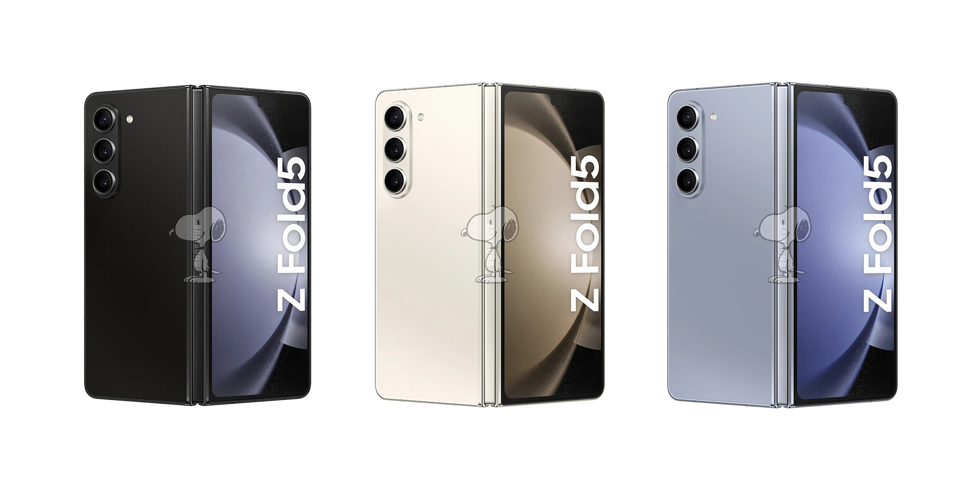
Galaxy Z Fold 5 and Z Flip 5
The biggest launch at Samsung’s event this week will be new foldables: Galaxy Z Fold 5 and Galaxy Z Flip 5. Both devices are expected to be somewhat iterative in their improvements, with most of the upgrades coming to the Galaxy Z Flip 5.
Samsung is set to improve on the Flip 5 primarily with a new cover display that’s drastically bigger than the Flip 3 and Flip 4. The display is expected to open support for a full keyboard and more useful widgets, but it’s unclear if full apps will be supported.
Both devices will also bring upgrades such as Snapdragon 8 Gen 2, a new hinge that allows the foldables to close fully instead of leaving a gap, and some new colors and cases.
Galaxy Tab S9 series
Samsung’s flagship tablets are also getting a refresh at Unpacked this year, with Tab S9, S9+, and S9 Ultra on the docket.
The main upgrade is Snapdragon 8 Gen 2, but there are other little tidbits beyond that, such as eSIM support, AMOLED on the smallest model, and more. It’s a welcome arrival, as it’s been a little over a year since Samsung last launched high-end Android tablets.
The standard Watch 6 is only seeing a couple of notable changes: a W930 chipset that should be a little faster and thinner bezels that make room for a bigger display. The RAM is also jumping from 1.5 GB to 2 GB.
Meanwhile, Galaxy Watch 6 Classic will revive the physical rotating bezel in addition to the standard model’s upgrades.
It’s possible these watches will also debut Wear OS 4, which was announced at Google I/O and brings several benefits, with the ability to connect to a new phone without a reset being one of the biggest perks.
The maybes
Outside of the core lineup, there are a few more things we might also see, but there’s not much known.
Galaxy SmartTag 2
One of the most likely unveilings might be the Galaxy SmartTag 2. Samsung hasn’t launched a new version of its tracker since the debut of Galaxy S21 over two years ago. There have been reports and regulatory evidence of this new model, but we haven’t seen any images leak, so there’s no guarantee.
Samsung’s XR headset
Samsung has been rumored to launch its own mixed-reality headset based on a new version of Android that was expected to arrive at this event. But rumor has it Samsung has delayed that device by a few months in the wake of Apple Vision Pro’s debut.
A small teaser is what we’d expect at the absolute most.
Galaxy Tab S9 FE & Galaxy S23 FE
Samsung’s “Fan Edition” lineups may return soon, as there’s strong evidence pointing towards upcoming releases for Galaxy Tab S9 FE and Galaxy S23 FE. While there’s a chance they could arrive at this event, it’s not very likely.
It’s been a bit since Samsung released a new set of earbuds, and there’s certainly a chance we could see a launch this week. But there’s only been one report on that matter and no leaks whatsoever. So we don’t expect to hear anything – no pun intended – on that front.
Reserve for a $50USD discount and Trade in at Samsung Australia for a $100AUD discount
Up until the day before Unpacked, Samsung is offering open reservations for the Fold, Flip, and Tab S9 series. All of those devices will be eligible for a $50 credit on pre-order, which can be used as a discount on the device or for accessories. In any case, it’s worth signing up if you think you might put in a pre-order.
In a teaser, Samsung confirmed that its next Galaxy Unpacked event will take place on July 26 – just a few days from now.
The event, held in Seoul, South Korea, will start at 7 a.m. ET and livestreamed via YouTube and Samsung’s social channels.
The event, at least according to rumors, will be headlined by serving as the launch date of Galaxy Z Fold 5 and Galaxy Z Flip 5. Beyond that, a new Galaxy Tab S9 series is expected, as is the Galaxy Watch 6 series. There’s also a chance of new earbuds, a new SmartTag tracker, and potentially more.
Samsung has reservations now for its new devices.
Those who sign up at Samsung.com or through the Shop Samsung app will be eligible for a $50 credit with the purchase of their device. Samsung has offered this reservation credit for quite a while, but this year it can be applied towards the actual cost of the device rather than just towards accessories (which you can still use it towards). You’ll get the credit when pre-ordering Galaxy Z Fold 5, Flip 5, or the new tablets.
There’s no commitment for this either – just drop in your email. Samsung has, in the past, also offered enhanced trade-ins with these reservations, but that doesn’t seem to be the case this time around.
If history serves as an example, Samsung will start shipping devices to customers within a week or two of the event, likely by the second week of August at the latest.
Full Galaxy Z Flip 5 and Z Fold 5 specs surface in super-cryptic leak
The Galaxy Z Flip 5 and Fold 5 are set to be the next foldable phones to come out of Samsung’s production line this year. With the release still to come, the Flip 5 and Fold 5 specs are already public thanks to a fun leak.
Through a convoluted process – obtaining a link through binary code posted on Twitter via SnoopyTech – every technical detail of the Galaxy Z Fold 5 and Flip 5 specs are now public. That includes display type, size, and SoC choice for each foldable.
First off, the Galaxy Z Flip 5 will unsurprisingly house two displays, one internal and another external. This go-around, Samsung is packing a much larger display on the outside of the Flip 5. That display hits 3.4-inches across at a resolution of 748 x 720. Internally, the Dynamic AMOLED 2X panel will come in at 6.7-inches and looks to be capable of hitting up to 120Hz, which flexible screen will be 2640 x 1080.
Internally, the Flip 5 is packed with 8 GB of RAM paired with either 256GB or 512GB and a Snapdragon 8 Gen 2. The clamshell foldable is also equipped with a 3,700mAh battery, which should last a decent amount of time. On the back, a 12MP primary and 12MP ultra-wide are set into the external display.
The device is set to come in four colors: Lavender, Mint, Cream, and Graphite.
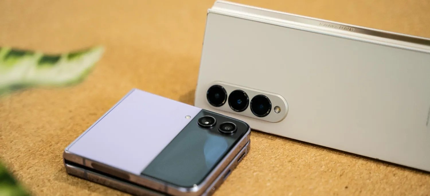
As for the Z Fold 5 specs, things get a little more intense. Both display sizes hit the same size as the previous generation and are backed by a Dynamic AMOLED 2X panel. The external display hits 6.2-inches at 2176 x 1812 while the internal screen comes in at 7.6-inches. Both are capable of 120Hz while the external display’s variable refresh rate hits a minimum of 48 frames per second.
Inside, the Fold 5 houses 12 GB of RAM with either 256GB or 512GB and a Snapdragon 8 Gen 2. The battery inside is a 4,400mAh unit, which isn’t a physical improvement over the Fold 4. The Fold 5 will come with a 50MP main sensor and 12MP ultra-wide. The telephoto lens paired with the other two is also 12MP.
Something to note within the released specs is that the Z Fold 5 seems to come in at 13.4mm tall when folded. That’s about 0.8mm thinner than the Z Fold 4. The foldable is also reportedly 10 grams lighter in this generation.
The Fold 5 will come in Phantom Black, Cream, and Icy Blue.
Interestingly enough, neither device seems to come with a dust resistance rating packed in the IPX8 rating listed. It was rumored both devices might get certified, though an “X” still stands in the current dust resistance classification.
Both devices will run Android 13 (One UI 5.1.1) out of the box, which houses some seriously impressive features. Samsung is set to reveal the Galaxy Z Fold 5 and Flip 5 in July. Previous reports indicate a release date of August 11.
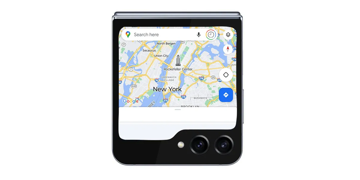
Galaxy Z Flip 5 outer display reportedly gets Google Maps, Messages, and YouTube apps
The upcoming Galaxy Z Flip 5 is set to bring the overdue upgrade of a big outer display and, apparently, Samsung is working with Google to bring select apps to that display including Maps and more.
As has been revealed by past leaks, the Galaxy Z Flip 5 is likely to deliver a 3.4-inch cover display that takes up almost the entire top half of the device. It’s a drastic improvement from the tiny 1.9-inch panel on Galaxy Z Flip 4, and even bigger than the Oppo Find N2 Flip’s panel.
What users can do on that outer display, though, has been largely unknown outside of a previous report that mentioned new widgets and features.
Now, a report from SamMobile details that the Galaxy Z Flip 5’s outer display will be getting some “optimized” apps from Google. This apparently includes:
Google Maps
Google Messages
YouTube
These “optimized” apps will also apparently be backed up by Samsung’s apps, which the report says to “expect” to be ready for the cover display.
But still, it’s unclear if Samsung’s phone will be able to match that of the new Motorola Razr+. That device has an even-bigger 3.6-inch display which, as we previously detailed, can run virtually an Android app.
Samsung is set to unveil Galaxy Z Flip 5 in July, the company has confirmed.
From a functionality and usability standpoint, smartwatches shouldn’t be miniature phones. Interactions should last seconds, with UI elements large and information highly glanceable, given the very physical constraints of a small screen size. One way modern apps abide by those tenets is in keeping to a single scrollable feed of content, while earlier apps opted for side-by-side windows/feeds that were roughly analogous to bottom bar tabs.
Wear OS 3 does a good job following those principles, and it’s very simple to use and pick up. In comparison, the Apple Watch tried to pack in too much, and it’s felt quite crufty for several generations now.
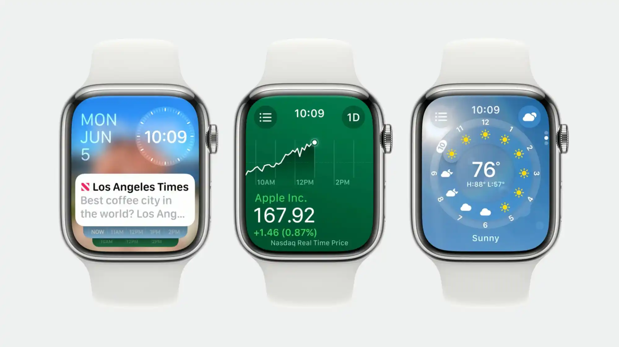
With watchOS 10, Apple has done a thorough redesign and created a design system for wearable apps. Info-dense applications don’t feel cramped, and it’s very obvious where to press. It works so well that I’m rethinking my expectations for what a watch app can be.
This layout/template works because it uses all the available space. It comes down to the Apple Watch being a rectangle and Wear OS watches being circular. The circle, while iconic and a point of pride for Google in designing the Pixel Watch, is constrained in terms of text layout and button placement.
The only Wear elements that really curve are the time and maybe watch faces that mimic analog clocks. Within the circular container, something like text and other graphics can only be placed in a square to ensure nothing gets cut off. The semicircle endcaps of a pill-shaped card do take up the left and right of the screen, but there’s no information placed there.
With watchOS 10, you’re able to place two in the top-left (back button or new message button) and right corners (now playing, etc.), while some apps even have FABs. It’s highly efficient, and the consistency trains users on where to tap.
Wear OS buttons cannot be placed in non-existent corners. For example, Messages’s Start chat button takes up a full line and is given equal importance to a conversation. The solution there would be a smaller button, like the one used for search by the Play Store. Another idea would be for apps to place vertical versions of those pill-shaped buttons on the left and right sides.
Meanwhile, the Apple Watch’s upcoming widget system is remarkably dense. In Wear OS, Tiles take up your entire screen and usually just show one piece of information. On watchOS 10, you can view two cards per screen, including heart rate with history, activity, sunset/sunrise, audio controls, timers, a compass, and much more.
This approach is so much better and is in large part due to Apple making it so that a swipe up from the watch face gives you widgets. Previously, that gesture took you to Control Center, which is now a side button press. (It’s annoying, as I think physical button presses are much less immersive.)
On Wear OS, Tiles are left/right swipes that eventually return you to the watch face. A swipe up on Google’s platform takes you to a notifications feed.
I think the approach Apple arrived at is so good that Google should consider changing its own. It makes more sense for notifications to be fullscreen, like Tiles currently, to show as much information as possible before you have to open it. An upward swipe for multiple widgets and/or mini-Wear OS Tiles would be highly glanceable.
Meanwhile, Wear OS could even consider placing circular complications here. The clever thing Apple has done with widgets always being a swipe up away is that you can set anything as your watch face. Fun options there include Mickey and Minnie Mouse, Snoopy, and fullscreen digital and analog clocks. Previously, I opted for something with a lot of complication slots, but now I just place the info I need in the widget feed.
The Apple Watch has always done more than Wear OS, but it was presented in an overwhelming manner. Now, it’s been thoroughly refined to fit elegantly. In comparison, what Wear OS has going for it is simplicity. That’s far from bad, but it might get old fast as we inevitably come to expect more from our wearables.
Galaxy Unpacked is mere days away, but we know what to expect from Samsung – another round of foldables that offer generational improvements. But is that enough for you to pull the trigger on a new Galaxy Z Fold 5 or Flip 5?
What do the Z Fold 5 and Z Flip 5 bring to the table?
Depending on what device you own right now, you’re looking at some improvements, just like you would with any device year over year. While the Galaxy Z Fold 5 and Galaxy Z Flip 5 haven’t technically been announced, we have enough reliable information from both leaks and the company itself to get a general idea of what the new foldables improve on.
Galaxy Z Flip 5 improvements
The first thing that comes to mind is the Z Flip 5‘s completely revamped external display. It is the foremost change and center of attention in terms of Galaxy foldables prior to launch. That display is said to come in at 3.4 inches across with a resolution of 748 x 720. By comparison, the Galaxy Z Flip 4 utilizes a 1.9-inch display with a resolution of 260 x 512. That’s a 55% increase in size, and the leaked images show just how much of a difference that makes.
As for the internal panel, that AMOLED 2X display is set at 6.7 inches and can hit up to 120 frames per second. That resolution clocks in at 2640 x 1080 – no surmisable difference on paper.
With the same 8 GB of RAM and 256 GB / 512 GB loadout, the only other stark difference is the superior Snapdragon 8 Gen 2, which should bring a slight performance increase over the previous generation.
Galaxy Z Fold 5 improvements
The step up from Fold 4 to Fold 5 is a little less pronounced. Each generation’s core display specs look to be, on paper, identical to each other. That includes size, resolution, and refresh rate.
Internally, the battery and memory options are the same, including 12 GB of RAM with 256 GB / 512 GB of internal storage. The only major difference here is the CPU. Just like the Flip 5, the Fold 5 will run a Snapdragon 8 Gen 2 for that increase in processing power and connectivity.
Physically, the Z Fold 5 sits at 0.8 mm thinner than the Z Fold 4. That matches up with what Samsung stated before the launch.
Getting ‘slimmer and lighter’
A major change affecting both the Galaxy Z Fold 5 and Flip 5 is the way Samsung designed the connection between the two sides of the device. In the center, it’s expected that Samsung is incorporating a new hinge system that does away with the “hinge gap” we’re used to in the Fold/ Flip 4 and prior devices. The tiny space that’s visible when the devices are closed may not exist on the Fold 5 and Flip 5, though that’s uncertain for now.
Samsung also hints at the foldables achieving a new minimum weight. It’s been reported that the Z Fold 5 will weigh a few grams more than the Galaxy S23 Ultra. The S23 Ultra isn’t exactly light as a feather, though it’s on the expected end for a solid device. For a foldable that houses two displays and a long center mechanism for smooth operation, that’s an encouraging benchmark.
Galaxy Z Fold 5 and Z Flip 5 might take on a heavier price tag
Another area of consideration for those looking to upgrade hardware is the price at which those new foldables will be sold. Both the Galaxy Z Fold 3 and Fold 4 had the same launch price – $1,799. While it’s no rainy-day money, it’s mostly understandable for relatively nascent technology, which has always followed a certain pattern. That trend generally says new tech is much more expensive, with subsequent generations getting more reasonably priced as time goes on.
That trend might have broken in 2023, as many other things have.
It’s looking like the Galaxy Z Fold 5 and Z Flip 5 will see a price increase of approximately €100 each – at least in France. That said, the report is limited to European pricing, leaving US pricing currently unknown.
Google and OnePlus want your attention
The last couple of years have seen Samsung crowned as the most successful foldable manufacturer, but Google and OnePlus are vying for that title with new and upcoming devices that offer up some competition.
The Pixel Fold has gone through its announcement and release, meaning the device has stirred up some publicity – good and bad. Overall, the Pixel Fold is a solid phone with some serious potential, especially considering this is Google’s first attempt at a product the general market knows very little about. The glaring error on Google’s part is the pricing, unfortunately. At $1,799, it’s hard to justify the Pixel Fold when the Galaxy Z Fold 5 is sitting around the corner at (probably) the same price.
The OnePlus Open, on the other hand, is set to debut sometime in August. The 8-inch foldable is expected to pack a Snapdragon 8 Gen 2, following in Samsung’s footsteps. While there’s no word on pricing, we’re more than confident that it will not be cheap, but it may not be as expensive as Google and Samsung feel is right.
Are you upgrading?
Let’s say you own a Galaxy Z Fold or Flip of any generation – are you trading it in or selling it to grab a Z Fold 5 or Flip 5?
It’s worth noting that those who do upgrade are more than likely to trade in, whether that’s through a carrier or directly from Samsung. At launch, Samsung has historically been more generous with trade-in values, offering more than any other buyer simply because it can recycle or resell older devices with relative ease. However, that trend has changed recently as well. The company is still running a $50 gift credit and up to $340 enhanced trade-in credit for anyone who reserves before the announcement.
We’re hoping that trading in a Galaxy Z Fold 4 for a Fold 5 means heavy savings. If trade-in values are as attractive as we’ve seen in the past, those who pre-order are likely to see a final price tag of a few hundred rather than close to $2,000. Unfortunately, there’s no telling where Samsung will set trade-in values, though it’s still a no-brainer for some looking to upgrade.
The improvements are there, but that still means an expensive device. On top of that, Google and OnePlus are becoming viable contenders. Depending on which form of Android you prefer, a foldable with OxygenOS or stock Android might sound even more appealing than Samsung’s extremely popular OneUI.
In any case, let us know your thoughts. We’re genuinely curious about how users are feeling about Samsung’s foldable prior to the official announcement. Things could change, and the Z Fold 5 or Flip 5 might be housing a bombshell improvement we know nothing about. If that isn’t the case, are you upgrading?
Apple delivered a solid update to its best wireless earbuds last fall with the launch of AirPods Pro 2. Now Apple is turning it up to 11 with five all-new features coming to the gen-two AirPods Pro – no hardware upgrade required.
Adaptive Audio
AirPods Pro 2 currently have three modes of noise control. Noise Cancellation effectively mutes the world around you. Transparency pipes in sounds around you while your ears are plugged. And off… off is what in-ear headphones sounded like before AirPods Pro. Damp and muffled. You’re probably in Noise Cancellation or Transparency.
Enter Adaptive Audio. You may never need the other two modes again.
Adaptive mode “dynamically blends Transparency mode and Active Noise Cancellation together based on the conditions of a user’s environment to deliver the best experience in the moment,” says Apple.
And it works like a charm.
Adaptive Audio lets you enjoy the presence of Transparency while you’re doing dishes then seamlessly adjust to Noise Cancellation when you turn on the vacuum cleaner. You won’t even realize mode switching occurred because audio playback just sounds consistent. The return of ambient sounds around you will wow you when you notice what just happened.
Conversation Awareness
From the very first version in 2017, AirPods have always been great at letting you stop the audio and tune in to the world. With Auto-Pause, you just remove an AirPod from your ear and playback stops. Slick.
Conversation Awareness is a new take on a similar idea.
If you speak with Conversation Awareness turned on, AirPods Pro 2 will be able to automatically lower your volume and enhance the voices of people speaking in front of you. While this is happening, Conversation Awareness will actively reduce background noise behind you.
In other words, it might finally be possible to have a conversation in a bar. What? I’m not tuning you out, I’m doing this because I care! But seriously, this will make jamming to music and saying hello to someone passing by possible without ever touching your AirPods.
Mute or Unmute
Mute or Unmute may not sound as mind-blowing as Adaptive Audio and Conversation Awareness, but it’s just as convenient if you ever use your AirPods Pro 2 on a phone call. Starting later this fall, you’ll be able to easily mute yourself during any call through your AirPods by pressing the stem. Press again to unmute. No need to pull out your phone.
But wait, there’s more. Personalized Volume is a new feature that will rely on machine learning to let AirPods “understand environmental conditions and listening preferences over time to automatically fine-tune the media experience.”
Automatic Switching is a feature for moving between Apple devices that exists today. An update to the feature will see the “connection time between a user’s Apple devices is significantly faster and more reliable,” according to Apple.
So that’s what we have to look forward to with AirPods Pro 2 later this year. Adaptive Audio, Conversation Awareness, Mute or Unmute, Personalized Volume, and Automatic Switching improvements will be available through a free software update starting this fall.
Conversation Awareness on AirPods Pro interrupting your music? Here’s why you may want to turn it off
Adaptive Audio in iOS 17 for AirPods Pro 2 brings multiple improvements with one of the new features automatically switching the headphones to transparency mode and lowering the volume when it hears you talking. While the capability works very well, there are some situations where it’s not helpful. Here’s how to turn off Conversation Awareness on AirPods Pro 2.
Apple highlights three features make up the new Adaptive Audio capabilities for AirPods Pro 2 with iOS 17.
“Adaptive Noise Control” is what “dynamically adjusts the external noise you are exposed to.” “Personalized Volume” adjusts your media’s volume “in response to your environment,” and there’s “Conversation Awareness” which switches to transparency mode and lowers your media volume when you start talking.
While the automatic nature of these three features and how seamlessly AirPods dynamically adjust feels like magic, fortunately, Apple has included separate controls for using Adaptive Noise Control and Conversation Awareness (and Personalized Volume too). That means Adaptive Audio isn’t an all-or-nothing feature.
What can interrupt music and videos with Conversation Awareness?
I’ve been very impressed with Conversation Awareness so far and often, I leave it turned on. However, there are a couple of scenarios where you’ll probably want to turn it off:
If you want to sing along with your music, you’ll find Conversation Awareness isn’t a good fit
Laughing can also trigger it, but in my testing, the feature ignores whistling and humming
A slick aspect of Conversation Awareness is it knows when you’re talking with someone versus being near others who are talking.
That means your AirPods only switch to transparency mode and lower your volume when you join a conversation. So you can leave the feature on for things like public transit, close workspaces, etc. without it interrupting your music/content.
How to turn off Conversation Awareness on AirPods Pro 2
Adaptive Audio is only available with AirPods Pro 2. You’ll need the iOS 17 betaon your iPhone along with the AirPods beta installed. With this being a developer beta, install it at your own risk.
Open Control Center on your iPhone (pull down from the top-right corner)
Long press on the volume/AirPods slider (make sure your AirPods are connected)
Tap Conversation Awareness to toggle it off/on
Alternatively, you can head to iOS Settings > AirPods > swipe down and under Audio, tap Conversation Awareness
Here’s how it looks to turn off Conversation Awareness:
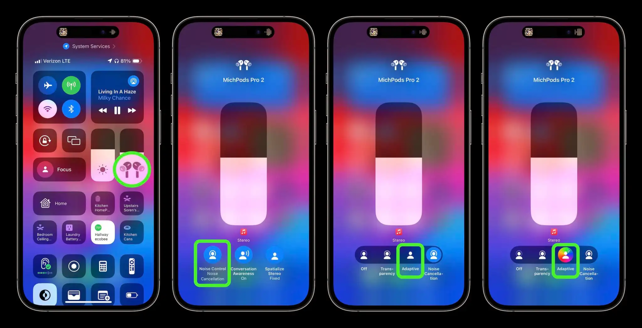
How to turn on AirPods Pro Adaptive Audio, how it works, more
AirPods Pro 2 get several impressive upgrades alongside iOS 17 with the headlining new capability allowing them to automagically adjust between noise-cancellation and transparency modes, change volume, and make it easier to hear voices. Follow along for how to turn on AirPods Pro Adaptive Audio, how it works, and more.
How AirPods Pro Adaptive Audio works
Apple says that Adaptive Audio is made up of three different automatic features.
First, Adaptive Audio includes “Adaptive Noise Control” which is what “dynamically adjusts the external noise you are exposed to.” Second, “Personalized Volume” adjusts your media’s volume “in response to your environment,” and third there’s “Conversation Awareness” which switches to transparency mode when you start talking and lowers your media volume.
Its been very impressed with how those three aspects of Adaptive Audio combine to offer a slick experience that feels seamless and magical.
I think a lot of that is thanks to a crossfade-like effect which means it doesn’t abruptly switch between modes, it’s a really smooth adjustment/transition between noise cancellation, transparency, and lowering/raising volume.
How to turn on AirPods Pro Adaptive Audio
Adaptive Audio is only available with AirPods Pro 2. You’ll need the iOS 17 beta on your iPhone along with the AirPods beta installed . With this being a developer beta, install it at your own risk.
After installing the AirPods beta, look for a splash screen asking if you’d like to turn on Adaptive Audio when using your AirPods Pro 2
If you don’t see that, you can manually turn the feature on
Open Control Center on your iPhone (pull down from the top-right corner) and long press on the volume/AirPods slider (make sure your AirPods are connected)
Tap the Noise Control button
Choose Adaptive
Now your AirPods Pro 2 will now automatically move between noise cancellation and transparency
You can also customize your AirPods Pro 2 controls
With your AirPods connected, open the Settings app on your iPhone > tap your AirPods at the top
Under Press and Hold AirPods > tap Left or Right (or whichever one says Noise Control)
The default appears to have AirPods Pro stem presses switch between Adaptive Audio and noise cancellation
You can add transparency and off to the mix of controls that long presses on your AirPods stem(s) will cycle through
You can turn off Conversation Awareness while leaving Adaptive Audio turned on
Alternatively, in iOS Settings > AirPods > swipe down and under Audio, tap Conversation Awareness, Personalized Volume, or Loud Sound Reduction to turn any of them off
Here’s how it looks to turn on AirPods Pro Adaptive Audio:
There’s a new unique sound effect that confirms Adaptive Audio is on and you’ll see the color wheel behind the Adaptive icon.
If you leave the AirPods Noise Control settings up while using Adaptive Audio, you can watch it smoothly switch between the different Noise Control modes as sound in your environment changes, you talk to people, etc.
You can also select Adaptive Audio in iPhone Settings > select your AirPods Pro along with customizing what long presses on your stems do:
But in my experience, Adaptive Audio auto adjustments work so well that I don’t need to switch between the audio modes manually anymore – and also means I don’t have to pull an AirPod out of my ear to hear or talk with someone.
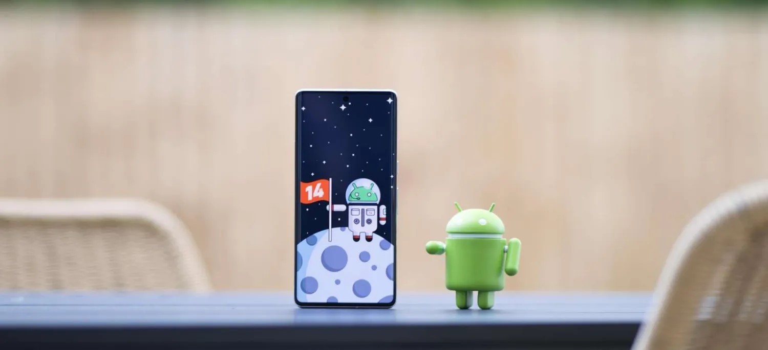
Android 14’s latest beta paves the way for a full launch sometime next month, but it’s still hinting at more features to come. One of those upcoming changes might be a warning when you try to sideload Google apps on Android 14.
Android Police reports that Android 14 adds the ability for app stores on your device to claim “update ownership” over select apps. This essentially just adds another step to sideloading, as a warning message will appear that states where updates normally come from, and reiterates the risk of sideloading. You can simply ignore the warning and continue on.
Apparently, Google apps are where we’ll see this first. A brief demo seen below shows Android 14’s new sideloading warning which says that updates are “normally” from the Play Store. In this case, Google Play Services was having an update installed via APK Mirror’s Installer app.
This app normally receives updates from Google Play Store. By updating from a different source, you may receive future updates from any source on your phone. App functionality may change.
This isn’t the only example of Google cracking down somewhat on apps in Android 14. Earlier this year, our Kyle Bradshaw and Dylan Roussel reported that Android 14 would also block the installation of “outdated” Android apps, whether they come from sideloading or an app store.
Android 14 set to block certain outdated apps from being installed
To help reduce the potential for malware, Android 14 will begin fully blocking the installation of apps that target outdated versions of Android.
For years now, the guidelines for the Google Play Store have ensured that Android developers keep their apps updated to use the latest features and safety measures of the Android platform. Just this month, the guidelines were updated, requiring newly listed Play Store apps to target Android 12 at a minimum.
Up to this point, these minimum API level requirements have only applied to apps that are intended for the Google Play Store. Should a developer wish to create an app for an older version, they can do so and simply ask their users to sideload the APK file manually. Similarly, if an Android app hasn’t been updated since the guidelines changed, the Play Store will continue serving the app to those who have installed it once before.
According to a newly posted code change, Android 14 is set to make API requirements stricter, entirely blocking the installation of outdated apps. This change would block users from sideloading specific APK files and also block app stores from installing those same apps.
Initially, Android 14 devices will only block apps that target especially old Android versions. Over time though, the plan is to increase the threshold to Android 6.0 (Marshmallow), with Google having a mechanism to “progressively ramp [it] up.” That said, it will likely still be up to each device maker to decide the threshold for outdated apps or whether to enable it at all.
If the minimum installable SDK version enforcement is enabled, block the install of apps using a lower target SDK version than required. This helps improve security and privacy as malware can target older SDK versions to avoid enforcement of new API behavior.
By blocking these outdated apps, Google intends to curb the spread of malware apps on Android. The developer responsible for the change notes that some malware apps have intentionally targeted older versions of Android to bypass certain protections only enforced on newer apps.
That said, if for whatever reason you want or need to install an outdated application, it will still be possible through a command shell, by using a new flag. Given the extra steps required, it’s less likely that someone would do this by mistake and inadvertently install malware.
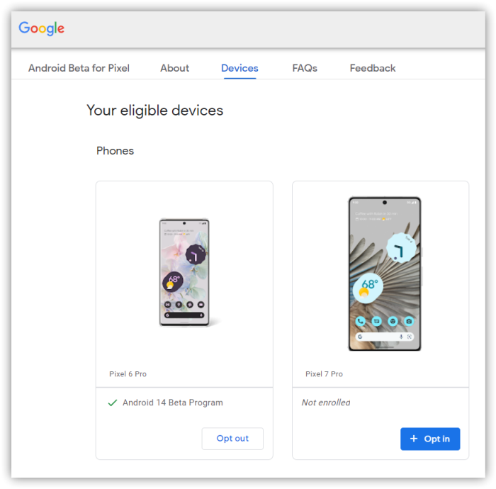
How to install the Android 14 Beta on Google Pixel
After a few early developer previews, the Android 14 Beta program has officially arrived. Here’s how to get Android 14 on your Google Pixel smartphone.
What Pixel devices can install the Android 14 Beta?
Android 14 will drop another set of Pixel smartphones out of active support, but several will still be eligible. The following Pixel devices will be eligible for the Android 14 Beta program.
Pixel 4a 5G
Pixel 5
Pixel 5a
Pixel 6
Pixel 6 Pro
Pixel 6a
Pixel 7
Pixel 7 Pro
Pixel 7a
Pixel Fold
Pixel Tablet
While Pixel 7a, Pixel Fold, and Pixel Tablet joined the party late, they’re all eligible to test out Android 14 at this point.
What’s the latest Android 14 Beta build?
As of July 11, 2023, Google has just opened the fourth beta release of Android 14, one of the last big releases before the final release.
Google has scheduled a total of five beta releases through May, June, and July, with the final release likely to arrive in August.
Beta 1 (April): Initial beta-quality release, over-the-air update to early adopters who enroll in Android Beta.
Beta 2 (May): Incremental Beta-quality release.
Beta 3 (June): First Platform Stability milestone, including final APIs and behaviors. Play publishing also opens.
Beta 4 (July): Near-final builds for final testing.
Beta 5 (July): Near-final builds for final testing.
Final release: Android 14 release to AOSP and ecosystem.
This adds one additional beta compared to Android 13’s release schedule, which only had four beta releases.
Notably, some users have noticed that the first two beta releases of Android 14 have been a bit more erratic compared to previous years. We’d certainly advise caution if you plan to try the beta on a daily device. As usual, proceed at your own risk.
How to get Android 14 with the Android Beta Program
The easiest way to get Android 14 on your Google Pixel device today is through the Android Beta Program.
This automated program allows you to “opt-in” to Android beta updates and install them as you would a normal system update. There’s no computer or fancy tools required, and you can roll back to Android 13 any time you’d like by simply opting out.
How to sideload Android 14 Beta on Google Pixel
By far, the fastest way to get a new version of Android on your Pixel is to sideload it. It’s a relatively easy process, but you’ll need to get set up to do it. Here’s how.
Download the needed files.
Boot into Recovery mode.
Navigate to ADB sideload.
Connect the handset to a computer with ADB tools installed.
Enter the sideload command.
Reboot your phone.
1. Download Android 14 Beta files
To get started, you’ll first need to download the files needed to actually put the Android 14 Beta on your Pixel. There are two ways to do so. First, you can install a Factory Image, which wipes your phone and starts everything from scratch. Alternatively, and the way we’ll detail here, there’s an OTA file, which installs over your current version of Android without wiping your phone.
You can download the beta OTA file from Google’s Full OTA Image hosting site. That site contains OTA downloads for sideloading different updates, including the Android 14 Beta, on every Pixel and Nexus device, so you’ll need to scroll down to ensure you are downloading the file that associates with your device. OTA downloads are available here.
For the Android 14 Beta, only Pixel 4a 5G, Pixel 5a, Pixel 5, Pixel 6/Pro, Pixel 6a, Pixel 7/Pro, Pixel 7a, Pixel Fold, and Pixel Tablet are available.
You won’t be able to install it on the original Pixel/XL, Pixel 2/XL, Pixel 3/XL, Pixel 3a/XL, Pixel 4/XL, or Pixel 4a.
Note: This process (using OTA) won’t wipe your device, but it’s good practice to back up any irreplaceable data in case something goes wrong.
2. Boot into Recovery mode
Next, you’ll boot your Pixel into Recovery mode. To do this, fully power down your handset. Then hold down on the Power button and the Volume down button at the same time until you get to the Bootloader page. You will know you’re in the right place when you see an Android figure lying down on the screen.
Using your volume buttons, scroll down to Recovery mode. Select this by clicking the power button. Alternatively, if you’re already connected to a computer with ADB, you can use the reboot recovery command.
Now, you should see a smaller Android lying down with an exclamation mark over it. From here, press the Power button and the Volume up button for about a second to fully enter Recovery mode. Releasing the Volume up button will send you into Recovery.
3. Navigate to ADB sideload
Using the volume buttons, scroll down to Apply update from ADB and select it with the power button. This will launch a mostly blank screen with text near the bottom directing you on how to sideload an OTA, such as this one for the Android 12L Beta.
4. Connect the handset to a computer with ADB tools installed
This step is important as it’s the only way to transfer the downloaded OTA file to your handset. You’ll need to have ADB and Fastboot tools in a handy place. You can download ADB tools from the Android Developers website. You can also use the Universal ADB Drivers from ClockWorkMod, which can make the process a bit easier on Windows devices.
5. Enter the sideload command
As long as everything is in place, you can now sideload the OTA file. On Windows, ensure your Command Prompt is directed to the ADB tools folder and type in adb sideload. If you’re on macOS or Linux, do the same thing in Terminal (use “cd” and “ls” commands to make sure your Terminal is pointed at the right folder – Google it if you need help) but type in ./adb sideload. You’ll then need to insert the file name of the .zip folder you downloaded from Google and hit enter to start the process.
If everything is working properly, you should see some dialog on your computer and handset that shows the process of the sideload and installation process.
6. Reboot your phone
Once the OTA is done installing, you will be taken back to Recovery Mode. The last step to jump into the new update is to select the Reboot now option with your power button.
Android 14 Beta tweaks and widens the share sheet
In recent weeks, the Android 14 Beta has steadily tweaked the share sheet to look cleaner and show more options.
Despite being a central component of Android, the share sheet has long been one of the weaker points of Google’s mobile operating system. The share sheet has gone through numerous iterations over the years, each one aiming to make it faster or better in some way, though sharing on Android still remains surprisingly slow.
Over the course of the Android 14 Beta, Google has made some changes to the share sheet. One more noticeable change, arriving with Beta 3, is that the share sheet is now five icons wide (up from four) on typical phones. This makes more options visible on screen at a time and is a shift toward more density rather than the extra blank space that some Material You designs have opted to take. As always, you can scroll the sheet to view the full list of available share targets.
Meanwhile, another tweak arrived with this week’s Android 14 Beta 4 release. The sheet now also includes a title that explains what you’d actually be doing. For example, if you choose to share a website from Chrome, you’ll see “Sharing a link” with the actual URL below it.
If you’re sharing any text, a shortcut to copy it to your clipboard will appear on the right-hand side. Similarly, when sharing an image, you’ll be offered an option (pencil icon) to first edit it in Markup.
Android 14 Beta 4 changes ‘Muted’ status icon design
Android 14 Beta 4 is here and small tidbits and changes are surfacing as we dig through the new OS version. One such change is a completely new design for the “Muted” status, leaving behind the familiar bell icon for a more modern look.
Most Android devices have three sound states: sound on, vibrate, and silent. While each person has their preference as to which they leave their phone set to, only one of those displays a status icon in the top bar, next to the WiFi and battery readouts.
In Android 14 Beta 4, a Pixel phone or other device set to silent or “muted” will now display a small yet very familiar speaker icon. This switch replaces the bell icon we’ve seen in past Android builds. The change makes a little bit of sense, as the bell could be seen as confusing to some, though it’s a very small adjustment.
In Android 14 Beta 4, no other sound states offer a status icon. The “muted” state remains the only one to reflect in the status bar, though a status icon for vibrate and sound on would be nice.
Another spot the icon is updated with the speaker silhouette is in the slider that appears when pressing the volume rockers. Instead of a ball icon and another with a slash through it, there is now one speaker icon and another with a slash, representing mute.
This change to the mute icon in Android 14 is anything but huge, but it’s notable nonetheless and offers a little insight into the changes being made between versions. Be sure to stay tuned for more Android 14 news as it’s uncovered.
Apple introduced a bunch of new capabilities for web apps with iOS 16.4, including access to push notifications and permission for third-party apps to add web apps to the iPhone and iPad Home Screen. Now popular web browser Google Chrome is taking advantage of these new features, as its latest update lets users add their favourite websites to the iOS Home Screen.
You can now add web apps to your iPhone or iPad using Google Chrome
As noted by Chris Messina, the latest update to Google Chrome for iOS provides an option that lets users add web apps to the Home Screen. This means that anyone can now save a website for quick access on the Home Screen without having to leave Chrome and use Safari. Previously, this option was restricted to Apple’s web browser.
“You can now add URLs or Progressive Web Apps to your home screen,” the release notes for this week’s update said. Of course, this requires the latest version of Google Chrome for iOS and also a device running iOS 16.4 or later – as previous versions of the operating system don’t have this API.
When a web app is added to the iOS Home Screen, you can open and use it as if it were a regular app, which means you won’t be redirected to open it in Safari, Google Chrome, or another web browser. With iOS 16.4 or later, these web apps can also provide you with push notifications, just like native apps.
Apple has been putting a lot of effort into finally embracing web apps. With macOS Sonoma, which is available as beta software and will be officially released later this year, Mac users can also save websites as web apps using Safari. Some believe these changes are an attempt by Apple to dodge accusations of anti-competitive practices when it comes to the App Store.
iCloud Passwords for Chrome are no longer only on Windows
macOS Sonoma’s best-kept secret is really no secret at all, and it’s something Chrome browser users are going to love.
For the longest time, Apple has supported iCloud Keychain for both Safari and Chrome users. The only catch is that Chrome users needed to use Windows. iCloud Keychain was a Safari-only party on the Mac.
That’s about to change with macOS Sonoma. The new version of macOS will be the first to expand iCloud Keychain support beyond Safari.
The existing iCloud Passwords extension for Chrome has been updated to version 2.0.5 on July 12,2023, and it works great on Chrome for macOS 14.
Chrome extensions aren’t just limited to Google’s Chrome browser either. They work on Chromium-based browsers, too, including the Browser Company’s interesting new Arc browser. So does the iCloud Passwords extension.
iCloud Passwords for the Microsoft Edge macOS browser also reached version 2.0.5 today, and iCloud Keychain on macOS Sonoma is fully compatible.
This lets you easily enter usernames, passwords, and authentication codes from iCloud Keychain without copying and pasting from System Settings on the Mac. The iCloud Passwords extension makes these browsers just as compatible as Safari.
macOS Sonoma was announced last month and is currently in developer and public beta. Apple released the first public beta version of macOS 14 July 12,2023.
Do Not Disturb mode lets you work or have fun without distractions from your iPhone.
When you want to work or watch a movie without distractions, turn on Do Not Disturb on your iPhone. A new Apple video shows how to activate this mode.
The activation process is simple enough that this Apple Support video mostly serves as a reminder that Do Not Disturb is available.
How to turn on Do Not Disturb with a couple of taps
Our iPhones keep us in constant contact with the world, but sometimes what we need from our handsets is peace and quiet. Whether it’s because you’re in a meeting, napping or having a heart-to-heart with a loved one turn on Do Not Disturb mode to hush your iPhone.
Activating it takes only a couple of steps. The button you need is in the Control Center, so start by swiping down from the top-right corner of the screen on iPhone (or iPad).
Open the Control Center and then a couple of taps is all it takes.
Once the Control Center is open, tap on the Focus button, then tap the Do Not Disturb button, which features a moon, to activate the feature immediately.
When you’re finished with your meeting or movie, reopen the Control Center and you’ll see the Focus button has been replaced by the Do Not Disturb button. Tap this to deactivate the mode.
With Do Not Disturb active, all audible alarms are silenced, and your handset won‘t vibrate. Also, the screen won’t come on whenever a notification comes in. Your iPhone is saving all these up for when the mode is deactivated.
Put your iPhone into Do Not Disturb mode and all your other Apple computers switch themselves to the same mode.
Tap on the section with three dots on the Do Not Disturb button to display options for automatically turning the mode off. It can be active for an hour, until evening or — perhaps most usefully — until you leave your current location.
Use Do Not Disturb with Focus on your iPhone or iPad
With Focus in iOS 15 and iPadOS 15 or later, you can use Do Not Disturb to silence calls, alerts, and notifications that you get while your device is locked. You can also schedule Do Not Disturb and allow calls from certain people.
When you have Do Not Disturb turned on, a crescent moon icon appears in the status bar and on your Lock Screen.
Turn on Do Not Disturb
Go to Settings > Focus.
Tap Do Not Disturb.
Under Turn on Automatically, set Do Not Disturb to turn on automatically at a certain time, location, or while using a certain app.
If you don’t want to be disturbed at a certain time, you can set a schedule and change other Do Not Disturb features to help you concentrate.
Go to Settings > Focus.
Tap Do Not Disturb.
You can select allowed or silenced notifications from people and apps, connect your Lock Screen or Home Screen, have this Focus turn on automatically, and add Focus filters.
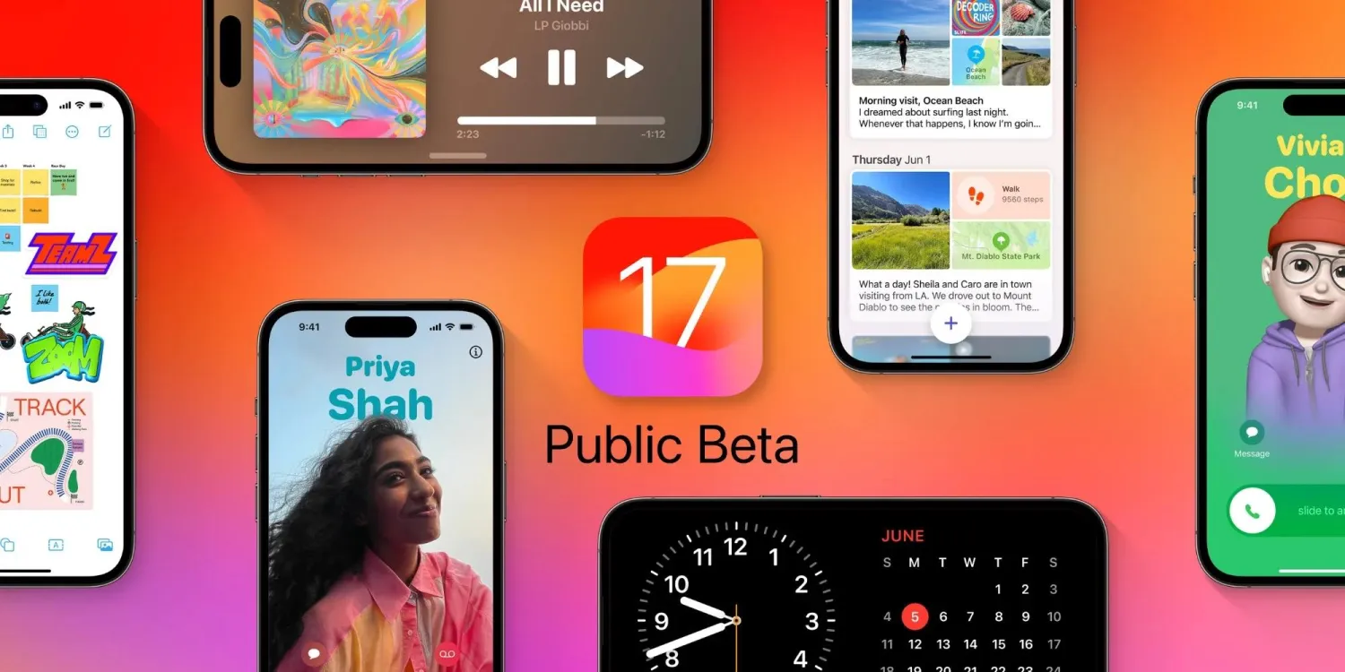
Considering testing out the iOS 17 public beta? From the new smart display mode to new health features, interactive widgets to a new Messages experience, Live Voicemail to offline Apple Maps, and more, here are the top 10 iOS 17 features you should try out.
iOS 17 has been in testing with developers since early June and now the public beta has launched.
Apple changed things up this year by making even the developer beta free for anyone. But the arrival of the public beta marks a more stable point in the testing process when Apple is comfortable with non-developers installing the software.
But even though the iOS 17 beta is quite stable at this point, bug and performance issues are common during the beta period. So don’t forget to make an iOS 16 backup for your iPhone just in case you want to downgrade.
Top 10 features to try out with the iOS 17 beta
StandBy mode
Contact Posters
Live Voicemail
Personal Voice
Offline Apple Maps
Share Passwords with friends, family, and colleagues
Automatically delete iPhone 2FA codes
Interactive widgets
Messages new UI and stickers
Screen Distance for eye health
iPhone StandBy mode
Apple enhances the Lock Screen experience this year in iOS 17 with the new landscape StandBy mode for iPhone.
Some of the available options include dual-view, customizable setups while others have different clock faces that take up the whole screen. Check out all the details in our full walkthrough:
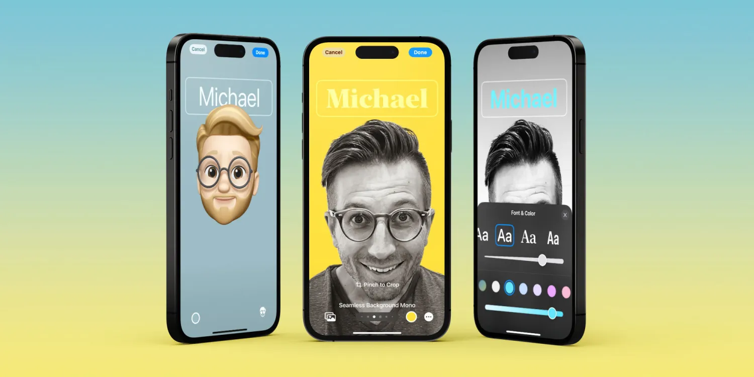
Contact Posters
Another neat way iOS 17 gets more customization is Contact Posters. There are lots of ways to create different designs and you can make them for yourself as well as others.
Live Voicemail
Live Voicemail makes it easy to know if you’d like to pick up a call while someone is leaving a message without having to call them back.
Personal Voice
Personal Voice is an impressive capability that lets users bank their voice in the event they lose it in the future. Whether for those with a degenerative disease or if you just like to be prepared, Personal Voice makes it easy to create and securely store a replica of your voice.
Offline Apple Maps
Want to save battery or won’t have a connection where you’re going? With iOS 17 you can download Apple Maps for offline use.
Shared passwords
Password sharing with anyone or any group is seamless with the ability to create shared iCloud Keychain vaults.
Automatically delete 2FA codes
Simple and very useful, iOS 17 can automatically delete 2FA code texts after you’ve used them.
Interactive widgets
Widgets get a nice upgrade with functionality right on your Home or Lock Screen. Here’s a look at them in action with the Home app widget.
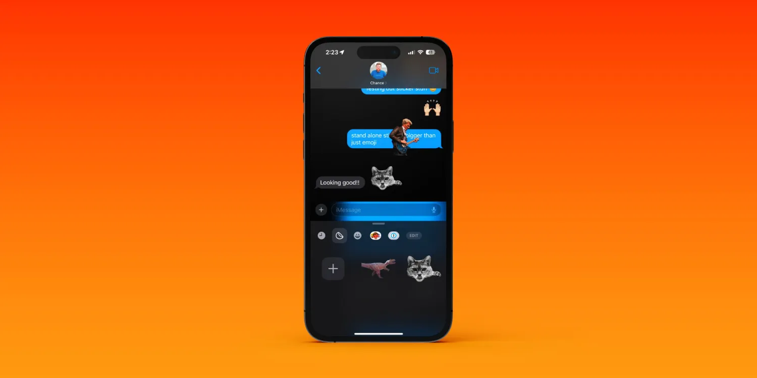
Messages stickers and new UI
Instead of emoji responses being limited to the six tapback choices, with iOS 17 you can respond to any text or image with an emoji or custom sticker.
Along with that, there’s a new UI for iMessage apps.
Screen Distance
This is a new eye health feature that helps prevent eye strain for all ages and helps reduce the likelihood of myopia for children.
It’s easy to set up and very effective.
one bonus feature. But this one requires signing up for an Apple Developer account and installing Xcode on your Mac (which is free but more involved):
AirPods Pro 2 Adaptive Audio
Coming with iOS 17 are a range of new capabilities for AirPods Pro that really feel like magic. Check out a closer look at Adaptive Audio with AirPods Pro 2.
Threads is ripping Twitter apart and taking over as one of the fastest social apps to gain popularity. As it’s so new, there are a lot of features that might not be so obvious. Here are just a few we’ve found during the initial launch, including muting people and quickly following other Threads users.
If you’re unfamiliar with Threads, that means you’re not one of the 100 million people to sign up in just a matter of days. That figure was released by Meta CEO Mark Zuckerberg only a couple of days ago, so the real number is likely to be much higher at the time of writing.
The social app is a hybrid between Instagram and Twitter, as it was developed by Meta, the owner of Instagram. Since its rollout, it’s taken on the social personality of Instagram with the format people appreciated on Twitter. Go figure, “threads” just refers to the format most content comes in.
Contrary to its incredible resemblance to the increasingly unstable social giant, Threads has a few features that haven’t been quite so publicly advertised.
Quick follow
One of the biggest “duh, why didn’t this exist before?!” features in Threads is the Quick Follow feature. Rather than diving into someone’s profile and hitting the Follow button, you can simply tap the plus icon next to their user handle and confirm you want to follow them.
We found this most useful when first setting up the new app. Since the app connects to Instagram, there are a ton of useful follow suggestions at the ready. Tapping the little plus icon next to everyone I already know means I can go on a following spree.
New thread shortcut
Each post is called a “thread,” unsurprisingly. Users can string multiple together to create a long-form post that always ties back to the original content. In normal use, you can draft a post and tap “Add to a thread” to tag a secondary post onto it. This creates your long-form thread before it’s even posted.
Rather than hitting “Add to thread,” Threads has included a neat trick. Simply draft your first post and then hit enter on your keyboard three times. That third tap will trigger a new thread and will move the cursor to a blank slate that’s automatically connected to the previous post.
This can be done over and over again to create a huge thread. While it’s almost just as easy to tap in the new post box to create a new tagged thread, the trigger has a place in muscle memory and comes in handy.
Mute profiles
My experience with Threads initially consisted of a homepage that was pulled straight from the Instagram algorithm, filled with content I could care less about. The more people you follow in Threads, the more your home screen is filled with content you’re more apt to appreciate, but it does take some training.
If you come across accounts you don’t want to hear from, you have the option to “mute” that Threads user. The feature is pretty common across social platforms, but that doesn’t make it any less useful. All you need to do is hit the three-dots menu on a post from the Threads account you want to mute. When it appears, hit the Mute option.
Muting someone in Threads hides their posts from you and allows you to browse without seeing their content. The account you mute won’t know you muted them.
Hidden words
Another useful content blocker is the hidden words feature. By heading into the Privacy page from your profile, you can find and tap Hidden Words.
This section allows you to hide both offensive replies and replies that contain specified words or phrases. At the bottom of that page, you can enter certain words or phrases you don’t want to see.
This feature doesn’t seem to hide posts that you haven’t interacted with, much like Twitter’s hidden feature. That feature was useful for hiding spoiler posts or muting certain topics, though it has a different application here.
Threads is still brand-new, so there will be more features to come as the app progresses. There is already an Android beta open to the public. It should house a good few features before they fully release. With over 100 million accounts in a matter of days, there’s no reason that the app should hit a standstill on tools to make using the app a better experience.
Threads will get more features, and you can try them early on Android – here’s how
Meta’s Threads has seen explosive growth in its two days of availability so far, and while it’s a solid start, what the platform really needs is more features. On Android, you can now sign up for a beta version of Threads to access those new features early.
The beta program, as usual, comes with a higher risk for instability within the app, but it also comes with the promise of bringing new features early. There’s no word on what might be coming first, but there’s a huge list of asks from the millions who have already signed up.
Just a few examples of frequently asked-for features that Threads has already confirmed being in the works include:
A feed that only includes accounts you follow
Delete your Threads account without deleting Instagram
Search
Editing
Multiple account support
Thread translation
Hashtags
No early beta releases have come out, but you can join the program now. Just tap “become a tester” to sign up, then check for updates in the Play Store.
In less than a week, Threads – the new microblogging platform from Instagram – has reached 100 million users, and the Google Play Store reveals how many of those are from Android.
At present, Meta’s Threads is only available on iOS and Android through each platform’s respective app store. While a web app is surely planned – and was briefly spotted live – Threads can only be accessed from smartphones and tablets.
Despite that limitation, it seems Threads has found significant success in its initial launch, with many people seeking a mainstream alternative to Twitter following that platform’s recent string of user-hostile moves. According to a post from Meta CEO Mark Zuckerberg, over 100 million people have signed up for Threads in just five days.
Threads reached 100 million sign ups over the weekend. That’s mostly organic demand and we haven’t even turned on many promotions yet. Can’t believe it’s only been 5 days!
Of those 100 million users, it seems a significant portion of them are Android device owners. The Google Play Store publicly displays the download count of various apps, albeit only as a generic milestone such as “1M+ downloads.” Notably, this doesn’t count how many individuals have downloaded an app but how many devices it’s been installed on. So if a single user installs an app on both their phone and tablet, that counts as two downloads.
According to the app’s Play Store listing, Threads for Android has been downloaded over 50 million times since its July 5 launch. This suggests that Android currently accounts for close to half the service’s 100 million users.
On the one hand, this figure may seem to be on the low side, as the latest data from Statista shows Android as having approximately 70% of the global mobile market share, while iOS accounts for approximately 28%. That said, Threads is currently unavailable in Europe – where Android enjoys a healthier lead over iOS than in the United States – due to “upcoming regulatory uncertainty,” per a statement to The Verge.