


❤ Google explains how Material You balances Dynamic Color with colors predefined by apps
![]()
![]()
Dynamic Color today is implemented across most first-party Google apps on Android. During the development process, the Material Design team had to reconcile the wallpaper-derived color palette with those that were hard-coded by the application/developer. A recent blog explains the solution Material You arrived at.
Before Material 3 launched to the world, our cross-functional team worked inside Google to understand how teams envisioned their products with the new Material You design language. Several teams raised a challenge with dynamic color: changing colors depending on the user conflicted with products’ chosen colors, which were often semantic and needed to stay static.
Semantic colors are those that initiatively “express conventional meaning,” like how red is associated with stopping/ending. During Dynamic Color’s design process, Google says the “challenges with semantic colors became clear right away,” especially when the wallpaper-generated palette was similar to hues that were manually selected by app developers.
For example, imagine a smart home app where custom colors like yellow, orange, blue, green could be used to intuitively represent concepts like lighting, heating, cooling, and success. These could clash with the user color on the same screen, especially if that color can change.

Google ultimately decided to retain semantic colors but make them closer – either warmer or cooler – to a user’s Dynamic Color. This resulted in a more “harmonious” experience as governed by color theory. A threshold makes it so that a color’s identity remains – “a ‘yellow’ didn’t turn all the way to ‘green,’ and retained its semantic meaning.”
We found that harmonious semantic colors tended to be closer to the user color: semantic colors’ hue numbers were shifting around, making them slightly warmer or cooler. For example, in a blue dynamic scheme, semantic colors like red, orange and green all became cooler, moving closer to the cool hue of the blue user color.
Color is personal and deeply subjective. What one person is drawn to may be off-putting or unusable for another. In Material 3, dynamic color makes apps personal for each user, so apps can adapt to user choices, preferences and needs like expression and accessibility. Dynamic color is one way Material You carries out its ethos of respecting the user.

Dynamic color adapts to each person and upholds the Material You ethos of respecting the user.
When we think about the people in our lives, each has their own unique needs, tastes and relationship with technology. An app’s basic design goal is to be broadly usable and visually capture a company’s brand, which can neglect these unique needs and tastes. Dynamic color addresses this gap and emphasizes the user’s perspective by giving apps a color scheme from the user’s wallpaper.
A Material color scheme provides accent, neutral, and other colors to meet most product needs. Being dynamic, almost all of these colors can change to the user. An exception is the Error color: a red that communicates a failure state when used on an icon or label. We call representational colors like Error, which express conventional meaning, ‘semantic’ colors. Designers often choose semantic colors for their intuitive or cultural associations: think how red is associated with ‘stop’.

‘Semantic’ colors express conventional meaning, and intuitively represent concepts like ‘stop’.
Before Material 3 launched to the world, our cross-functional team worked inside Google to understand how teams envisioned their products with the new Material You design language. Several teams raised a challenge with dynamic color: changing colors depending on the user conflicted with products’ chosen colors, which were often semantic and needed to stay static. For example, imagine a transit app that takes colors from real-world signage or a weather app that uses colors to represent hot and cold temperatures.
This tension presented an opportunity to mature dynamic color—how might Material honor the end-user and product maker with a color system that respects both?
The challenges of algorithmic color
Dynamic color schemes in Material are algorithmic (generated from a set of rules) and derived from the user’s wallpaper.
Material’s new color system is algorithmic. This means that all colors that Material provides are generated from a set of rules, rather than the manual process of hand-picking colors that designers are used to. Even so, designers on the Material team explore colors by hand and evaluate them by eye before turning the colors that we like into an algorithm. This way, we preserve the human touch and sometimes unexpected decisions that create the best visual results.
Material designers also like to work collaboratively with makers using our system, whether that’s a team inside Google or an independent outside team. In this case, we brought together designers from other Google teams in a color workshop. During this, we explored how products’ own colors might fit into dynamic color: a world where the overall color scheme changes, according to the user’s wallpaper.
In a smart home app, specific semantic colors could be used to represent concepts like lighting and heating, which could clash with the user color scheme.
The challenges with semantic colors became clear right away. For example, imagine a smart home app where custom colors like yellow, orange, blue, green could be used to intuitively represent concepts like lighting, heating, cooling, and success. These could clash with the user color on the same screen, especially if that color can change.
Exploring colors by hand

Replacing semantic colors with the user scheme looked pleasing, but made apps that relied on semantic color harder to use.
At first, our designers explored replacing semantic colors with those from the wallpaper-based user scheme, but this made the state of one’s home difficult to parse. We didn’t want aesthetics to compromise giving users an easy and intuitive experience, so we needed to maintain distinguished colors in some way. Knowing this, we explored schemes where different semantic colors appeared visually pleasing and at home under the overall user wallpaper color scheme, largely by manually picking or adjusting them.

The design team needed to maintain different semantic colors while creating harmony in the color scheme overall.
This led to some pretty interesting and provocative color combinations. Ultimately, the most promising examples proved to be those in which the overall scheme appeared harmonious, while semantic colors’ original identity (‘a yellow’), and hence the viewer’s understanding of what they represent (‘lights are yellow’), were retained.
Having just drawn examples, we knew that it was theoretically possible to create color schemes where semantic colors look pleasing rather than clash with user color. But because our color system is dynamic, we now needed to define rules for our algorithm that would create such harmonious schemes given any set of colors, across the whole spectrum.
Finding a solution with the help of color science
First we wanted to understand why these colors were visually pleasing, to uncover any properties they had which could translate into rules. Why does this yellow look more harmonious under this red scheme, while another yellow looks better under a blue scheme?

A color can be described by its hue, tone, and chroma.
This harmony can be explained by color theory. For any color, its hue corresponds to one’s perception of it as red versus blue, or yellow versus green (other properties that describe a color include tone, or how light or dark it appears, and chroma, or how vibrant or neutral). Hue is a spectrum that can be drawn like a circle, and ranges on this circle will correspond to what one might recognize as a certain color, like yellow (how people recognize and separate colors is highly influenced by culture).
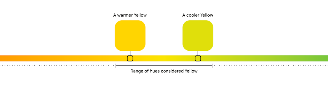
A particular hue of a color can be considered warmer or cooler, depending on where it is on the spectrum.
Depending on where in this range a particular color falls, it can be considered a warm or cool version of that color. For example, yellows towards the orange hues are warm yellows, while those towards the green side are cool yellows. This idea of color temperature also corresponds to entire types of colors that people visually and culturally perceive as warm or cool. For example, red overall is a warm color, while blue is a cool one.

Sets of colors that sit closer together on the hue spectrum can appear more harmonious than those farther apart.
In Material, we quantify hue as a number from 0-360, very much like degrees on the circle. To understand why some colors looked pleasing together, we examined their hue numbers. We found that harmonious semantic colors tended to be closer to the user color: semantic colors’ hue numbers were shifting around, making them slightly warmer or cooler. For example, in a blue dynamic scheme, semantic colors like red, orange and green all became cooler, moving closer to the cool hue of the blue user color.
An algorithm to create color harmony
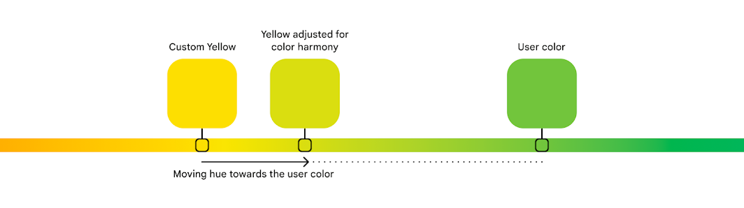
Material creates color harmony by adjusting custom colors towards the user color for a more pleasing overall scheme.
From this, we realized we could define rules to consistently take a semantic color’s hue and shift it towards the user color, creating a warmer or cooler version with better harmony. With more experimenting, we found a threshold that achieved this color harmony while retaining a color’s identity: a ‘yellow’ didn’t turn all the way to ‘green’, and retained its semantic meaning.
Along the way, our designers learned a lot about the intricacies of color science and perception. And since we’ve added color harmony to our design guidance, the Material Theme Builder and engineering resources, we hope to pass this knowledge on to teams and makers, and enable them to work with color in both beautiful and functional ways.
