


❤ Compared to Wear OS, watchOS 10 apps and widgets are next-gen
![]()

From a functionality and usability standpoint, smartwatches shouldn’t be miniature phones. Interactions should last seconds, with UI elements large and information highly glanceable, given the very physical constraints of a small screen size. One way modern apps abide by those tenets is in keeping to a single scrollable feed of content, while earlier apps opted for side-by-side windows/feeds that were roughly analogous to bottom bar tabs.
Wear OS 3 does a good job following those principles, and it’s very simple to use and pick up. In comparison, the Apple Watch tried to pack in too much, and it’s felt quite crufty for several generations now.
With watchOS 10, Apple has done a thorough redesign and created a design system for wearable apps. Info-dense applications don’t feel cramped, and it’s very obvious where to press. It works so well that I’m rethinking my expectations for what a watch app can be.

This layout/template works because it uses all the available space. It comes down to the Apple Watch being a rectangle and Wear OS watches being circular. The circle, while iconic and a point of pride for Google in designing the Pixel Watch, is constrained in terms of text layout and button placement.
The only Wear elements that really curve are the time and maybe watch faces that mimic analog clocks. Within the circular container, something like text and other graphics can only be placed in a square to ensure nothing gets cut off. The semicircle endcaps of a pill-shaped card do take up the left and right of the screen, but there’s no information placed there.
With watchOS 10, you’re able to place two in the top-left (back button or new message button) and right corners (now playing, etc.), while some apps even have FABs. It’s highly efficient, and the consistency trains users on where to tap.
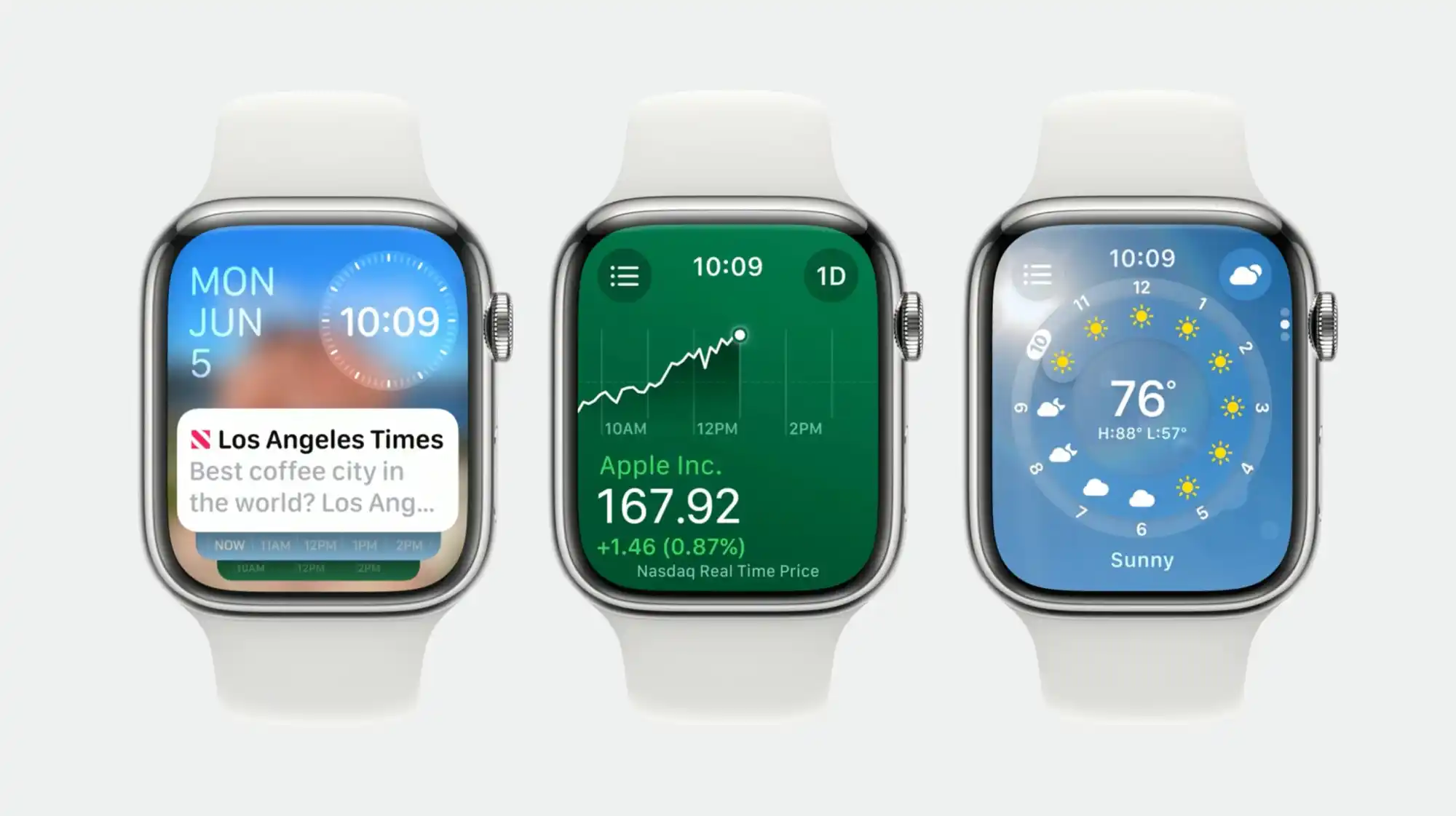


Meanwhile, the Apple Watch’s upcoming widget system is remarkably dense. In Wear OS, Tiles take up your entire screen and usually just show one piece of information. On watchOS 10, you can view two cards per screen, including heart rate with history, activity, sunset/sunrise, audio controls, timers, a compass, and much more.
This approach is so much better and is in large part due to Apple making it so that a swipe up from the watch face gives you widgets. Previously, that gesture took you to Control Center, which is now a side button press. (It’s annoying, as I think physical button presses are much less immersive.)

On Wear OS, Tiles are left/right swipes that eventually return you to the watch face. A swipe up on Google’s platform takes you to a notifications feed.
I think the approach Apple arrived at is so good that Google should consider changing its own. It makes more sense for notifications to be fullscreen, like Tiles currently, to show as much information as possible before you have to open it. An upward swipe for multiple widgets and/or mini-Wear OS Tiles would be highly glanceable.


Meanwhile, Wear OS could even consider placing circular complications here. The clever thing Apple has done with widgets always being a swipe up away is that you can set anything as your watch face. Fun options there include Mickey and Minnie Mouse, Snoopy, and fullscreen digital and analog clocks. Previously, I opted for something with a lot of complication slots, but now I just place the info I need in the widget feed.
The Apple Watch has always done more than Wear OS, but it was presented in an overwhelming manner. Now, it’s been thoroughly refined to fit elegantly. In comparison, what Wear OS has going for it is simplicity. That’s far from bad, but it might get old fast as we inevitably come to expect more from our wearables.