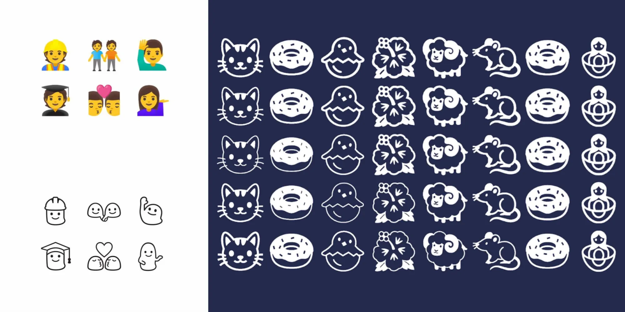
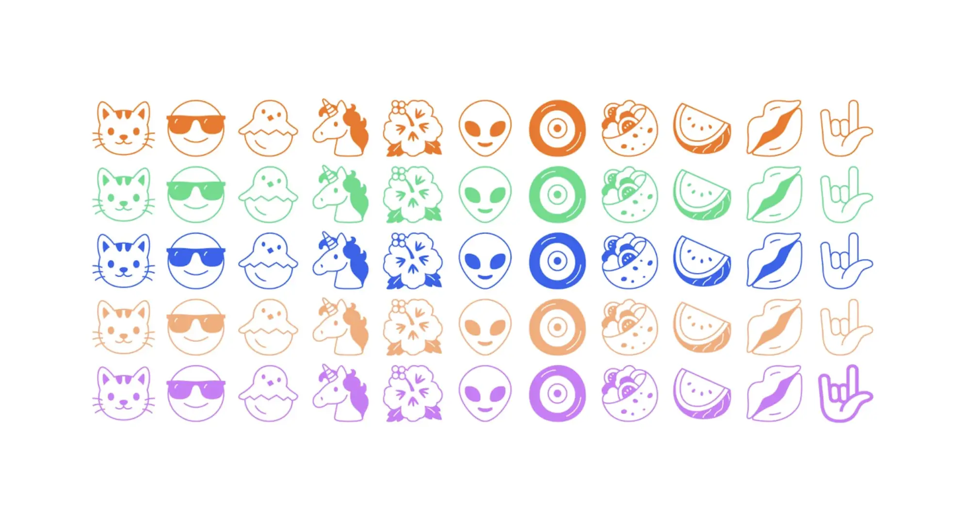
Google has created a new emoji (variable) font with “Noto Emoji,” whose defining characteristic is a black-and-white design that tries to capture the “simplicity” of the format – and also happens to bring back the blobs.
Over time, emoji have become more detailed. Instead of representing broad concepts, there has been a trend to design emoji to be hyper realistic. This wouldn’t be a problem except skeuomorphism’s specificity has resulted in the exclusion of other similar concepts in your keyboard.
Google is bucking that trend toward realism with Noto Emoji by “removing as much detail as possible.” The goal with this set is to make emoji “more flexible, representing the idea of something instead of specifically what is in front of you.” For example, the dance emoji today clearly just represents one form of dancing to the detriment of other types.
Many resulted in 1:1 conversions, but there were several design challenges associated with simplification that prevented Google from just redrawing emoji in black-and-white, especially flags:
You can’t simply convert flags into black and white. You wouldn’t be able to tell the difference between Finland and Sweden. You could redraw the flags but that puts them at risk of being incorrect. Instead, we leveraged the ISO’s country codes. These sequences of letters are unique and represent each country.
Meanwhile, people in Noto Emoji are represented using Google’s blob characters:
Relatable without maintaining a distinction between genders. Google’s blob emoji were really something special. Cute, squishy, and remarkably friendly. We were able to bring back a little bit of what made them special while simultaneously discarding the parts that weren’t working. Most notably, the blobs’ facial expressions were wildly inconsistent but that was very easily fixed in black and white mode.
That said, one modern aspect of Noto Emoji is how it is a variable font with a weight grade that lets characters appear “light” or “bold.” There are also dark and light modes as well as the ability to change text/character color, like all other fronts.
Noto Emoji is open-sourced and available from Google Fonts today. It supports the latest Unicode 14.0 specification with 3,663 emojis in total.
OnePlus promises to deliver regular system updates for its wide array of smartphones for at least two years and in some cases much longer for flagship models, but how is the April 2022 security update being handled?
OnePlus April 2022 security update — What’s new?
At the start of April, Google added the security patch as the fifth post-Android 12 update for all eligible Pixel devices after the previous addition of a substantial Feature Drop and version 12.1/12L upgrade. This OTA included a number of new tweaks to improve the experience on larger displays while simultaneously tuning the base Android 12 experience for devices.
Moving forward, this will be the basis for third-party OEM builds, but it’s still unclear when OnePlus phones will see it. It might be enveloped into the full Android 13 release at some point in future. Unlike Samsung, OnePlus is not quite as fast out of the blocks when it comes to Android updates. It took until April 20 before the latest security patch arrived on eligible handsets.
Late March saw the release of the OnePlus 10 Pro, which is likely to be given priority for future patches. That said, the OnePlus 9 and 9 Pro have been supported very well since launch given that updates are often served on a bimonthly basis.
At this point in time, the April 2022 security patch has only arrived on a few OnePlus devices, but we expect that to change over the coming days and weeks. The April 2022 security update for OnePlus devices patches the DirtyPipe exploit, as this predominantly affected Google Pixel and Samsung Galaxy smartphones.
OnePlus devices with the April 2022 update
OnePlus 9 series
Although superseded by the recent OnePlus 10 Pro, the OnePlus 9 and 9 Pro are running a newer security patch courtesy of the OxygenOS C.48 update. This patch includes some system stability improvements and the latest patch but very little else.
OnePlus 7T series
Although almost identical to the OnePlus 7 Pro with very similar internals and external design, the OxygenOS 11.0.7.1 update is now available for the OnePlus 7T and 7T Pro. This patch includes the April 2022 security update and some general software stability improvements for the OnePlus duo.
OnePlus 7 series
Bearing the same build number as the April patch for OnePlus7T series devices, the OxygenOS 11.0.7.1 OTA is now rolling out for the OnePlus 7 and 7 Pro. Much like the OnePlus 7T patch, this update includes very little beyond the April security update.
OnePlus Nord series
The first device to actually get the latest April patch was, in fact, the OnePlus Nord 2. This upgraded follow-up to the original Nord is starting to see OxygenOS A.20, which includes the April 2022 security patch and some other tweaks as part of the update.
OxygenOS 11.0.6 is now rolling out for the most affordable Nord series handset. The Nord N100 might not be a powerful or “stacked” smartphone but it is getting the April security patch (via XDA). The update should be rolling out over the coming days to eligible handsets.
Devices still awaiting the April patch
While we’re seeing a very small pool of devices get the latest patch, a larger selection of the OnePlus hardware lineup is still updated with older 2022 security patches — with all devices noted below. As patches are often served on a bi-monthly cadence, you may see some devices skipped ahead of a wider rollout of an upcoming patch.
It’s also important to note that OnePlus has officially confirmed that the 6 and 6T series will no longer be updated or supported over the coming months. The 2018 flagship duo received a surprise update in mid-November and now will only be supported via third-party unofficial means moving forward.
OnePlus 10 series
OnePlus 10 Pro (March 2022 patch)
OnePlus 9 series
OnePlus 9 (March 2022 patch)
OnePlus 9 Pro (March 2022 patch)
OnePlus 9R (November 2021 patch)
OnePlus 9RT (March 2022 patch)
OnePlus 8 series
OnePlus 8 (February 2022 patch)
OnePlus 8 Pro (February 2022 patch)
OnePlus 8T (February 2022 patch)
OnePlus 7 series
OnePlus 7 (February 2022 patch)
OnePlus 7 Pro (February 2022 patch)
OnePlus 7T (February 2022 patch)
OnePlus 7T Pro (February 2022 patch)
OnePlus Nord series
OnePlus Nord (March 2022 patch)
OnePlus Nord CE (March 2022 patch)
OnePlus Nord 2 (December 2021 patch)
OnePlus Nord CE 2 (March 2022 patch)
OnePlus Nord N10 5G (March 2022 patch)
OnePlus Nord N100 (February 2022 patch)
OnePlus Nord N200 5G (March 2022 patch)
How can I get the April 2022 security patch on my OnePlus device?
OnePlus has a habit of rolling out updates for devices in a staged manner. That means that the initial release and subsequent confirmation on the OnePlus Forums don’t always indicate when you’ll be able to grab an OTA file and get your device updated/patched.
Our advice is to use a third-party application to get updates in a timely manner. The community-run Oxygen Updater allows you to sideload official update .zip files as soon as they are available publicly. While this will ensure you get updates right away, if you encounter problems, you may need to revert to an older build. This may require a device reset if problems are major.
Realme is a brand that has built a name for offering affordable handsets with decent specs, and the latest phone release definitely lives up to the expectations. The Realme C3 was introduced today with Helio G70 chipset and Realme UI, effectively making it the first Realme smartphone coming with the in-house interface out of the box.
The C lineup has always been about affordability and looks more than anything else. The Realme C3 comes in two neat colors and a price tag of just INR6,999, which translates to $100 or €90. There is 3 GB RAM, dual cameras on the back and a big 6.5″ screen on the front for that price and it feels like a phone that can withstand an average daily use.
Realme C3 specs
Body: Plastic back, plastic frame Gorilla Glass 3 front
Screen: 6.5-inch, HD+, IPS LCD
Rear Camera: Primary 12 MP, f/1.8 lens; Secondary 2 MP depth sensor; LED flash; 1080@30fps video recording
Front Camera: 5 MP, f/2.4; 1080p@30fps video recording
Memory: 3/32 GB or 4/64 GB, dedicated microSD slot
OS: Android 10; Realme UI 1.0, based on ColorOS 7 on top
Battery: 5,000 mAh, 10W charging
Connectivity: Dual SIM (4G), Bluetooth 4.2, GPS/GLONASS, Wi-Fi a/b/g/n, FM radio, microUSB 2.0
Colors: Blazing Red, Frozen Blue
Misc:Face Unlock, Reverse Charging
The Realme C3 comes with a huge battery which also supports reverse charging, meaning you can use the handset as a portable power bank – that’s basically two gadgets for the price of one.
Hands-on – design and user interface
The texture on the back of the Realme C3 is similar to the Realme C2 – slippery, so you better hold on tight to the device. However, now Realme fixed the sides and they aren’t like the back panel – it has a smooth feeling making the handling of the phone a tad better.
The display is an LCD with HD+ resolution, but at first glance, the content on the screen was decently visible under strong sunlight. The sun also helps the design on the back – Realme called it Sunrise Design for a reason. The phone looks lovely and appears to have sunbeams shining out of the camera module.
Setting up the device, we were pleasantly surprised to see Face Unlock making its way to the budget lineup. It works fast, just like any other Realme device, and you can prevent the phone from unlocking with your eyes closed. We tried to trick the system and unlocked the phone while winking.
The user interface looks fresh and “young”, as Realme has put it. With the new Realme UI, a lot of system apps were redesigned and there are new features as well. Now you can double-tap the C3 to lock the phone. There are also new looks for the File Manager, the notification center is revamped and Quick Settings has two tabs, unlike the single one in Color OS 6.1.
Benchmarks
Mediatek introduced the Helio G70 chipset back in January as a platform for entry-level gaming devices. The Realme C3 is the first phone to have it, and we decided to put the phone through some benchmarks. We have compared it with other affordable and lower-midrange devices, and the raw data looks impressive.
GeekBench 5.1 (multi-core)
Higher is better
Redmi Note 8 Pro1622
Xiaomi Redmi Note 81339
Realme C31262
GeekBench 5.1 (single-core)
Higher is better
Redmi Note 8 Pro493
Realme C3347
Xiaomi Redmi Note 8315
AnTuTu 8
Higher is better
Redmi Note 8 Pro279355
Realme C3192223
Realme 5s168635
Xiaomi Redmi Note 8161572
Xiaomi Redmi 8A89901
GFX 3.1 Manhattan (onscreen)
Higher is better
Realme C327
Realme 326
Realme 526
Redmi Note 8 Pro24
Realme 5s24
Realme 5 Pro22
Realme 3 Pro20
Xiaomi Redmi 8A13
Xiaomi Redmi Note 811
GFX 3.1 Car scene (onscreen)
Higher is better
Realme C315
Realme 315
Redmi Note 8 Pro14
Realme 513
Realme 5 Pro12
Realme 5s12
Realme 3 Pro11
Xiaomi Redmi 8A7
Xiaomi Redmi Note 85.9
Camera performance
The camera of the Realme C3 includes a main 12 MP f/1.8 snapper with ChromaBoost feature coming out of the box with the Realme UI. You can also take HDR or non-HDR images, and there is a depth sensor for added Bokeh effects – the blur strength can be adjusted – the shots of the flower below shows it at 60% and 80%.
When the outdoor light is good, colors are realistic and the shadows are deep. The engine reads the edges very well and images of the flower look lovely for a smartphone that costs only $100.
With a price tag starting from INR6,999 and going up only as high as INR7,999 (if you want to get the 4/64 GB option), the Realme C3 is definitely a phone worth considering. Especially if you want a handset that takes decent pictures, is good enough for photos, and looks lovely.
We are eager to see what other manufacturers like Xiaomi (and their brand Redmi) and Samsung have to offer in the competition for the best entry-level smartphone.
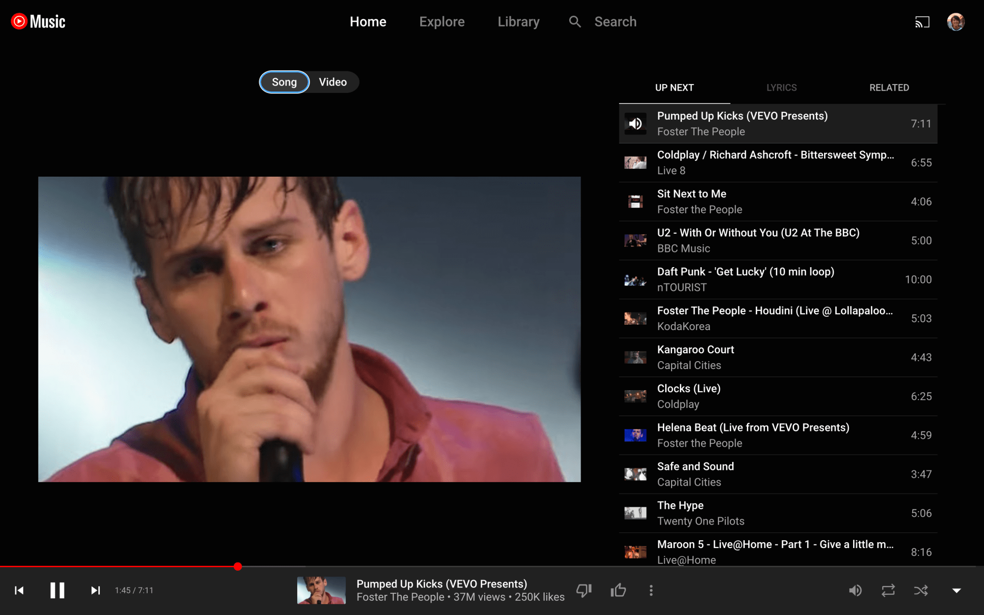
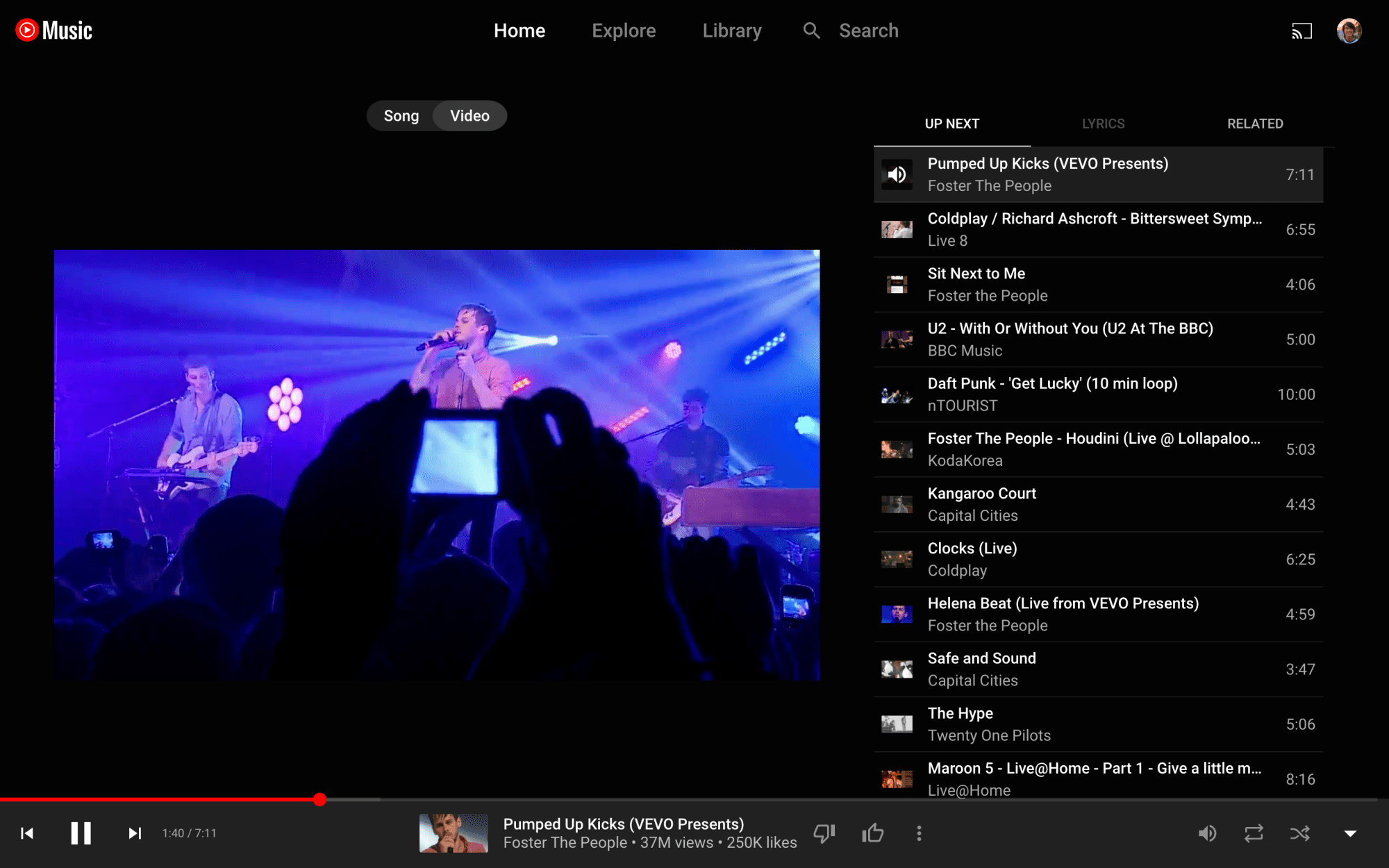
After testing for some time, YouTube Music is finally bringing the song/video switcher to the Now Playing UI of the web client.
Just above cover art is the Song and Video switcher that has been a staple of the Now Playing screen on Android and iOS.
There are two primary use cases for this switcher. The first is switching between the official music video and the album version of a song, as evidenced by cover art appearing in the latter instance. Your playback position is retained when switching. The switcher appears grayed out when songs aren’t available as videos.
The other use is disabling the video aspect of a live recording, which just uses the thumbnail as cover art. It’s useful for those that just want to listen to audio, with users previously resorting to minimizing Now Playing at the expense of being able to see the Up Next queue.
YouTube Music has been testing the switcher for some time on the desktop, but it looks to be widely rolled out today. It’s another example of the web client getting feature parity with the mobile apps, while the Related tab was introduced in recent months.
Google should also theme the background of Now Playing to album art instead of defaulting to just a dark background. This was previously spotted but never widely rolled out.
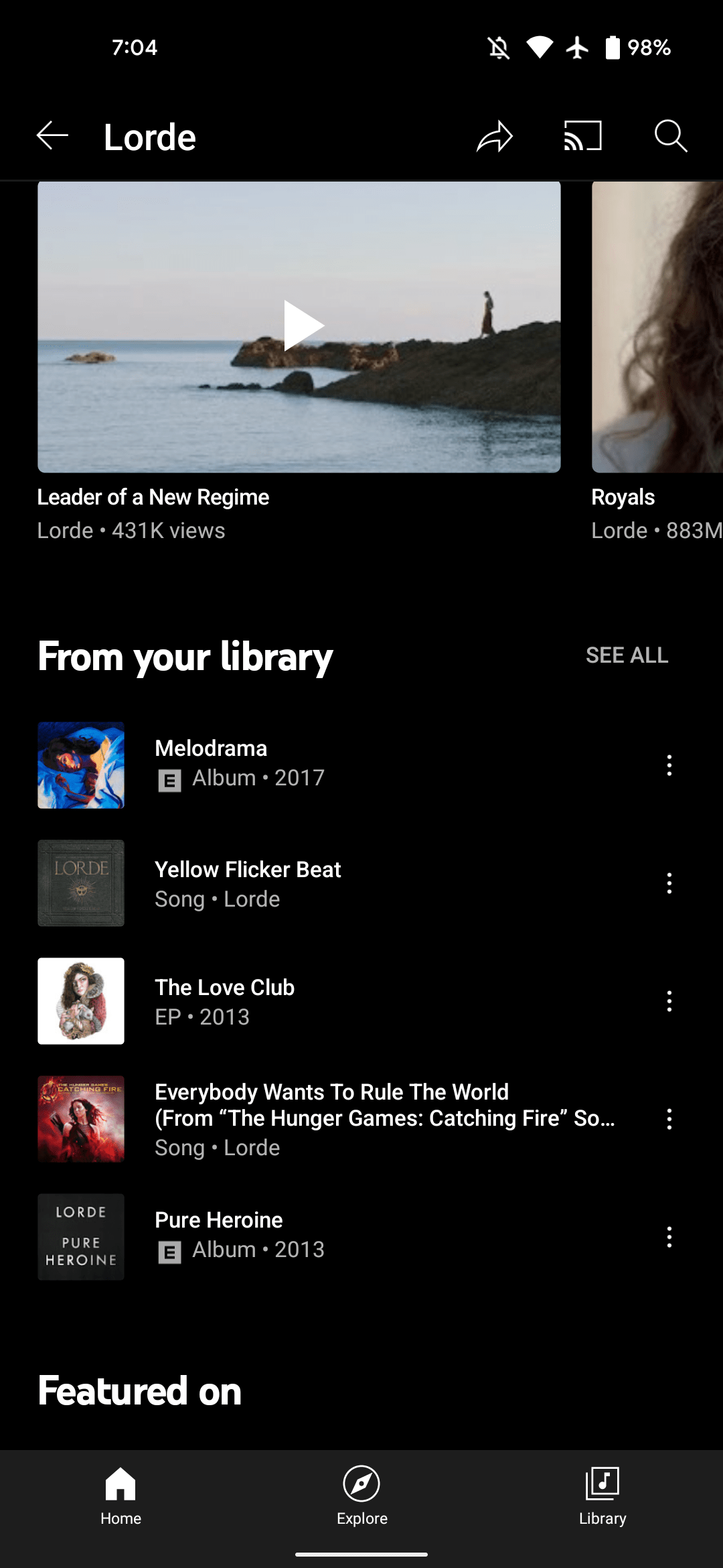
YouTube Music artist pages now list songs and albums ‘From your library,’ like Play Music
After rolling out a redesigned “Add to playlist” UI, YouTube Music is adding a “From your library” section to artist pages that is similar to something that was found in Google Play Music.
It’s third from the bottom and just below the “Videos” carousel. Up to five songs or albums are listed with “See all” in the top-right corner. That button takes you to a list of just tracks. There’s a convenient “Shuffle all” button, while sort options include Release date, Recently added, A to Z, and Z to A.
YouTube Music’s Library essentially lets you save media for quicker access, but it does not include songs you’ve manually uploaded. This new grouping joins the Albums, Songs, and Artists views, while “From your library” also exists as a carousel in the Home tab.
The From your library section in artist pages is widely rolled out today on YouTube Music for Android and iOS. However, it’s not currently found on the web, and would ideally be ranked higher up in the page. In all, this new feature is similar to “My Library” in Google Play Music.
Dynamic Color today is implemented across most first-party Google apps on Android. During the development process, the Material Design team had to reconcile the wallpaper-derived color palette with those that were hard-coded by the application/developer. A recent blog explains the solution Material You arrived at.
Before Material 3 launched to the world, our cross-functional team worked inside Google to understand how teams envisioned their products with the new Material You design language. Several teams raised a challenge with dynamic color: changing colors depending on the user conflicted with products’ chosen colors, which were often semantic and needed to stay static.
Semantic colors are those that initiatively “express conventional meaning,” like how red is associated with stopping/ending. During Dynamic Color’s design process, Google says the “challenges with semantic colors became clear right away,” especially when the wallpaper-generated palette was similar to hues that were manually selected by app developers.
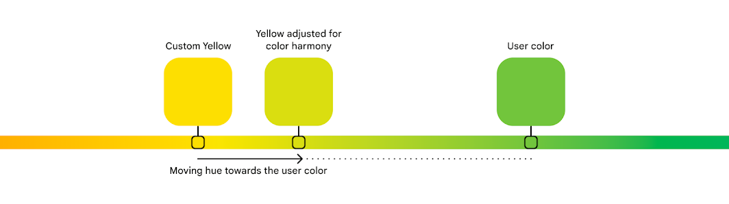
For example, imagine a smart home app where custom colors like yellow, orange, blue, green could be used to intuitively represent concepts like lighting, heating, cooling, and success. These could clash with the user color on the same screen, especially if that color can change.
Google ultimately decided to retain semantic colors but make them closer – either warmer or cooler – to a user’s Dynamic Color. This resulted in a more “harmonious” experience as governed by color theory. A threshold makes it so that a color’s identity remains – “a ‘yellow’ didn’t turn all the way to ‘green,’ and retained its semantic meaning.”
We found that harmonious semantic colors tended to be closer to the user color: semantic colors’ hue numbers were shifting around, making them slightly warmer or cooler. For example, in a blue dynamic scheme, semantic colors like red, orange and green all became cooler, moving closer to the cool hue of the blue user color.
Color is personal and deeply subjective. What one person is drawn to may be off-putting or unusable for another. In Material 3, dynamic color makes apps personal for each user, so apps can adapt to user choices, preferences and needs like expression and accessibility. Dynamic color is one way Material You carries out its ethos of respecting the user.
Dynamic color adapts to each person and upholds the Material You ethos of respecting the user.
When we think about the people in our lives, each has their own unique needs, tastes and relationship with technology. An app’s basic design goal is to be broadly usable and visually capture a company’s brand, which can neglect these unique needs and tastes. Dynamic color addresses this gap and emphasizes the user’s perspective by giving apps a color scheme from the user’s wallpaper.
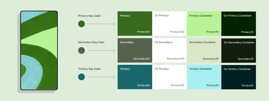
A Material color scheme provides accent, neutral, and other colors to meet most product needs. Being dynamic, almost all of these colors can change to the user. An exception is the Error color: a red that communicates a failure state when used on an icon or label. We call representational colors like Error, which express conventional meaning, ‘semantic’ colors. Designers often choose semantic colors for their intuitive or cultural associations: think how red is associated with ‘stop’.
‘Semantic’ colors express conventional meaning, and intuitively represent concepts like ‘stop’.
Before Material 3 launched to the world, our cross-functional team worked inside Google to understand how teams envisioned their products with the new Material You design language. Several teams raised a challenge with dynamic color: changing colors depending on the user conflicted with products’ chosen colors, which were often semantic and needed to stay static. For example, imagine a transit app that takes colors from real-world signage or a weather app that uses colors to represent hot and cold temperatures.
This tension presented an opportunity to mature dynamic color—how might Material honor the end-user and product maker with a color system that respects both?
The challenges of algorithmic color
Dynamic color schemes in Material are algorithmic (generated from a set of rules) and derived from the user’s wallpaper.
Material’s new color system is algorithmic. This means that all colors that Material provides are generated from a set of rules, rather than the manual process of hand-picking colors that designers are used to. Even so, designers on the Material team explore colors by hand and evaluate them by eye before turning the colors that we like into an algorithm. This way, we preserve the human touch and sometimes unexpected decisions that create the best visual results.
Material designers also like to work collaboratively with makers using our system, whether that’s a team inside Google or an independent outside team. In this case, we brought together designers from other Google teams in a color workshop. During this, we explored how products’ own colors might fit into dynamic color: a world where the overall color scheme changes, according to the user’s wallpaper.
In a smart home app, specific semantic colors could be used to represent concepts like lighting and heating, which could clash with the user color scheme.
The challenges with semantic colors became clear right away. For example, imagine a smart home app where custom colors like yellow, orange, blue, green could be used to intuitively represent concepts like lighting, heating, cooling, and success. These could clash with the user color on the same screen, especially if that color can change.
Exploring colors by hand
Replacing semantic colors with the user scheme looked pleasing, but made apps that relied on semantic color harder to use.
At first, our designers explored replacing semantic colors with those from the wallpaper-based user scheme, but this made the state of one’s home difficult to parse. We didn’t want aesthetics to compromise giving users an easy and intuitive experience, so we needed to maintain distinguished colors in some way. Knowing this, we explored schemes where different semantic colors appeared visually pleasing and at home under the overall user wallpaper color scheme, largely by manually picking or adjusting them.
The design team needed to maintain different semantic colors while creating harmony in the color scheme overall.
This led to some pretty interesting and provocative color combinations. Ultimately, the most promising examples proved to be those in which the overall scheme appeared harmonious, while semantic colors’ original identity (‘a yellow’), and hence the viewer’s understanding of what they represent (‘lights are yellow’), were retained.
Having just drawn examples, we knew that it was theoretically possible to create color schemes where semantic colors look pleasing rather than clash with user color. But because our color system is dynamic, we now needed to define rules for our algorithm that would create such harmonious schemes given any set of colors, across the whole spectrum.
Finding a solution with the help of color science
First we wanted to understand why these colors were visually pleasing, to uncover any properties they had which could translate into rules. Why does this yellow look more harmonious under this red scheme, while another yellow looks better under a blue scheme?
A color can be described by its hue, tone, and chroma.
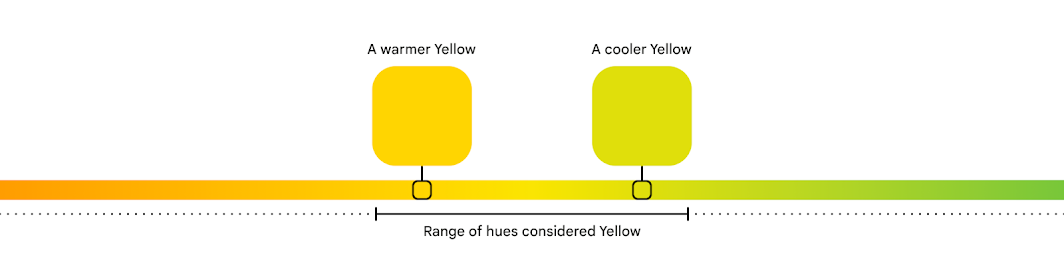
This harmony can be explained by color theory. For any color, its hue corresponds to one’s perception of it as red versus blue, or yellow versus green (other properties that describe a color include tone, or how light or dark it appears, and chroma, or how vibrant or neutral). Hue is a spectrum that can be drawn like a circle, and ranges on this circle will correspond to what one might recognize as a certain color, like yellow (how people recognize and separate colors is highly influenced by culture).
A particular hue of a color can be considered warmer or cooler, depending on where it is on the spectrum.
Depending on where in this range a particular color falls, it can be considered a warm or cool version of that color. For example, yellows towards the orange hues are warm yellows, while those towards the green side are cool yellows. This idea of color temperature also corresponds to entire types of colors that people visually and culturally perceive as warm or cool. For example, red overall is a warm color, while blue is a cool one.
Sets of colors that sit closer together on the hue spectrum can appear more harmonious than those farther apart.
In Material, we quantify hue as a number from 0-360, very much like degrees on the circle. To understand why some colors looked pleasing together, we examined their hue numbers. We found that harmonious semantic colors tended to be closer to the user color: semantic colors’ hue numbers were shifting around, making them slightly warmer or cooler. For example, in a blue dynamic scheme, semantic colors like red, orange and green all became cooler, moving closer to the cool hue of the blue user color.
An algorithm to create color harmony
Material creates color harmony by adjusting custom colors towards the user color for a more pleasing overall scheme.
From this, we realized we could define rules to consistently take a semantic color’s hue and shift it towards the user color, creating a warmer or cooler version with better harmony. With more experimenting, we found a threshold that achieved this color harmony while retaining a color’s identity: a ‘yellow’ didn’t turn all the way to ‘green’, and retained its semantic meaning.
Along the way, our designers learned a lot about the intricacies of color science and perception. And since we’ve added color harmony to our design guidance, the Material Theme Builder and engineering resources, we hope to pass this knowledge on to teams and makers, and enable them to work with color in both beautiful and functional ways.
On the surface, Gmail seems like a basic email platform for simple sending and receiving. Under the hood, there are tons of functions you can make use of – schedule send, label organization, theme changes, and even Google’s Gmail chat. Read along to find out how each of these useful features works.
How to schedule send in Gmail
There are plenty of times when you have an idea, something to say, or a picture to send, but it’s way too early or late at night to do so. That’s when Gmail’s scheduled send really comes in handy. This feature allows you to delay sending an email until a preferred time in the future.
You can schedule an email to send well over a year in advance if you really want to. In fact, there doesn’t seem to be a limit on how far out you can schedule an email.
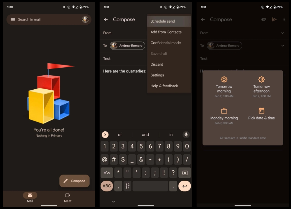
Find the Compose email button on the lower right side of your screen, and tap it.
Compose an email like you would normally.
When you’re done composing, tap the three-dot menu at the top right of the screen.
Tap Schedule send, and select your time.
You can choose between Google’s presets, or you can define your own timeframe by hitting Pick date & time.
Hit Schedule send to confirm and finalize your email.
Web
Head to gmail.com on your preferred browser, and sign in.
Look for the compose button. It should be located toward the top left of your browser screen. Click it.
Write out your email like normal. When you’re finished, click the dropdown arrow next to the Send button.
Click Schedule send.
Just like on mobile, you can choose a Google preset time, or pick your own time by hitting Pick date & time.
Click Schedule send to finish the email.
Both on mobile and web, you can cancel any email that you schedule in two different ways. First, you’ll notice a small notification at the bottom of the screen after you schedule an email. This notification has an Undo button on it. By hitting this, your email will cancel and revert to draft form so you can edit and try again.
The other way to cancel the email is to head into your Scheduled folder in Gmail, which appears after scheduling an email on web but is constantly there on mobile. Here, you can find your scheduled email and choose to delete it or cancel it by opening it and tapping Cancel send. Schedule send in Gmail can come in handy pretty often, so it’s a good function to know how to use.
Organizing by changing label colors in Gmail
Labels in Gmail act sort of like dynamic folders for the emails you want to organize and sort. You can add rules for new emails coming in to automatically sort into labels and change the color of the label in order to easily manage them. Changing the color is relatively easy to do and can liven up your inbox a little more. While this feature is only available on Gmail for web, it’s still an extremely useful organizational tool. Here’s how to change label colors in Gmail:
In the sidebar menu to the left of your screen, find a label you’ve created.
Note: If you don’t have any labels created, you can do so by scrolling down in the sidebar menu and clicking Create new label.
When hovering over a label with your mouse, you’ll see a three-dot menu appear. Click it.
Click Label color and choose among the preset colors Gmail has to offer, or create your own.
Automatically organizing emails
You can also create rules for emails in your Gmail inbox to automatically add labels. For instance, tax-related documents and receipts can be siphoned into one label for easy management. Not only that, but emails can automatically be forwarded, deleted, archived, and much more. Here’s how you can create incoming email rules:
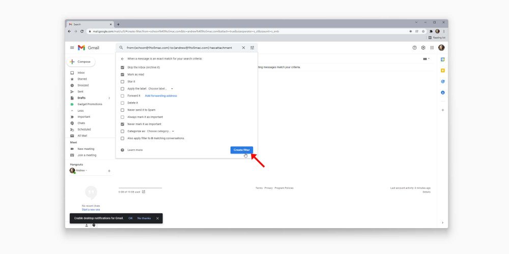
At the top of the page, click the adjustment icon in the search bar.
Fill out the parameters to your liking.
Note: Here, you can define a set of emails from certain senders as well as define emails including certain terms. This form can be filled out in a lot of different ways, and not all boxes need to be filled. You can test out your parameters by clicking Search to see what sort of emails come up.
Once you fill out the information to your liking, click Create filter.
Choose what happens to those emails.
Note: Here you can choose whether these emails get immediately deleted, starred, or moved into an existing or new label.
Once you’re done, hit Create filter again.
Creating rules for incoming emails is a Gmail feature that can help you stay organized a lot more easily. Play around with different rules to see what helps you out the most as this tool can be used a thousand different ways.
Unread message icon in Chrome
Another nifty little feature you can enable is the unread message icon. This icon will appear as a number in your Google Chrome tab icon, showing you exactly how many emails you haven’t read yet. Here’s how to enable it:
Look for and click the settings cog at the top right of the page, then click See all settings.
Find and click the Advanced section.
Scroll to the bottom, and find the Unread message icon. Click it.
Click Save changes.
Gmail will refresh after hitting Save changes. You’ll notice a small number appears on the Chrome tab if you have unread emails.
Gmail viewing modes
Whether you like your inbox to look condensed so all your information is right where you need it or spaced out, Gmail has you covered. By going into Settings, you can change Gmail’s density. There are three options:
Default
Comfortable
Compact
Play around with these different viewing densities, and choose one that fits your needs. Personally, I like default, since it allows the most information at a glance.
Changing your Gmail theme
Some Gmail features are purely there as quality-of-life settings. Themes fit right into that category. Rather than a dull white or black Gmail, you can develop or choose a theme that represents you a little better, or just lightens up your mood when replying to monotonous emails all day.
Gmail allows you to choose between preset photos, colors, and even your own Google Photos images to use. Here’s how to change your Gmail theme:
Look for the settings cog at the top right of the page and click it.
Look for the Theme section. You can choose from these few photos, or you can hit View all to choose from even more.
Once you hit View all, scroll through the page and find what really speaks to you. If nothing does, click My photos at the bottom left.
Choose between Featured, My photos, and Recently selected if you’re wanting to revert to a previous photo.
Note: If an image is over 20MB, you won’t be able to use it for your theme.
Once you find the photo you want, select it, and hit Save.
Once you save, you should see your new theme appear in the background of Gmail. There’s no limit on how many times you can change your theme, so go nuts.
Turning off Google Chat/Meet in Gmail
Some settings are fantastic when enabled, others are even better when disabled. One example is Google Chat and Meet. While these optional chat platforms can be useful for communication, it tends to clutter up Gmail, which is already prone to clutter.
Whether you should disable Google Chat and Meet is completely up to you and how you use Gmail. In case you never use these features and want to clean up your Gmail experience, here’s how to disable Chat and Meet:
Look for the settings cog at the top right of your screen.
Tap See all settings.
Look for and click the Chat and Meet section.
Next to Chat, select Off.
Next to Meet select Hide the Meet section in the main menu.
Click Save changes.
You don’t have to disable Google Chat and Meet in Gmail or even either of them. It all depends on your preferences for using Gmail. Once you hit Save changes, Gmail will refresh, and your changes will be reflected. Suddenly, you’ll find that the side menu is much less cluttered and easier to navigate.
These are just a few things you may not have realized you can do to change your Gmail experience. Whether you want to implement all of them or none of them is up to you. Either way, Gmail is a great tool and even greater when you know how to organize labels, change their color, and disable certain features.
As usual, HomeKit announcements are expected to be one of the biggest trends at CES this year. Today, home security company Schlage has announced an all-new Encode Plus Smart WiFi Deadbolt, and the company is going all in on Apple’s ecosystem with support for both HomeKit and home keys in the Apple Wallet application.
Apple’s home key feature was first announced at WWDC in June. When you add a home key to your Apple Wallet application, you can simply tap to unlock your door using your iPhone or Apple Watch, just like how Apple Pay currently works. Here’s how Apple explains the feature:
Add home keys to Wallet on iPhone and Apple Watch, then simply tap to unlock a compatible HomeKit door lock for seamless access to your home. Home keys live in the Wallet app with other important items like your car keys and credit cards.
The home key functionality works in addition to HomeKit, allowing you to control the Encode Plus via the Home application, with Siri, through automations, and by tapping on the lock itself using your iPhone and Apple Watch. The lock also features a keypad where you can manually lock or unlock it using a passcode.
The process of setting up a home key is also very simple. Once you add the lock itself to HomeKit, you can directly add a home key to the Wallet app on your iPhone and Apple Watch as well. You can also easily share Apple home keys with others for granting permanent or temporary access to the lock to friends and family members.
The new Schlage Encode Plus has been touted as the “first smart lock solution” in North America with support for both HomeKit and home keys. Note that Apple’s home key features require an iPhone XS or newer running iOS 15 or above, while Apple Watch support is limited to the Apple Watch Series 4 or newer running watchOS 8 or above.
Schlage says the new Encode Plus Smart WiFi Deadbolt will be available sometime in the spring for $299.99 MSRP. We’ll be sure to keep you in the loop when additional information is released.
Like Apple Wallet evolved with iOS 15 to include the ability to store keys for homes and hotels, with upgraded U1 support for the car key standard too. Now it looks like one of the first HomeKit smart locks to feature the NFC Apple home key support could be on the way.
Spotted by HomeKit Authority, the yet-to-be-released Schlage Encode Plus popped up momentarily on Home Depot’s website (now pulled) with some interesting details.
Along with HomeKit support like some of Schlage’s existing smart locks include, the Encode Plus appears to come with instructions on how to use it with the new Apple home key feature.
After setting up your Schlage Encode Plus lock in the Apple Home app, you can add a home key to the Wallet app for easy and secure access to your home using your iPhone or Apple Watch.
No word yet on when the Schlage Encode Plus is officially available, but it may not be long as Home Depot accidentally posted the product listing early before pulling it. Based on the FCC filing, it looks like there will be two styles available (modern and traditional).
The handy part about Apple home key is you have an NFC key to quickly unlock your door with Apple Watch or iPhone. While standard HomeKit locks have Siri support, sometimes Siri is unresponsive or slow to respond to open locks or garage doors.
Another benefit is you can share Apple home keys with others through the Home app.
Earlier, on Hyatt become the first hotel to adopt Apple Wallet keys.
The new Google Pay app brought with it a lot of annoying design changes and UI quirks, and slowly they’ve been quietly fixed. Now, Google Pay has finally added a sorely needed search bar for sifting through rewards and offers.
Google Pay’s rewards and offers tab is full of cashback offers, boosted rewards for referrals, and more – Google even occasionally runs events that can offer various other monetary rewards.
In one of Pay’s latest updates, though, Google has finally gotten around to adding a search bar to the rewards tab. This means users can easily search through the various offers and cashback rewards in the Pay app without scrolling endlessly for a few minutes. Prior to this change, the only way to find a specific reward or offer in the app was to either scroll until you finally found it, or just hope that Google happened to feature it in the top grid.
This change is genuinely useful, as now those looking to buy a product can check Google Pay to see if there’s some sort of offer available for that retailer.
It’s almost crazy to think that Google didn’t previously offer a search bar in the Pay app given, well, the company’s entire success story is built around having an extremely popular search engine. It wouldn’t be the first time a Google product lacked a search bar, though, as Google Stadia lacked the feature for the better part of two years.
In a surprise announcement at The Game Awards,Google this evening revealed that it’s bringing Android gaming to Windows PCs next year through a desktop Play Games app.
Android users might know Play Games as the pop-up that loads when they open a title, as well as a mobile application that shows various achievements and serves as a directory. Google uses “Play Games” as the umbrella term for the various services (e.g. player accounts, storing/syncing data, social, achievements/leaderboards, testing, and store distribution) it offers to aid Android game developers.
In all, the company says there are 2.5 billion monthly active users gaming with Android apps across phones, tablets, and Chrome OS, with the latter form factor seeing game usage grow three times year-over-year.
Google now wants to bring its multi-screen gaming platform to Windows PCs. This expansion is pitched as a continuation of its mission and as something desired by the Android developer community.
It will take the form of a native “Google Play Games” Windows application. In addition to the app, Google will be directly distributing content, which includes both emulated Android titles and games that run natively on Windows. There will be seamless game experiences that let players go between mobile and desktop.
Behind-the-scenes, the Google Play team built something different from what Microsoft has for Windows 11. In fact, Google’s app will be available on Windows 10 and newer — exact specs coming at a later date. As part of this, the app/service has a new green, triangular icon with half a controller.
“Google Play has helped billions of people find and play their favorite games across multiple platforms, including on mobile, tablets and ChromeOS. Starting in 2022, players will be able to experience their favorite Google Play games on more devices: seamlessly switching between a phone, tablet, Chromebook, and soon, Windows PCs. This Google built product brings the best of Google Play Games to more laptops and desktops, and we are thrilled to expand our platform for players to enjoy their favorite Android games even more. We’ll have more to share soon!”
Greg Hartrell, Product Director, Games on Android and Google Play
Play Games for Windows will be available next year and more details are coming “soon.”
Google is not yet ready to detail specifics of this upcoming experience, but it did lay out the first part of a grand vision that’s inline with the internal “Games Future” presentation made public in August as part of the Apple and Epic Games lawsuit.
This document laid out the cross-platform ambition that Google just made official at The Game Awards. It includes a possible image of the straightforward desktop app, which is rather tablet-like. At a high level, Google wants to let users “play on any screen,” including the Android, Windows, and macOS platforms and all form factors like phones, tablets, desktops, smart displays, and TVs, with the company possibly creating a “low-cost” Bluetooth controller.
A year after Apple Music first became available on GoogleNest and Home devices, the streaming service is now supported in five more countries.
Australia, Canada, India, Mexico, and South Korea join the US, UK, France, Germany, and Japan. To enable Apple Music, open the Google Home app (Android or iOS) > the Settings gear > (under Services at the bottom) “Music.” You can also open Google Assistant settings and scroll down to “Music.”
Tap the blue link/chain icon next to “Apple Music” and agree to “Link Account.” You’ll be sent to an Apple website where you can enter Apple ID credentials. Once complete, requests to Google Assistant for songs and albums will automatically play in Apple Music.
After it is set up, you can easily queue up your favorite playlist, artist, or any of the award-winning Apple Music Radio stations live streaming today’s hits, classics, and country to play over your connected device.
Stateside, supported streaming services include YouTube Music, Spotify, Apple Music, Pandora, Deezer, and iHeartRadio. Apple’s Android app also supports Casting, while there’s still no TV+ app to watch original content despite the presence of an Android TV client.