Most devices have some sort of battery saver mode, while Google’s Pixel lineup comes with an “Extreme Battery Saver.” So what is it, and what makes it extreme? This guide will take you through it.
On most Android devices, battery saver works in a very similar way. Unnecessary processes are turned off in the background, your screen’s refresh rate slows down (even to the point of turning off variable refresh rate entirely), and your phone switches to a dark theme to save energy. You might also experience the lack of certain features, such as the always-on display.
All of these limitations combined significantly improve your batter’s efficiency, and battery saver mode can mean the difference between a dead phone in two minutes or an extra 25 minutes of power, roughly speaking.
So what is the Pixel’s Extreme Battery Saver?
Beyond the regular battery saver, the Pixel’s Extreme Battery Saver is an added layer of battery efficiency. In fact, in order to use the latter, you need to initially have battery saver active.
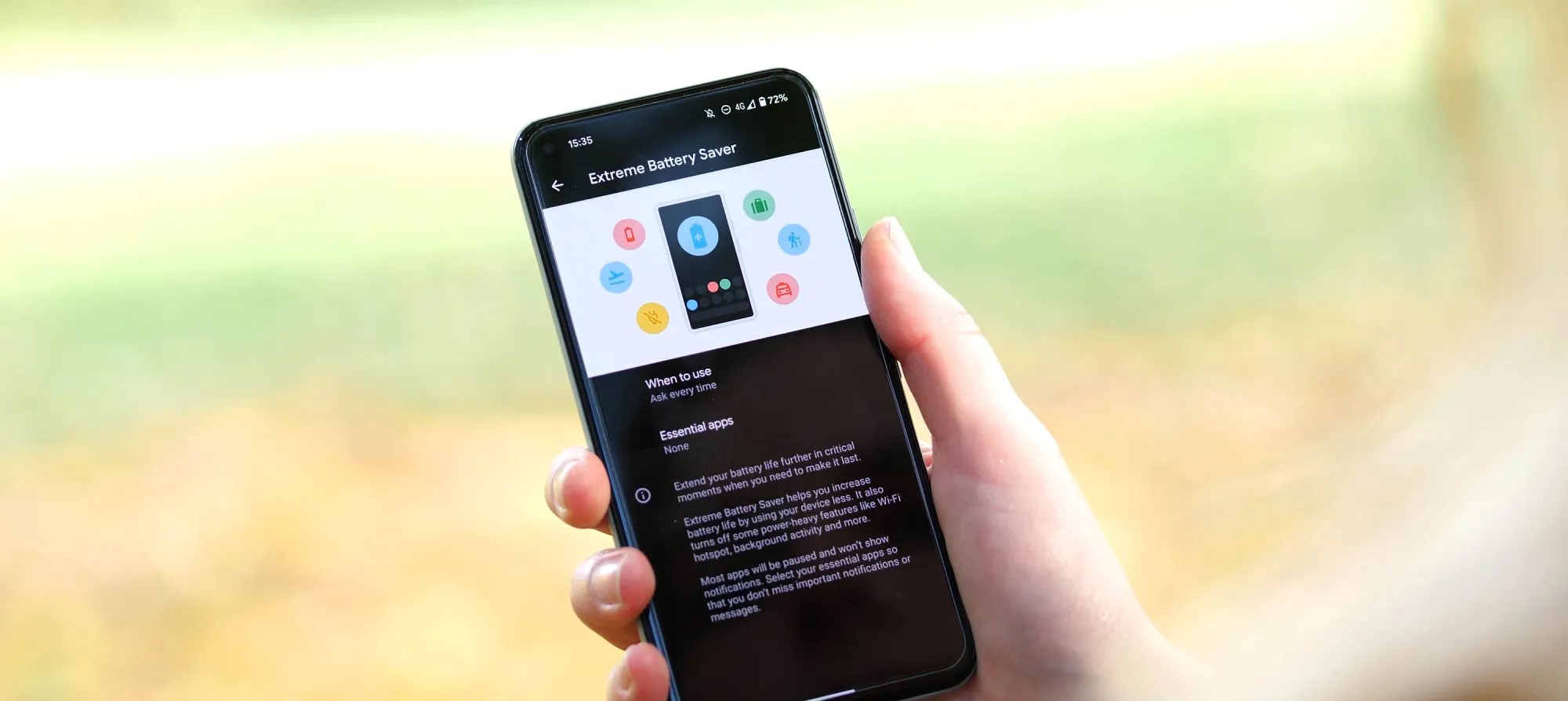
Once it is, you can access the extreme version, which goes beyond turning off a couple of features. Rather, Extreme Battery Saver turns off most of your apps and completely pauses notifications from them. In essence, most nonessential apps completely halt background usage.
This feature is used for pretty dire circumstances and can get you even more battery life when you really need it. While you can’t access most apps during Extreme Battery Saver mode on the Pixel, you can choose to classify some apps as essential. After doing so, those apps become usable while the limitation is turned on.
How to turn it on
Before turning it on, you need to adjust a couple of settings that specify how you use it.
On your Pixel, head to your settings by swiping down twice and hitting the settings cog.
Tap Battery.
Hit Battery Saver.
Select Extreme Battery Saver.
Choose when to use it – you can choose to have it turn on automatically with regular battery saver or you can have your Pixel ask you first.
Choose your essential apps.
Note: Don’t go wild. The fewer apps you choose, the better your battery life will be.
Once you configure these settings, you can choose to have the extreme mode turn on after battery saver is initiated. The best way to turn the battery saver on is to access your Quick Settings on your Pixel and turn it on from there. We have a great guide on doing just that.
For the past three years Google has attempted to repackage its flagships phones into A Series phones that capture the Pixel essence at a far more attractive price point. The Google Pixel 6a even got the same custom Tensor chipset as the more expensive Pixels, further sweetening the deal.
The Pixel 6a is notably compact with its 6.1-inch OLED screen and far lighter at 178g (vs 207g for the Pixel 6). It perfectly captures the design, look, and feel of the more expensive Pixel 6 and Pixel 6 Pro while strategically shaving costs down in places that doesn’t have a big impact on usability.
The Pixel 6a doesn’t have a charger in the box – a change that came with the Pixel 6 and 6 Pro. Google also axed the headphone jack in a first for the Pixel A Series.
Google Pixel 6a specs at a glance:
Body: 152.2 x 71.8 x 8.9 mm, 178g; Glass front (Gorilla Glass 3), plastic dual-tone back with horizontal camera bar, aluminum frame; IP67 water and dust resistant.
The Pixel 6a‘s camera is the tried-and-true Sony IMX 363 sensor, the same one that’s been used since the Google Pixel 2. Google only stopped using it on its premium Pixels this year, so we probably shouldn’t be surprised that the 6a didn’t get a different sensor. And we might still see the aging sensor up its performance when paired with the Google Tensor.
Pixel A Series have had excellent battery endurance historically. This time Google slightly reduced the battery size, but with a smaller screen and the Tensor chip we might be in for another solid run. We are also hoping that the 6a has addressed thermal performance weakness we saw with the 6 and 6 Pro. But let’s start with the unboxing.
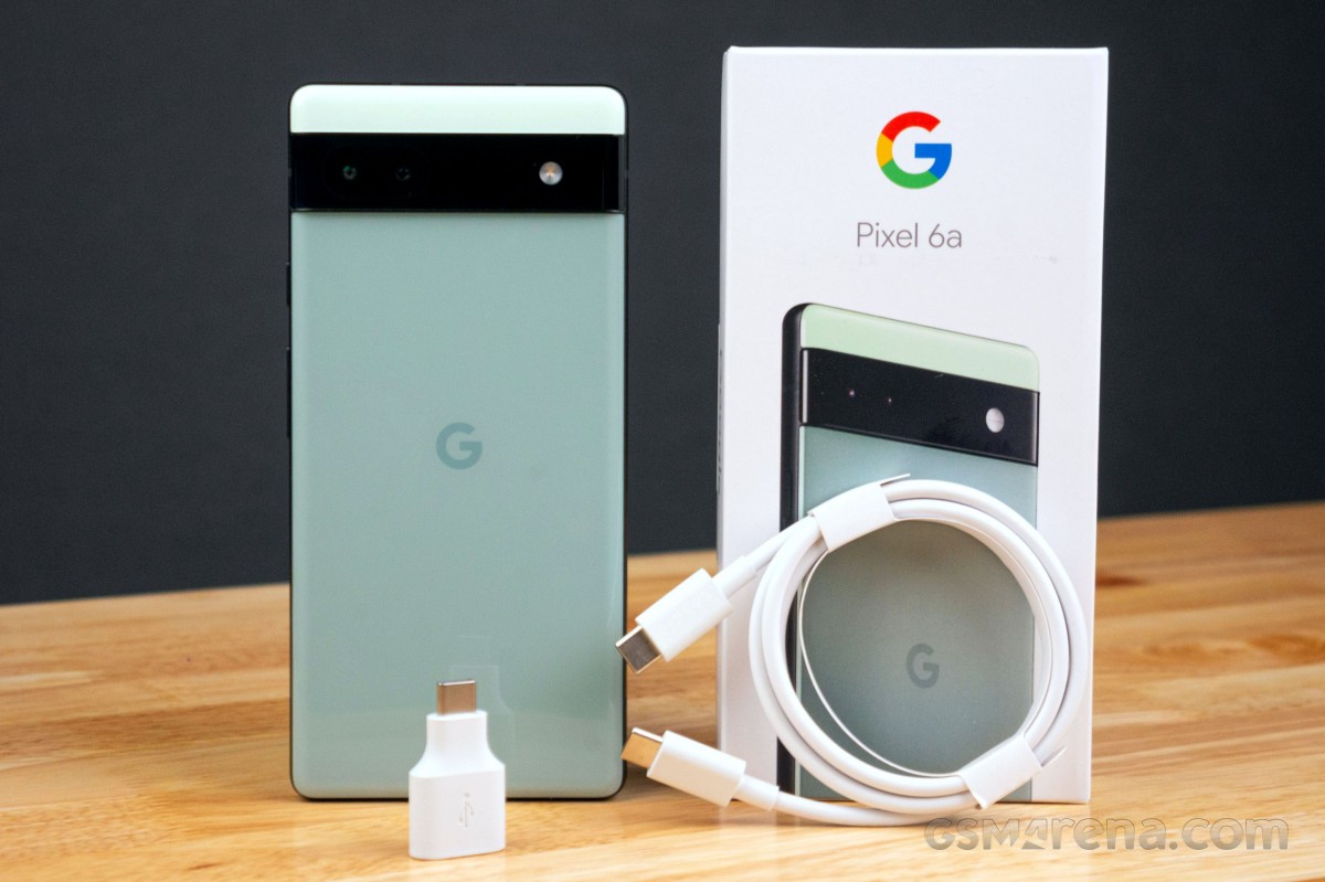
Unboxing the Google Pixel 6a
The Google Pixel 6a comes in a slim package that we can’t really say covers even the essentials. You’ll no longer find a power adapter in the package, so the Pixel 6a comes with a SIM eject tool and 1-meter USB-C to C cable. We’re glad to also see the USB-C (male) to USB-C (female) “Quick Switch Adapter” for bringing data from another Android device or iPhone over a cable.
Now let’s dive into the testing, starting with the phone’s design, looks, and build. We’re excited for this one, so grab an icy beverage and enjoy the ride.
The competition
The Google Pixel 6a costs $449 in the US, £399 in the UK, and €459 across major EU markets. It is also available in India for Rs 43,999, where the markup caused by import costs is by far the highest.
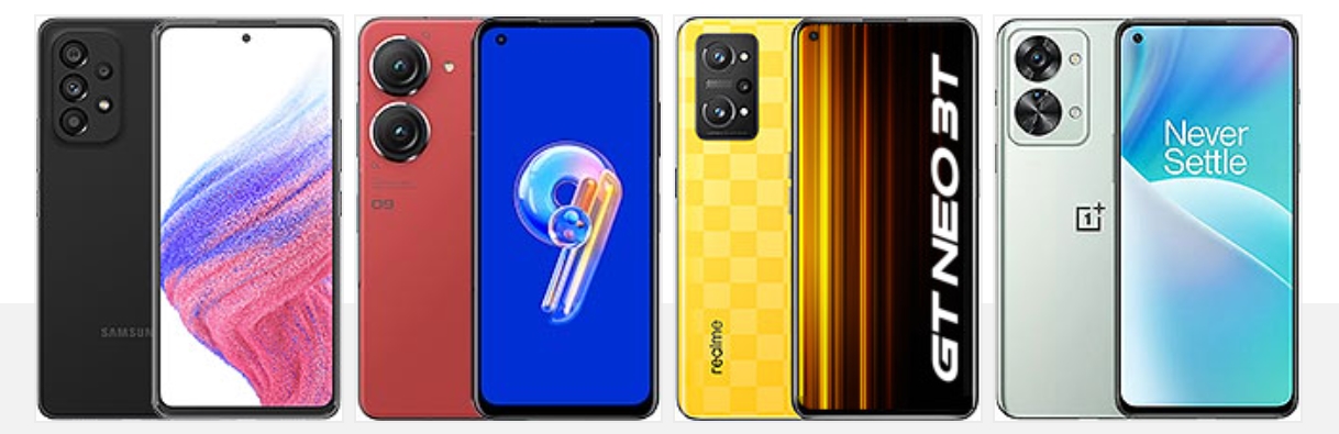
There is plenty to choose from in this price range. One competitor selling for less is the Nothing phone (1), which is cheaper than the Pixel 6a. It has a higher refresh rate screen, respectable camera performance, and the unique Glyph design that is sure to stand out even amongst flagships.
If you’re after a small flagship device, the iPhone 12 mini is still available from Apple, though it is pricier than the 6a at $599. There’s also this year’s iPhone SE, which we’d avoid unless you really insist on getting an iPhone and it’s the only one you can afford (but then you probably wouldn’t be reading this).
Nothing Phone (1) • Apple iPhone 12 mini • Apple iPhone SE (2022)
The Samsung Galaxy A53 is a popular smartphone in the US for its lower price point. You get more features and a more impressive hardware sheet. There a high refresh rate display, large battery, IP67 rating, though the camera is not too stellar and the Exynos 1280 is not a great performer.
If you’re after a small Android flagship, the Zenfone 9 is at least worth mentioning. It’s priced out of competing with the Pixel 6a, but it’s a compact handset with a 5.9-inch AMOLED screen with 120Hz refresh rate and the Snapdragon 8+ Gen 1.
The Realme GT Neo 3T is in the same price bracket as the Pixel 6a and it has great battery life, a bright AMOLED screen with 120Hz, and excellent charging speeds. Its main camera is solid and can stand up to the Pixel 6a, but its ultrawide shooter is inferior.
The Nord 2T has a reliable camera and great performance with the Dimensity 1300 5G chip. There’s also 80W fast charging, but there’s no ingress protection.
Samsung Galaxy A53 5G • Asus Zenfone 9 • Realme GT Neo 3T • OnePlus Nord 2T
Verdict
Before continuing with the verdict, we need to address an issue revealed by early testers of the Pixel 6a. It was confirmed that some devices were able to authenticate the device’s biometrics by using a finger that was not even registered to the device. The instances seem isolated, but they pose a serious security flaw with the device. Google is yet to addressed the issue, so it’s worth keeping an eye on and withhold purchase until it’s cleared if you often find yourself in environements where sensitive info might be exposed.
That aside Google may have finally mastered the A Series formula with the Pixel 6a. It managed yet again to capture the essence of the Pixel flagships into a more affordable phone that does not water down the overall experience too much. The 60Hz display and leisurly charging speeds count against it, but the overall execution of the 6a is great for its price. The
Shipping the 6a with a Google Tensor versus last year’s Snapdragon 765G and keeping the same $449 price point makes it a great offer. Camera performance remains solid, software and performance are polished and battery life is respectable. Plus, Google addressed performance throttling issues with Google Tensor on the Pixel 6a.
It’s arguably Google‘s most competitively positioned smartphone in a good while and one we can wholeheartedly recommend. The obvious asterisk here is that things stand differently in India where consumers have a huge choice in this price segment and the Pixel 6a‘s higher price makes it far less tempting.
Pros
Attractive, compact design that looks more expensive than it is.
Bright and accurate AMOLED display.
Good sustained performance from the Google Tensor this time.
Extended firmware update support; Voice Typing and on-device language processing is excellent.
Great all-around camera.
Cons
Isolated instances of a fingerprint security flaw are not acceptable.
60Hz refresh rate is not competitive for this price range.
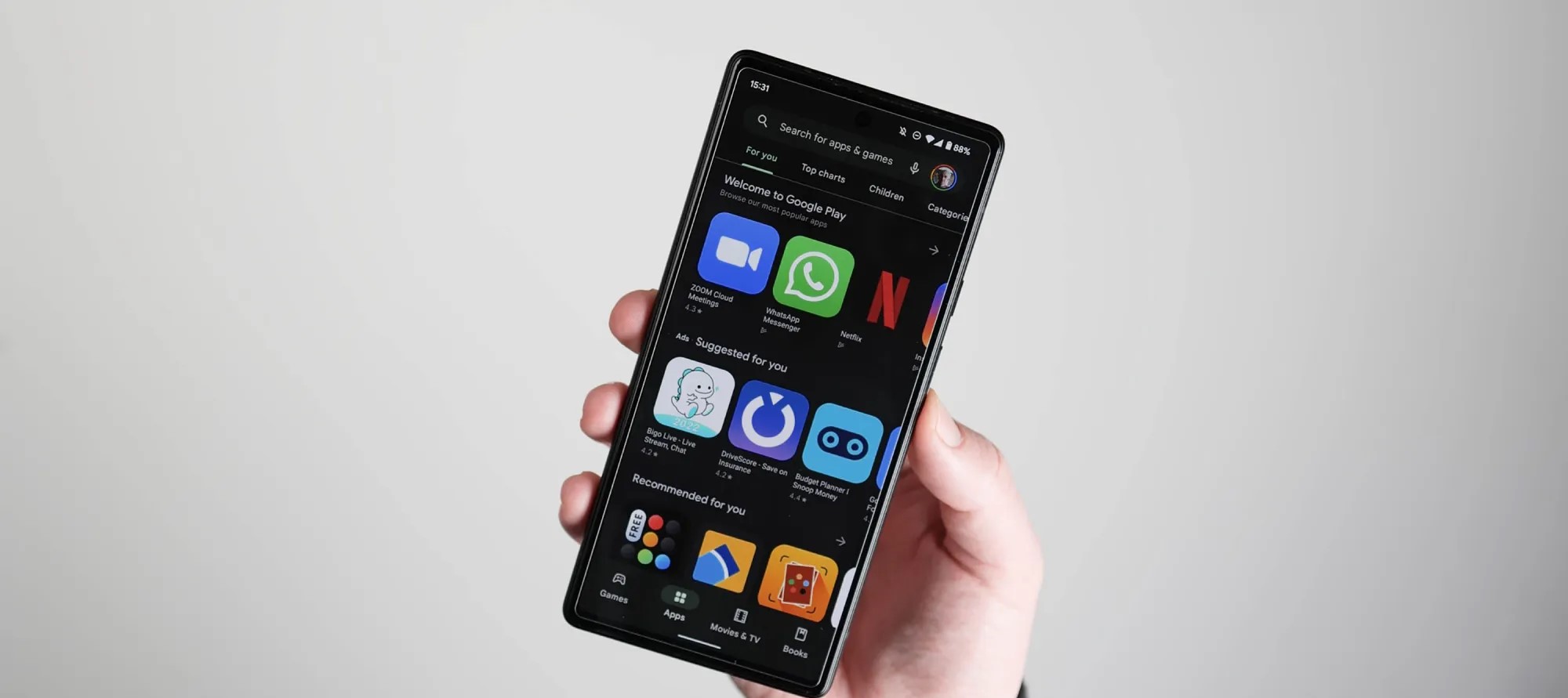
Google Play Store not showing all your ‘Recently updated’ Android apps
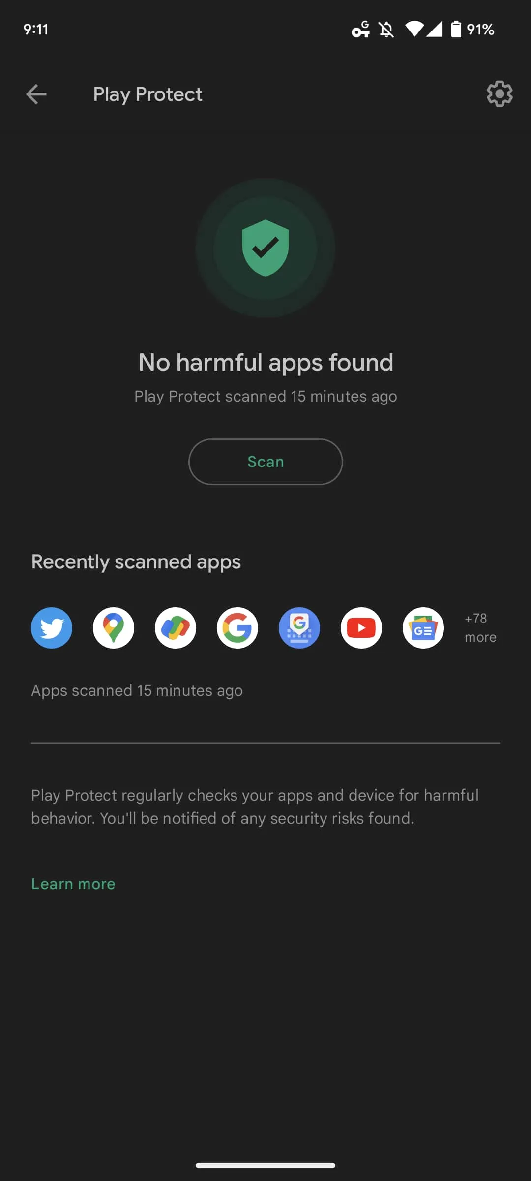
Google recently addressed an issue where version numbers disappeared from the Play Store, and a similar problem in that vein has now appeared involving the “Recently updated” list.Since yesterday (August 23), Google Play has not consistently shown all the Android apps that you have “Recently updated,” which is the default view/filter for the “Manage” tab in “Manage apps & device.” You might have one or two appear but the vast majority are missing. In the example below, Google Docs, Sheets, and Slide are missing, while Apple Music was also updated yesterday in addition to on Monday. There are countless other examples across a handful of devices we checked, though not all users say they are affected. The issue continues into today with Google Pay (Tez) showing up but not Google Maps or Twitter for me.
One way of seeing what apps are missing is by comparing that list to the “Recently scanned apps” row shown on the Play Protect page. We’re encountering this issue on both the latest stable release (31.9.1) of the Play Store and newer versions that are still rolling out.
The new Google Play Store logo goes live on Android [U]
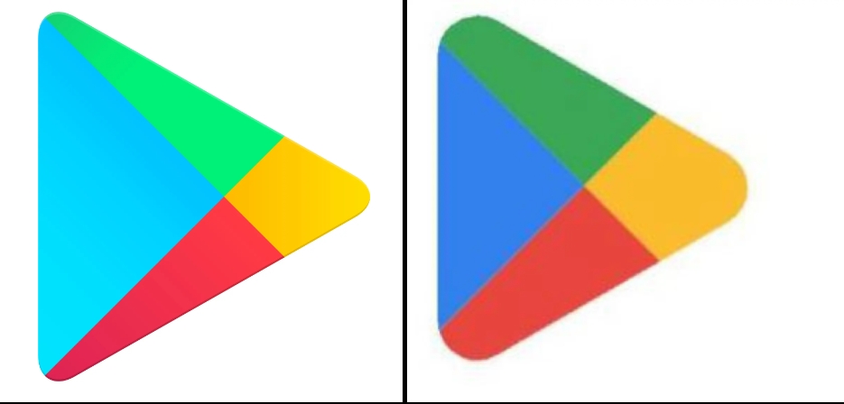
Google last changed the Play icon in 2016 when Play Movies & TV, Music, and Newsstand were still vibrantly kicking. Over six years later, the Google Play Store is getting a new logo.
Update 7/27: The new logo is starting to appear on Android with version 31.6.13-21 of Google Play. It’s a pretty straightforward replacement with not a lot changing in terms of proportions or triangle size. There’s also a new outline-style status bar icon with bold lines.
That update is not yet widely rolled out, but it has already appeared on one of our devices.
Update 7/26: Following the official 10th anniversary announcement yesterday, the new logo is live on play.google.com , as well as the developer site. It’s meant to better reflect the “magic of Google and matches the branding shared by many of our helpful products — Search, Assistant, Photos, Gmail and more.”
blue (#4285F4), red (#EA4335), yellow (#FBBC04), and green (#34A853)
Of course, most users will encounter it when the Android app is updated and the homescreen icon changes.
Update 7/16: Additional proof that Google Play is getting a new logo comes from the US Patent and Trademark Office. We see the more rounded triangle with updated coloring in much higher-resolution, though it’s still somewhat blurry. The company officially describes it as such:
The mark consists of a triangle comprised of rounded corners, divided in four colored sections; the color blue appears at left; the color green appears at top; the color yellow appears at right; and the color red appears at bottom.
Original 7/6: Before the 2016 redesign, which also placed everything in triangles, the icon had more shadows.
This new Google Play logo is still a triangle, but notice how the corners are much more rounded compared to the current one. Meanwhile, the four colors in use are more closely aligned with that of the four Google colors, which is the clear trend and mandate of recent revamps. That said, we can’t help but note how muted and dark the icon is compared to other first-party services.
Blue and green are definitely less vibrant, while the internal partition has been tweaked so that the parts are more equal in size. Today, the blue triangle is oversized compared to the other three components.
Current vs. upcoming
Only a low-resolution version of this icon is available today. It can be found in both GPay and Google Pay – soon Wallet – when you make a Play Store transaction, like adding credit to your account, as the merchant icon. There’s no obvious indication when it was updated.
It’s not live anywhere in the Play Store app or play.google.com, which was just redesigned. That would have been an optimal time to unveil it.
At this point, it’s not clear when Google will introduce the new Play Store logo. Google Play did just remove the Movies & TV tab, while the likely exit of Play Books to make the Play Store entirely focused on Android apps makes eventual sense. Meanwhile, the fate of the “Play” in Play Games is slightly more solid given the big push into Android gaming on Windows. However, the future of the dedicated Android app is not as firm.
Google is preparing to expand Pixel’s support for showing At A Glance notifications from smart doorbells to also include alerts from Ring products.
About APK Insight: In this “APK Insight” post, we’ve decompiled the latest version of an application that Google uploaded to the Play Store. When we decompile these files (called APKs, in the case of Android apps), we’re able to see various lines of code within that hint at possible future features. Keep in mind that Google may or may not ever ship these features, and our interpretation of what they are may be imperfect. We’ll try to enable those that are closer to being finished, however, to show you how they’ll look in the case that they do ship. With that in mind, read on.
Over the course of this year, Google has put a significant amount of effort into the expansion of the At A Glance widget that is ever present on the homescreen and lock screen of Pixel devices. What originally started as useful reminders from Assistant and Calendar has become an all-in-one hub for things your phone thinks you might want to know immediately.
One such recent improvement was the addition of support for alerts from Nest Doorbells, indicating that someone is at the door and (if recognized by Familiar Faces) who it is. Now it seems Google is preparing to expand At A Glance’s support for smart doorbells to include third-party options.
As spotted in the latest release of Android System Intelligence — “T.5” which is notably the first non-beta update to the app’s Android 13 variant — the At A Glance widget is picking up support for doorbells from Ring. Since 2018, Ring has been owned by Amazon, but the company has been no stranger to Google’s ecosystem, offering full Google Assistant integration.
“Show who’s at the door when your Nest or Ring doorbell rings”
Where the existing integration with Nest is easily possible as the Google Home app is installed by default on Pixel phones, the upcoming Ring doorbell support will require that you have Ring’s app installed. Given the feature has so far only appeared in Android 13 builds of Android System Intelligence, it’s likely this particular integration won’t be launching until much later this year.
At A Glance has steadily expanded over the past year
The new tidbit comes as part of a broader movement by Google to integrate At A Glance with third-party apps and services. In recent weeks, we’ve seen preparation for the widget to support delivery notifications from services like Doordash and ETA alerts from ridesharing apps like Uber and Lyft.
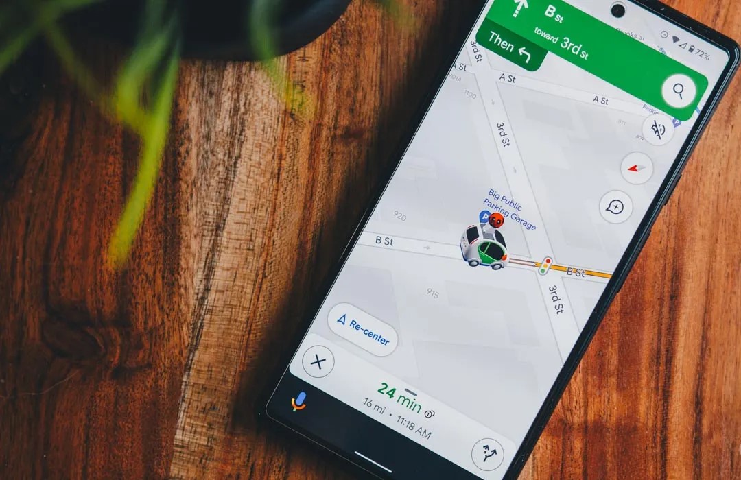
Google Maps is preparing to expand its fuel-efficient routing options by specifically tailoring to electric vehicles, hybrids, and more.
Last year, Google Maps began offering an alternative way to navigate your car from one place to another. Where typically a navigation app optimizes for the shortest travel time, Google Maps started offering routes that would be more fuel-efficient and eco-friendly, even defaulting to that route if the ETA is similar.
However, not all vehicles behave the same way or can optimize fuel efficiency with the same methods. While gas-powered vehicles are still all too common in the United States, there’s a growing number of hybrids and electric vehicles on the road, and quite a few diesel-powered ones as well. Suffice it to say the most efficient route for a traditional ICE car will not be the same as one for an electric.
To that end, the latest beta update to Google Maps, version 11.39, includes preparations to specify the engine type of the vehicle you’re currently driving. This selection — with options for gas, diesel, electric, and hybrid — will be used by Google Maps to “tailor” your navigation to find what will “save you the most fuel or energy.”
New! Get fuel-efficient routes tailored to your vehicle’s engine type.
Save more fuel by choosing your engine type
This info helps Maps find the route that will save you the most fuel or energy.
It doesn’t seem like you’ll be required to select a particular type of engine, even once this feature launches. Additionally, there will be an option in the app’s settings to switch to a different engine type, if needed.
Choose engine type
Change engine type
The change makes a great deal of sense for Google Maps given the company’s environmental consciousness, and it implies the success they may have had so far with automatically choosing the energy-efficient route. As the functionality is only just beginning to appear in beta testing, drivers of electric and hybrid vehicles will likely still have to wait a few more weeks to experience the tweaks Google Maps will make to their drive.
Google Maps begins rolling out estimated toll prices for planned routes
Estimated toll prices for planned routes now appear to be rolling out for Google Maps users on both Android and iOS after being announced earlier this year.
Having already been announced earlier this year, it has taken a little longer than expected for toll prices to arrive in Google Maps. First reported by Android Police, the feature rollout has since been confirmed by the official Google Maps help page post(and Twitter) with 2,000 toll roads in the US, India, Indonesia, and Japan being accounted for.
Google previously stated that more countries will see the feature “soon” but did not specify just what regions will be first in line once the expansion starts. Toll price estimates is a feature that has existed in Waze for some time, but given the ubiquity of Google Maps, this is a solid option for those in regions where toll roads are a common occurrence. This is in tandem with the existing feature that allows you to avoid toll roads entirely when route planning.
For the planner friend: this new feature is for you. 🙏
Now when you’re planning trips big and small, you can check estimated toll prices before you pick a route—and spend what you save on road snacks. pic.twitter.com/Lfy8s2TXQU
You’ll see the estimated toll price to your destination before you start navigating thanks to trusted information from local tolling authorities. We look at factors like having a toll pass or not, what the day of the week it is, along with how much the toll is expected to cost at the specific time you’ll be crossing it.
The pricing data is directly sourced from local tolling authorities. Maps then factors in the outright cost of using a toll pass, specific payment method charges, daily toll rates, along with how much the toll is expected to cost at the specific arrival time to give you an estimate when mapping out a potential route.
You will have the option within settings to show toll prices with or without having a toll pass–as in many geographies the price changes based on the payment method you use. You will also still have the option to avoid routes crossing toll roads entirely, if possible, by selecting ‘Avoid tolls’ within settings.
While this is a great move, it’s worth noting that Google Maps is not yet capable of showing individual toll road prices. Instead, you’ll only get a “full” estimate for a complete route. There are also no options to select things such as vehicle type nor add-in discount passes if they exist for certain transit methods. Either way, this is a great step in the right direction, and it would be great to see Google develop it further with more fine controls and pricing data.
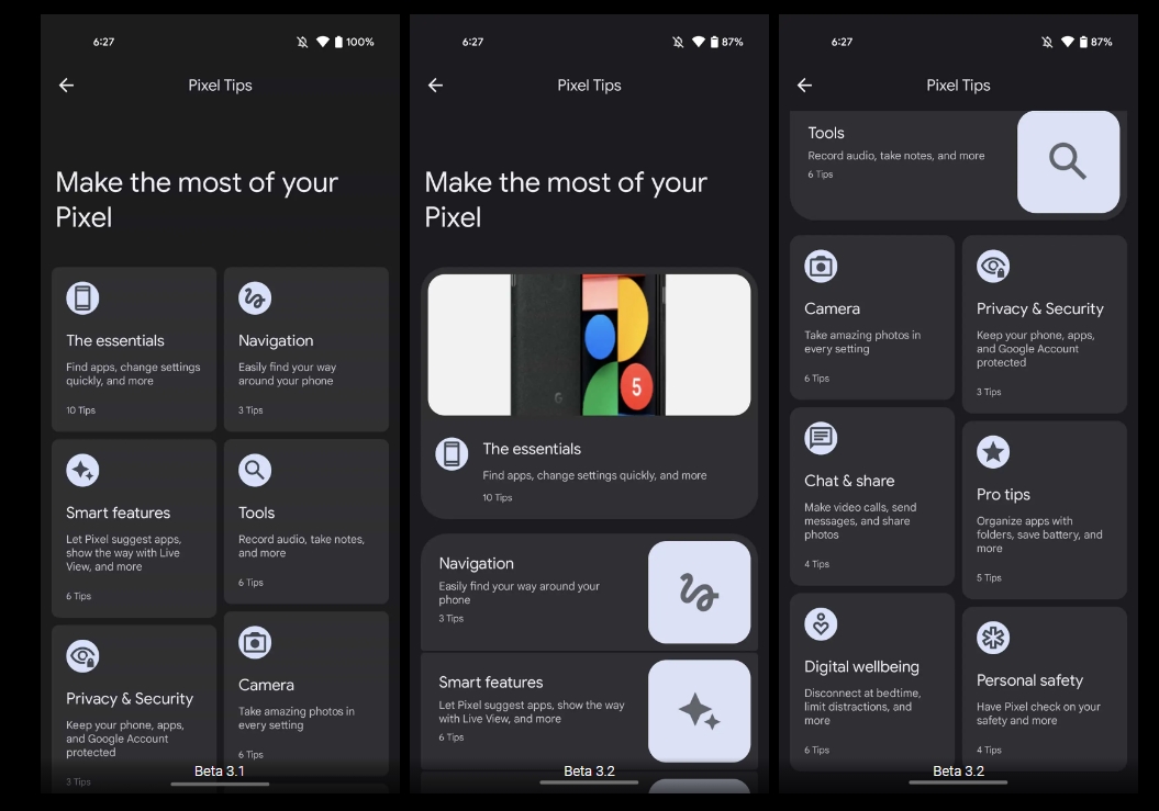
For a patch, Android 13 Beta 3.2 contains many more changes than expected and we’re diving into everything new as a result.
Over the coming hours, we’ll dive into all of Android 13 Beta 3.2’s new features and every single change. (The newest updates will be at the top of this list. Be sure to check back often and tell us what you find in the comments below.) Beta 3.1 screenshots appear on the left and Beta 3.2 at the right.
Prep towards new Easter Egg
Tweaked Pixel Tips layout: More prominent highlights
Tweaks to Clipboard
Sharing is now done via the bottom-left corner overlay.
The share button is no longer in the full-screen editor. After making any edits and tapping “Done,” you’re taken back to the previous screen with the corner overlay still visible.
Pixel Launcher: ‘Always show keyboard’ in app drawer
Updated Google Lens icon
Google rolls out Android 13 Beta 3.2 to Pixel with several bug fixes
Following a patch last Friday, Google is back with Android 13 Beta 3.2 today to fix more issues on Pixel phones.
Google usually does not release more than one patch in-between major previews, but Beta 3.1 was required as a more pressing fix — coming only two days after Beta 3 — given the unavailability of the Beta Feedback app for new users.
At a high-level, Beta 3.2 includes the “latest bug fixes and improvements to stability and performance.” Five Android 13 issues are specifically addressed with this update:
Fixed an issue where the back gesture wasn’t working in some apps.
Fixed an issue where the At a glance settings page would collapse inconsistently when scrolling.
Fixed an issue where some apps would crash instantly on opening.
Fixed an issue where the microphone would turn on and off unexpectedly during unrelated use of the device.
Fixed an issue where the Google Photos app would crash frequently.
These problems are particularly application and user-facing, though we have not seen widespread reports of them.
Factory images for Android 13 Beta 3.2 build TPB3.220610.004 (versus TPB3.220513.017.B1 previously) are available now. On a Pixel 4a, the OTA comes in at 238MB.
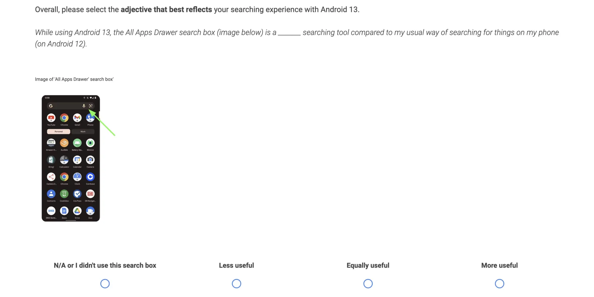
After the main release and two patches, Google is now asking for feedback on Android 13 Beta 3 in a survey that’s slightly different from past versions by focusing on the search experience.
For starters, the survey is hosted on Qualtrics instead of Google Forms and asks for demographic information (age and occupation). It opened today and ends on June 28 at 5 p.m. PT.
This survey should take no longer than 10 minutes to complete. Please keep in mind that all questions and content within this survey are confidential and should not be shared with anyone.
This Android 13 Beta 3 survey is not limited to Pixel with various OEMs, including those that have not announced preview programs yet, listed:
Realme, Momo, Oppo, Samsung, Microsoft, Google Pixel, OnePlus, Motorola, Sony, and Nokia
After specifying the current build on your device, Google asks which “search box did you primarily use since using your device on Android 13”: Search widget on the home screen or All Apps Drawer search box. You’re able to select “Both.” Google wants to know whether Android 13 has changed your usage compared to Android 12. Listed capabilities include:
Apps not yet installed (i.e. Google Play store apps)
Settings
Apps (installed on your phone)
Google Assistant
Pixel Tips
Contacts
Content within Apps
Quick app actions (i.e. shortcuts)
Web content (e.g. websites, Google search results page)
Screenshots
There’s then a question about “how easy or difficult was it to find what you were searching for in the search box” with the ability to expand further via written responses; Google then asks you to compare the two search fields.
Likely to help improve the process of registering your fingerprint on devices with in-display readers, Android 13 Beta 3 has gained a new enrolment UI.
Of course, with the Pixel 6a and Pixel 7 series yet to be officially available, that means the new UI is currently limited to the Pixel 6 and 6 Pro. If you update a device which already has pre-registered biometric data, you may never actually see this new UI. However, when enrolling a fingerprint or thumbprint, during the latter stages of this process in Android 13 Beta 3, you will see a new animation and guides to help you get a better reading of your finger.
Given the bad press that the Pixel 6 and 6 Pro in-display fingerprint scanners have received, it’s likely that this new guidance and improved UI have been added to ensure better registration processes for all users. We do know that the upcoming Pixel 6a will utilize a different in-display scanner, but it remains to be seen if this new change will help alleviate the Pixel 6 series issues.
By adding a new fingerprint enrolment UI within Android 13, it makes it more obvious just when to begin adjusting your finger and add the extremities or edges. In Android 12, a text prompt alongside guide brackets are currently used, which are actually not entirely visible when pressing your finger on-screen.
Making this change to the fingerprint enrollment section within Android 13 could have major benefits for the upcoming Pixel 7 series, but could also help those with problems with their existing Pixel 6 series handset and ensure better unlock times when using the new unlock method.
Google is ever on the quest to improve the general perception of security and privacy on its mobile operating system. The latest effort is called “Protected by Android” and that branding looks set for a broader rollout.
The Android YouTube channel today uploaded a 50-second video about how the OS “is all about keeping you and your information safe so you can focus on what matters most.” Still images of people using smartphones – presumably Android-powered ones, but we’re pretty sure there’s one of an iPhone 8 Plus at 0:05 – with short captions are used throughout:
From detecting and defeating bad apps to helping you control your personal information, you’re always protected by Android.
A slick animation sees the green Android head morphs into a checkmarked shield: “Whatever you’re up to, you’ve got peace of mind when you’re protected by Android.” Highlighted platform and ecosystem features include:
Verified by Play Protect: “You’re safe from malware and harmful apps”
Monthly security updates: “Defended by non-stop security”
Location access permissions: “And in control of your personal information”
The ending tagline is “Android has you covered so you can focus on what matters,” while there’s a link to protectedbyandroid.com though that just redirects to android.com/safety.
Besides this ad, Google at I/O 2022 showed off Android 13’s upcoming unified “Security & privacy” settings page. Underneath the prominent “Scan device” button there’s the same “Protected by Android” branding and shield.
The page will be anchored by new action cards that notify you of critical steps you should take to address any safety risks. In addition to notifications to warn you about issues, we’ll also provide timely recommendations on how to enhance your privacy.
While there is undoubtedly a lot of science that goes into making your Pixel water resistant, the ratings we currently see on our devices are not an exact science. Depending on what rating you see and what you’re told, it can get a little confusing. So is your Google Pixel waterproof or water-resistant? Here’s what you need to know.
What does your IP rating mean?
For every device, a dust and water resistance rating is released with it. It can range anywhere from IP00 to IP69K, with IP00 being unable to resist any dust or water in any capacity at all and the latter being completely water and dust-proof, even under pressure.
When it comes to smartphones, you’ll likely never see an IP00 rating simply because having an enclosure around the internals dictates at least some amount of water and dust resistance. More often than not, you’re looking at ratings around IP67 and IP68. So what does that mean?
Dust and solid object resistance
Well, the IP rating is split into two numbers – the first and second digit. The second number the first number after “IP” is the amount of resistance to dust and hazardous objects, with 6 being the highest. An IP6X rating means that your device is completely resistant to “dust ingress,” which basically means you don’t have to worry about dropping it in dirt and having any particle enter the enclosure of your Pixel. Most of Google’s Pixels have an IP6X rating, so this isn’t so much of a worry.
Water resistance
The second number after “IP” is the rating against liquid. Most devices now rate somewhere between a 6 and 8. If your IP rating is IPX6, your device is able to resist something equivalent to a harsh 12.5mm wide stream of water from any direction; where the line starts to get blurred is at IPX7 and IPX8. A lot of devices fall into one of these categories.
At IPX7, you’re looking for two qualifying resistance factors. The phone is able to withstand being submerged up to 1 meter for less than 30 minutes. At IPX8, your device can withstand more than 1 meter. Unfortunately, this could mean anywhere from 1 centimeter over a meter to 2 meters, with the exact rating being left up to the manufacturer.
Remember, these ratings are intended to represent water resistance, meaning the Google Pixel is not waterproof, only resistant up to a certain degree depending on the rating.
Rule of thumb
Since the latter rating is somewhat left up to the manufacturer to decide, here’s the general rule of thumb we recommend you exercise: if your Google Pixel has an IPX8 water resistant rating, avoid submerging over 1 meter anyways. Since this could mean that your device is protected at 3’1/8″, it’s much better to play it safe and pretend like you only have an IPX7 rating.
Does the IP rating stay the same throughout the Pixel’s life?
No. No, it does not.
Your Pixel’s IP rating, whether that’s IP67 or IP68, will not remain the same the whole time you have the phone – the rating is meant to represent what state the device is in when it left the factory. In fact, there are a few ways that the IP rating could take a dip. Anything from dropping the device to having the Pixel repaired could cause that IP rating to come down a bit.
The bits and pieces that makeup water and dust resistance also happen to be materials that are shock absorbing. This includes silicones and types of glue inside your Pixel. If your device does fall and take a hit, some of that glue could come loose, developing a weak spot in your Pixel’s water resistance rating.
What waterproofing rating is your Pixel?
As mentioned, Google’s line of Pixels usually falls in either the IP67 or IP68 rating, with newer phones being IP68. Unfortunately, Google doesn’t release an IP rating for some “a” series devices, such as the Pixel 4a or 3a. For these devices, it’s better to avoid water and dust altogether. Here’s the rating for your Google Pixel’s waterproofing:
Pixel 6 Pro – IP68
Pixel 6 – IP68
Pixel 5a – IP67
Pixel 5 – IP68
Pixel 4a – N/A
Pixel 4 – IP68
Pixel 4 XL – IP68
Pixel 3a – N/A
Pixel 3a XL – N/A
Pixel 3 – IP68
Pixel 3 XL – IP68
Pixel 2 – IP67
Pixel 2 XL – IP67
Pixel – IP53
Pixel XL – IP53
In all, it’s important to know what your Pixel can handle in terms of water and dust. To be on the side safe, even if your Google Pixel has an IP68 water resistant rating, don’t submerge your phone past 1 meter underwater if you can help it. Also, note that these ratings don’t stand true the whole lifespan of the device and can absolutely degrade over time.
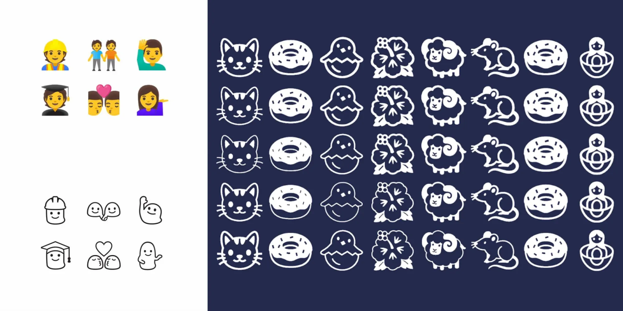
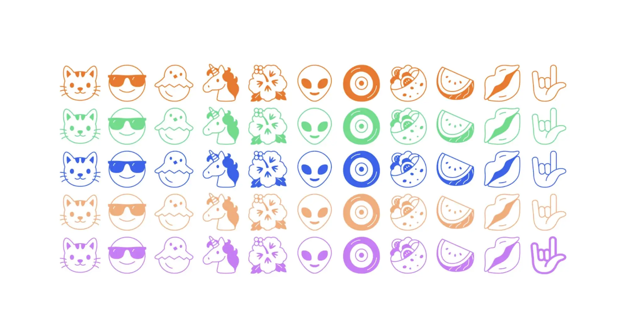
Google has created a new emoji (variable) font with “Noto Emoji,” whose defining characteristic is a black-and-white design that tries to capture the “simplicity” of the format – and also happens to bring back the blobs.
Over time, emoji have become more detailed. Instead of representing broad concepts, there has been a trend to design emoji to be hyper realistic. This wouldn’t be a problem except skeuomorphism’s specificity has resulted in the exclusion of other similar concepts in your keyboard.
Google is bucking that trend toward realism with Noto Emoji by “removing as much detail as possible.” The goal with this set is to make emoji “more flexible, representing the idea of something instead of specifically what is in front of you.” For example, the dance emoji today clearly just represents one form of dancing to the detriment of other types.
Many resulted in 1:1 conversions, but there were several design challenges associated with simplification that prevented Google from just redrawing emoji in black-and-white, especially flags:
You can’t simply convert flags into black and white. You wouldn’t be able to tell the difference between Finland and Sweden. You could redraw the flags but that puts them at risk of being incorrect. Instead, we leveraged the ISO’s country codes. These sequences of letters are unique and represent each country.
Meanwhile, people in Noto Emoji are represented using Google’s blob characters:
Relatable without maintaining a distinction between genders. Google’s blob emoji were really something special. Cute, squishy, and remarkably friendly. We were able to bring back a little bit of what made them special while simultaneously discarding the parts that weren’t working. Most notably, the blobs’ facial expressions were wildly inconsistent but that was very easily fixed in black and white mode.
That said, one modern aspect of Noto Emoji is how it is a variable font with a weight grade that lets characters appear “light” or “bold.” There are also dark and light modes as well as the ability to change text/character color, like all other fronts.
Noto Emoji is open-sourced and available from Google Fonts today. It supports the latest Unicode 14.0 specification with 3,663 emojis in total.
Dynamic Color today is implemented across most first-party Google apps on Android. During the development process, the Material Design team had to reconcile the wallpaper-derived color palette with those that were hard-coded by the application/developer. A recent blog explains the solution Material You arrived at.
Before Material 3 launched to the world, our cross-functional team worked inside Google to understand how teams envisioned their products with the new Material You design language. Several teams raised a challenge with dynamic color: changing colors depending on the user conflicted with products’ chosen colors, which were often semantic and needed to stay static.
Semantic colors are those that initiatively “express conventional meaning,” like how red is associated with stopping/ending. During Dynamic Color’s design process, Google says the “challenges with semantic colors became clear right away,” especially when the wallpaper-generated palette was similar to hues that were manually selected by app developers.
For example, imagine a smart home app where custom colors like yellow, orange, blue, green could be used to intuitively represent concepts like lighting, heating, cooling, and success. These could clash with the user color on the same screen, especially if that color can change.
Google ultimately decided to retain semantic colors but make them closer – either warmer or cooler – to a user’s Dynamic Color. This resulted in a more “harmonious” experience as governed by color theory. A threshold makes it so that a color’s identity remains – “a ‘yellow’ didn’t turn all the way to ‘green,’ and retained its semantic meaning.”
We found that harmonious semantic colors tended to be closer to the user color: semantic colors’ hue numbers were shifting around, making them slightly warmer or cooler. For example, in a blue dynamic scheme, semantic colors like red, orange and green all became cooler, moving closer to the cool hue of the blue user color.
Color is personal and deeply subjective. What one person is drawn to may be off-putting or unusable for another. In Material 3, dynamic color makes apps personal for each user, so apps can adapt to user choices, preferences and needs like expression and accessibility. Dynamic color is one way Material You carries out its ethos of respecting the user.
Dynamic color adapts to each person and upholds the Material You ethos of respecting the user.
When we think about the people in our lives, each has their own unique needs, tastes and relationship with technology. An app’s basic design goal is to be broadly usable and visually capture a company’s brand, which can neglect these unique needs and tastes. Dynamic color addresses this gap and emphasizes the user’s perspective by giving apps a color scheme from the user’s wallpaper.
A Material color scheme provides accent, neutral, and other colors to meet most product needs. Being dynamic, almost all of these colors can change to the user. An exception is the Error color: a red that communicates a failure state when used on an icon or label. We call representational colors like Error, which express conventional meaning, ‘semantic’ colors. Designers often choose semantic colors for their intuitive or cultural associations: think how red is associated with ‘stop’.
‘Semantic’ colors express conventional meaning, and intuitively represent concepts like ‘stop’.
Before Material 3 launched to the world, our cross-functional team worked inside Google to understand how teams envisioned their products with the new Material You design language. Several teams raised a challenge with dynamic color: changing colors depending on the user conflicted with products’ chosen colors, which were often semantic and needed to stay static. For example, imagine a transit app that takes colors from real-world signage or a weather app that uses colors to represent hot and cold temperatures.
This tension presented an opportunity to mature dynamic color—how might Material honor the end-user and product maker with a color system that respects both?
The challenges of algorithmic color
Dynamic color schemes in Material are algorithmic (generated from a set of rules) and derived from the user’s wallpaper.
Material’s new color system is algorithmic. This means that all colors that Material provides are generated from a set of rules, rather than the manual process of hand-picking colors that designers are used to. Even so, designers on the Material team explore colors by hand and evaluate them by eye before turning the colors that we like into an algorithm. This way, we preserve the human touch and sometimes unexpected decisions that create the best visual results.
Material designers also like to work collaboratively with makers using our system, whether that’s a team inside Google or an independent outside team. In this case, we brought together designers from other Google teams in a color workshop. During this, we explored how products’ own colors might fit into dynamic color: a world where the overall color scheme changes, according to the user’s wallpaper.
In a smart home app, specific semantic colors could be used to represent concepts like lighting and heating, which could clash with the user color scheme.
The challenges with semantic colors became clear right away. For example, imagine a smart home app where custom colors like yellow, orange, blue, green could be used to intuitively represent concepts like lighting, heating, cooling, and success. These could clash with the user color on the same screen, especially if that color can change.
Exploring colors by hand
Replacing semantic colors with the user scheme looked pleasing, but made apps that relied on semantic color harder to use.
At first, our designers explored replacing semantic colors with those from the wallpaper-based user scheme, but this made the state of one’s home difficult to parse. We didn’t want aesthetics to compromise giving users an easy and intuitive experience, so we needed to maintain distinguished colors in some way. Knowing this, we explored schemes where different semantic colors appeared visually pleasing and at home under the overall user wallpaper color scheme, largely by manually picking or adjusting them.
The design team needed to maintain different semantic colors while creating harmony in the color scheme overall.
This led to some pretty interesting and provocative color combinations. Ultimately, the most promising examples proved to be those in which the overall scheme appeared harmonious, while semantic colors’ original identity (‘a yellow’), and hence the viewer’s understanding of what they represent (‘lights are yellow’), were retained.
Having just drawn examples, we knew that it was theoretically possible to create color schemes where semantic colors look pleasing rather than clash with user color. But because our color system is dynamic, we now needed to define rules for our algorithm that would create such harmonious schemes given any set of colors, across the whole spectrum.
Finding a solution with the help of color science
First we wanted to understand why these colors were visually pleasing, to uncover any properties they had which could translate into rules. Why does this yellow look more harmonious under this red scheme, while another yellow looks better under a blue scheme?
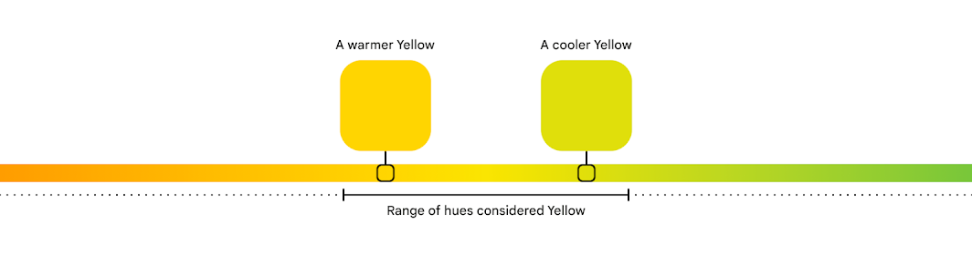
A color can be described by its hue, tone, and chroma.
This harmony can be explained by color theory. For any color, its hue corresponds to one’s perception of it as red versus blue, or yellow versus green (other properties that describe a color include tone, or how light or dark it appears, and chroma, or how vibrant or neutral). Hue is a spectrum that can be drawn like a circle, and ranges on this circle will correspond to what one might recognize as a certain color, like yellow (how people recognize and separate colors is highly influenced by culture).
A particular hue of a color can be considered warmer or cooler, depending on where it is on the spectrum.
Depending on where in this range a particular color falls, it can be considered a warm or cool version of that color. For example, yellows towards the orange hues are warm yellows, while those towards the green side are cool yellows. This idea of color temperature also corresponds to entire types of colors that people visually and culturally perceive as warm or cool. For example, red overall is a warm color, while blue is a cool one.
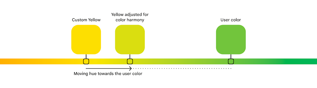
Sets of colors that sit closer together on the hue spectrum can appear more harmonious than those farther apart.
In Material, we quantify hue as a number from 0-360, very much like degrees on the circle. To understand why some colors looked pleasing together, we examined their hue numbers. We found that harmonious semantic colors tended to be closer to the user color: semantic colors’ hue numbers were shifting around, making them slightly warmer or cooler. For example, in a blue dynamic scheme, semantic colors like red, orange and green all became cooler, moving closer to the cool hue of the blue user color.
An algorithm to create color harmony
Material creates color harmony by adjusting custom colors towards the user color for a more pleasing overall scheme.
From this, we realized we could define rules to consistently take a semantic color’s hue and shift it towards the user color, creating a warmer or cooler version with better harmony. With more experimenting, we found a threshold that achieved this color harmony while retaining a color’s identity: a ‘yellow’ didn’t turn all the way to ‘green’, and retained its semantic meaning.
Along the way, our designers learned a lot about the intricacies of color science and perception. And since we’ve added color harmony to our design guidance, the Material Theme Builder and engineering resources, we hope to pass this knowledge on to teams and makers, and enable them to work with color in both beautiful and functional ways.