Back in September 2023, Google introduced an updated wordmark and 3D robot design for Android. That new wordmark is appearing on Pixel devices with the Android 14 QPR3 Beta.
On Pixel devices, the boot sequence starts with the “Google” logo appearing in full color and then a Material You Dynamic Color “G” that animates in. “Powered by Android” then appears at the bottom of the screen.
Starting with Android 14 QPR3 Beta 1 on some devices, “Powered by” is centered (instead of left-aligned) with the updated wordmark that prominently features a capitalized “A” and other tweaked letters. This is followed by the Android head.
As of QPR3 Beta 2, not all devices, like the Pixel Tablet, have been refreshed with the new Android wordmark.
On newer Android devices, like the Honor Magic 6 Pro and Xiaomi 14 Ultra, a 3D version of the head, which appears at the bottom edge of the screen, is used. The Galaxy S24 features the new wordmark.
Meanwhile, QPR3 Beta 2 increases the size of the boot animation as evidenced by the size of the “Google” logo getting bigger when the animation starts.
It’s a shame that this change wasn’t timed with the initial Android 14 release in October, or the Pixel 8 and 8 Pro launch.
Satellite connectivity for smartphones has proven valuable on Apple’s iPhone, but it’s a feature that’s struggling to get out the door on Android devices. This week, though, a new “Satellite SOS” feature has started appearing on Google Pixel phones, and we’ve got a sneak preview of what it will be able to do.
If you dive into Settings > Safety & emergency on a Pixel phone today, you’ll very likely see “Satellite SOS” appear between Emergency SOS and Car Crash Detection. Google, seemingly in an error, has rolled out the setting widely to virtually all Pixel device through a recent update to Adaptive Connectivity Services.
But, right now, the feature doesn’t do anything. Tapping “Satellite SOS” on a Google Pixel device doesn’t open any menus, but it will soon.
Through a rooted Pixel, we were able to access the menu Google is preparing for this feature. The Satellite SOS page explains:
With your Pixel, you can message with emergency services and share your location when you can’t connect to a mobile or Wi-Fi network.
The page explains that you can call or text emergency services, share your location using Google Maps, and answer questions about your emergency. There’s no word if you’ll be able contact anyone outside of emergency services, but Google also details that it will share your name and phone number from your Google account, as well as contact details for up to three emergency contacts.
Google reiterates what details are shared at the bottom of the page:
When you connect with emergency services by satellite, your name, email, phone number, location, device information (IMEI, language, model, battery level), and emergency information are share with emergency services and satellite service providers.
The page links out to a Google support page about what countries are supported by Satellite SOS, but the page unfortunately is not yet live. There’s also a link to a Garmin Search and Rescue Insurance plan. Notably, Google Messages previously showed signs of using Garmin services for satellite connectivity.
There are demos for satellite connectivity, but neither “Try a demo” or “Test real mode” are currently working.
It’s unclear when Google intends to push this functionality live, but the fact that the shortcut is appearing widely on Pixel phones today combined with how fleshed out this behind-the-scenes settings menu is suggests that it’s not too far off.
Qualcomm is following last month’s big announcement with the Snapdragon 7 Gen 3 November 16,2023. The goal remains bringing more flagship features down the chip lineup.
The 4nm Snapdragon 7 Gen 3 has one Prime core (up to 2.63 GHz), three Performance cores (2.4 GHz), and four Efficiency (1.8 GHz). Compared to the 7 Gen 1, Qualcomm touts a near 15% improvement in performance (based on Geekbench 6.1 Single Thread) and an over 50% jump for the GPU (Aztec Ruins 1080p), while offering 20% power savings.
Meanwhile, the AI Engine offers 60% better AI performance per watt, with INT4 precession support new for the 7-series. Qualcomm is also highlighting improved AI-based face detection in regards to challenging scenes and extreme combinations, like glasses and low-light conditions.
Another new addition to the Snapdragon 7-series this generation is spatial audio with head tracking, as well as multi-device Snapdragon Seamless experiences.
On the camera front, Qualcomm explicitly references mentions the Google Ultra HDR image format on Android 14. There’s also continued support for capturing from three cameras simultaneously. An “AI Remosaic” feature lets you “eliminate grainy discoloration for higher-res results” that have more vivid colors
There’s the Snapdragon X63 5G modem for up to 5 Gbps downloads, as well as 5G Dual-SIM Dual-Active (DSDA) in 5G+5G or 5G+4G SIM card configurations. Qualcomm is also touting triple frequency location support for improved accuracy even with a lower-quality GNSS antenna.
Honor and Vivo plan to use the Snapdragon 7 Gen 3, while the first commercial device is set to be announced this month.
With the latest beta updates to Android 14, Google seems to have drastically sped up how fast Pixel devices can install an OTA update. Now, we’re getting a closer look at how that’s been accomplished.
First spotted with Android 14’s QPR2 Beta 1 update, the “Seamless Updates” feature has gotten a whole lot faster on Pixel phones.
Where Google’s updates used to take upwards of 20-40 minutes to install a simple OTA, the new process could be as quick as 10-15 minutes, perhaps even less. It’s extremely impressive and would make anyone wonder how Google pulled it off.
On Twitter/X, APKMirror founder, Artem Russakovskii, discusses a few main points of improvement that seem to be responsible for faster seamless updates. Russakovskii cites “Google’s tests” and Google’s David Anderson (a software engineer working at the company since 2018), but Google itself doesn’t seem to have publically shared this data.
That starts with compression operations, which Android is now parallelizing for a speed boost of 26% in Google’s own tests, Russakovskii explains. OTA updates on Android require the compression of thousands of “small blocks” of data, so putting those operations in parallel certainly speeds things up.
Related to that, Android is now batching operations for those same blocks. Where the OS previously would make 200 separate writes of 4KB files, it now makes a single write of one 800KB file. Google apparently found a 24% reduction in install time with this method.
Finally, the biggest improvement comes in newer Pixels switching from the GZ compression method to the LZ4 method. Google describes LZ4 as “extremely fast compression,” and it certainly shows here.
This apparently results in a 50% reduction in install time but only applies to specific devices. Pixel 7, Pixel 7 Pro, Pixel 7a, Pixel Tablet, Pixel Fold, Pixel 8, and Pixel 8 Pro are the only devices eligible for this new compression method, as older Pixels will stick with the slower GZ method. It’s unclear why this is the case, but it could have something to do with the chip. Mishaal Rahman highlighted on Twitter/X that, when installing Android 14 QPR2 Beta 1, Pixel 8 Pro was taking advantage of Tensor G3’s mid-cores to speed things along, and Google specifically notes that LZ4’s faster compression is “scalable with multi-cores CPU.”.
Google is, according to Russakovskii, changing its guidance for other Android OEMs with this new method in mind, so there’s a chance we could see similar improvements outside of Pixel in the future.
3. Google switched the Pixels (I'm getting clarification on exactly which, but at least P7) to use LZ4 compression instead of GZ. This resulted in a 50% (!!) decrease in install time.
All of these combined take a ~25 min install time down to around 6 minutes.
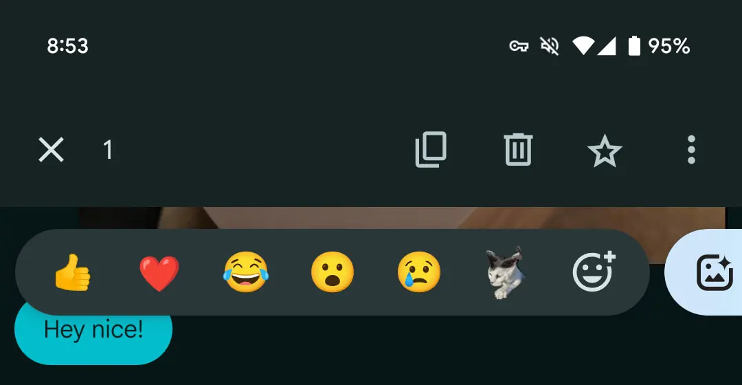
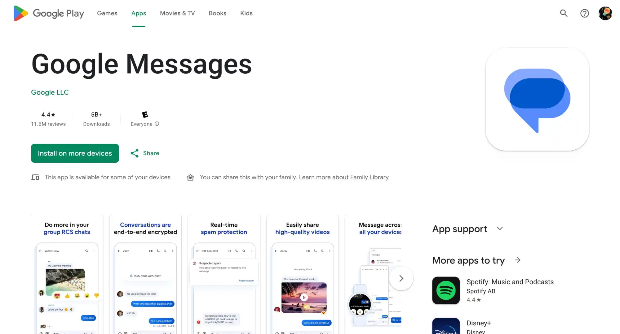
How Google Messages will let you edit recent sends
While we wait for a slew of existing features to roll out, Google Messages is working on the ability to edit what you’ve recently sent.
It’s a staple of modern messaging services at this point. Long-press on a message you sent and a new “Edit” pencil icon — as shown by AssembleDebug — will appear in the toolbar at the top next to copy, delete, star, and overflow. Editing is available to messages sent in the last 30 minutes.
This will place that message in the compose field for you to edit, with a checkmark in place of the send button.
Strings in the latest beta today (version 20240213_01_RC00) indicate that Google will note the “Original message” in addition to what it was “Edited to”:
<string name=”edited_message_title”>”Edited to: “</string>
From what was enabled by AssembleDebug today, something you’ve edited is sent as a new message for those that don’t have the feature active. What could be happening behind-the-scenes is that the receiving Google Messages client is more or less interpreting that edit and seamlessly displaying it to the recipient. This would be similar to how emoji reactions work today with the iPhone.
Meanwhile, this beta also reveals that the double tap gesture will also work to remove a reaction.
Google Messages might be switching to double tap to react
Following the wide rollout of Photomoji a few weeks ago, Google Messages is readying a small change wherein you double tap to react.
About APK Insight: In this “APK Insight” post, we’ve decompiled the latest version of an application that Google uploaded to the Play Store. When we decompile these files (called APKs, in the case of Android apps), we’re able to see various lines of code within that hint at possible future features. Keep in mind that Google may or may not ever ship these features, and our interpretation of what they are may be imperfect. We’ll try to enable those that are closer to being finished, however, to show you how they’ll look in case that they do ship. With that in mind, read on.
Now, you long-press on a text or chat to get the tray of emoji and Photomoji options. The latest Google Messages beta (version 20240208_00_RC00) adds a promo string detailing how double_tap_to_react is coming. This change is not yet live.
It remains to be seen whether you still press and hold to access copy, delete, star, share, forward, and view details from the top toolbar. Divorcing how you react in Google Messages and that menu makes some sense. That said, I’m not sure there will be much of a time savings.
Meanwhile, this beta release renames various Bard strings to Gemini now that the rebrand is live. It would suggest Google is proceeding with this one-to-one chatbot inside Messages.
Google Messages rolls out text field redesign with shortcuts bar [U]
2023 Google Messages is rolling out a redesign of the compose text field that features a dedicated shortcuts bar.
Update 1/30: Over the past few days, this redesign has widely rolled out to the stable channel (version 20240116_01_RC04).
Update 1/27/24: The redesigned RCS and Text message field is starting to appear for those not enrolled in the Google Messages beta.
Compared to the other features announced in late November, Google never detailed this change. At the start of this month, Photomoji and Magic Compose exited beta. (Animated emoji is also widely available.) Other capabilities like Custom Bubbles, Voice Moods with a redesigned recorder, and Profiles are not widely available yet.
Despite the standalone button, the redesigned voice recorder with Voice Moods is not yet rolled out for most users. The same can be said of Custom Bubbles and Profiles.
Original 12/2: Historically, the RCS/Text message field takes up the right two-thirds of your screen and expands to hide the “plus,” gallery, and Magic Compose buttons as you enter more text. At the other end, you get emoji and voice memo shortcuts.
I don’t like it. I like the text box more to the right with the icons on the left. I don’t have this change yet and I’m not looking forward to to. Also, the voice recording button doesn’t work for me and if I tap it then the other buttons on the left like emoji and add picture stop working. It took me a while to figure out that’s why the other buttons weren’t working. I have to close and reopen the keyboard to fix it.
Google Messages is now switching to a left-aligned text field with an emoji button up first. You then get Magic Compose, gallery (which has a new icon), and the plus, which is now on the opposite end. The voice recorder, which is getting thoroughly revamped with Moods, is now its own separate button outside the pill.
As some have pointed out, it’s somewhat odd that the text field is aligned to the left when the messages you send continue to appear at the right.
Meanwhile, when you start typing, there’s a new UI that’s split into two lines. The text field is at the top, while a bar keeps all the shortcuts on the same strip. This makes for a slightly more complex/heavy interface that might take some time to adjust to.
Some users in the Google Messages beta are already seeing this text field redesign with the dedicated bar, but it is not yet widely rolled out, which is also the case with the other functionality Google announced last November 2023.
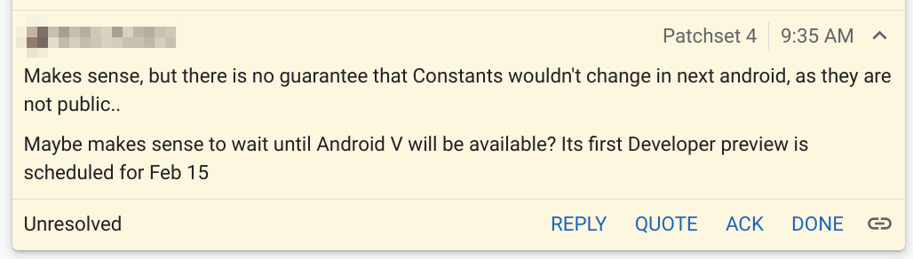
According to a public-facing comment, Google is set to launch its first preview of Android 15 later this week.
In a comment posted to the Android Open Source Project on Tuesday morning, a Google developer said that the first preview of Android 15 is “scheduled for” this Thursday, February 15, 2024. The developer calls it “Android V,” which refers to the release’s internal dessert codename, “Vanilla Ice Cream.”
Maybe makes sense to wait until Android V will be available? Its first Developer preview is scheduled for Feb 15
If the timing holds, the first Android 15 Developer Preview will arrive just over a week after the launch of Android 14 QPR3 Beta 1. Somewhat notably, Android 15’s first preview is arriving later than last year’s preview, which was released on February 8, 2023. By comparison, though, Android 13’s second quarterly update was still being tested at the time.
It’s safe to assume that only Pixel devices will be eligible for the Android 15 Developer Preview, as was the case in years past. Those enrolled for beta updates will likely stay on Android 14 for the time being, as “Developer Preview” releases are typically less stable and not ready for public use.
This Android 15 Developer Preview should afford our first solid look at what to expect from the next annual release of Google’s mobile OS. That said, we have gotten quite a few hints over the last year in the form of features that our APK Insight team has found/enabled that Google has yet to launch. Chief among these is the “Private Space” feature that will allow you to hide and lock certain apps from appearing in your app list.
With Android 14, developers can build share sheets with app-specific actions, and Google Photos is now replacing its custom implementation with a native one.
When sharing an image in Google Photos, a “Sharing image” sheet slides up the screen. “Modify” in the top-right corner lets you select more images to share using a grid.
The first section shows a preview of the selected picture(s) with the pencil icon in the corner launching the Markup tool to quickly crop, add text, draw, and highlight. The carousel below it links to various Google Photos actions, which is what Android 14 makes possible: Create Link, Send in Photos, Add to album, and Create album.
Direct Share targets — which use more signals from apps to improve relevance — appear next, along with frequently used apps. Nearby Share might appear in the first position. Scrolling up takes you to the full grid.
We’re seeing this new share sheet rolled out with version 5.65 of Google Photos today on Android 14 Pixel phones. It’s not yet appearing on large-screen (Pixel Tablet) devices that we checked this afternoon. The share sheet will presumably remain unchanged on Android 13 and earlier.
This follows Chrome, which was a big holdout, also dropping its custom implementation for Android 14 in August.
Google Photos redesign with new Memories feed rolls out
Last August 2023, Google announced a redesign to Photos that revamps the Memories feature, tweaks the bottom bar, and makes other changes. It’s now seeing wider availability in the US.
This redesign starts by moving the “Google Photos” wordmark to the left, while the Print store, Sharing, and your account avatar are at the right.
Sharing in the bottom bar makes way for “Memories,” with Library next and Search being the final tab. (This will certainly disrupt muscle memory.) A similar reorganization is live on tablets, while the “Utilities” tab has been removed from the navigation rail.
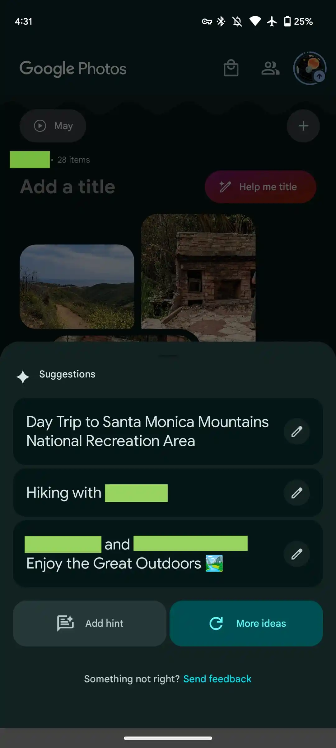
The most significant change is the Memories feed with its scrapbook-like timeline — which is not particularly well-optimized for tablets, as padding is just applied to the left and right — that uses AI for automatic curation and organization. Google aims to let you “easily relive, customize and share your most memorable trips, celebrations and daily moments with your loved ones.”
Users can create memories, which are pseudo albums from an editing and sharing perspective, from a rather tiny FAB (floating action button) that only appears when you scroll down. Meanwhile, generative AI is used to offer “customized title suggestions.” “Help me title” slides up a sheet that lets you add a “hint” to guide the generation.
Google started rolling this out in mid-August, but the revamp is only now seeing wide availability with version 6.54. If it’s not yet live on your device, try using the “Force stop” option on Google Photos from App info. It does not appear to be live on iOS yet.
This Google Photos redesign and Memories feed is coming first to the US and is set for global availability in the “coming months.”
Google Photos gets updated upload UI on the web
A small tweak to the Google Photos website in recent days modernizes the interface for uploading images and videos.
Like before, you can start uploading by dragging files into the window, or by tapping “Upload” in the top-right corner and selecting “Computer” to get a system file picker. Google Drive (pre-Workspace logo) is also still listed, but that’s now joined by “Add from other places,” which can also be found in the mobile app:
Transfer from photo collections: Facebook, iCloud
Transfer from photography services: Pixieset, Pic-Time, image.canon
Digitize physical photos: Photomyne, Capture, CVS
Back up from your computer: Google Drive for desktop
Scan photos with your phone: PhotoScan
The more notable change today is to the bottom-left corner progress UI. When uploading, you’ll get an estimate of how much longer it will take with a blue “Stop” button to end the process. “Show more” will expand this UI to provide a list of what’s in the queue.
Once complete, you just get “Add to album” as the available action, with “Saved album” removed. Overall, the UI is smaller than before.
Meanwhile, the redesigned Google Photos app on Android and iOS has yet to widely launch.
Google Photos Locked Folder sync starts rolling out
Announced at the end of August 2023, the ability to sync the Google Photos Locked Folder across devices signed in to your Google Account is rolling out more widely.
As of this morning, we’re seeing a prompt to “Back up Locked Folder” at the top of Google Photos. (Try Force stop from App info if it doesn’t appear, but this is not fully launched yet.) That takes you to a screen that explains how “Backing up Locked Folder keeps your hidden photos & videos safe when you change devices or delete the app.”
You have the option to “Turn on backup” or “Do not back up,” which keeps the feature unchanged from today. The Locked Folder grid will show a cloud icon in the top-right corner. That menu will let you disable sync at any time.
After turning it on, everything will start uploading to the cloud. Locked Folder can be enabled on a per-device basis. In this case, it appears that previously synced photos will appear on a disabled device, but any additions won’t. A cloud icon appears in the bottom-right corner of image previews in those cases.
Meanwhile, “Locked Folder” appears in the photos.google.com sidebar just above “Trash.” To access, you will have to sign in to your account, including 2-Step Verification (2FA).
This is getting a wider rollout today — photos.google.com/lockedfolder — but it’s not yet fully available. We’re also now seeing Locked Folder with sync in Google Photos for iOS today. Meanwhile, the broader bottom bar redesign and AI-powered Memories is not yet seeing broad availability.
Google did a pretty good job redesigning the Weather experience on Android. It’s modern and has a straightforward layout that shows what’s coming up in the next few hours and days all on one screen.
When you do scroll or select a day, digestible cards note wind, humidity, UV index, precipitation, and more. Meanwhile, Google has kept around the lovable “Froggy” with different backgrounds that reflect the current condition to add a bit of whimsy. It really does keep the app fresh.
Helping power 12-hour precipitation forecasts is a deep learning model called MetNet-3 from Google Research and DeepMind that has so far been on par with Apple Weather/Dark Sky in my testing.
This updated Weather experience is currently available on Pixel, but it will presumably expand to all Android devices going forward.
Before the October rollout to Pixel, the last update to Google Weather came in September of 2021. That redesign used Google’s previous Material Theme design language just as Material You was going live in other apps. It’s embarrassing that it took that long to modernize.
Looking forward, I really hope Google has a feature roadmap in place rather than Weather entering maintenance mode until it’s time for the next refresh. An obvious thing to add next is radar and more widgets to show hourly and multi-day forecasts in a 5×1 size. A broader thing Google could do is bring weather to more first-party apps. It’s already starting to do this with Clocks and Contacts, but I think adding it to Google Calendar with a direct link to the full experience would be very interesting and could help people schedule their days.
One thing that could help with that is separating the fullscreen Weather experience out of Google Search and making it a standalone application. For a long time now, it has been part of the Google app.
The reason behind this is presumably because Google views weather as an extension of Search’s knowledge and information purview. The search engine has a rich experience on the web, as well as the Google app on iOS, which also uses MetNet-3. However, that’s not enough, and I think you need to give people a simple app icon that’s ideally preloaded onto every Android device. Given how good Apple’s Weather app is on iOS, Google really should have a 1:1 competitor.
At the very least, Google needs to drop the Pixel exclusivity for the two widgets available today, as that would make for a much more prominent way to launch weather than the homescreen shortcut that’s badged with the Google icon in the corner.
Samsung is pretty widely rolling out its Android 14 update over the past week, but there’s a slight chance you should wait to actually install it, as it seems Samsung has left out a method that prevents burn-in from the status bar.
Burn-in on smartphone displays was once a major problem, with a few years on the same smartphone often resulting in display elements showing up nearly constantly on the screen. A common trick to prevent this is to slightly shift UI elements so they never stay in the same place too long. It’s nearly invisible to the user, but goes a very long way in preventing burn-in.
In One UI 6 (Android 14), though, it seems Samsung might have left this out.
Users on Reddit noticed that the status bar elements (time, battery, etc) no longer seem to shift over time. This was spotted by comparing screenshots over time, with the status bar elements perfectly aligning. Back in One UI 5 (Android 13), comparing screenshots over time showed that the elements would move a fair bit, resulting in an almost blurred effect when stacking screenshots on top of each other as seen below.
Notably, the navigation bar buttons still move, so Samsung doesn’t seem to have given up on this method entirely.
As for what exactly is going on here, it’s really hard to say. It’s entirely possible that Samsung has just adjusted screenshots to where they compensate for status bar elements moving, or that the company is using a new method for preventing burn-in. It’s also noteworthy that the comparison is made on two different devices – a Galaxy S23 Ultra on One UI 6 and a Galaxy Note 20 Ultra on One UI 5.
In any case, it’s at least a little worrying, and we’ll be curious to see if things change with further updates.
One UI 5 (1st photo) vs One UI 6 (2nd photo)
Samsung posts a new Android 14 update schedule for over 50 Galaxy devices
Samsung’s Android 14 rollout is well underway this week, and the company has now posted an updated schedule for the release, which details over 50 devices set to be updated over the next couple of months.
In Germany, Samsung has posted (as spotted by SamMobile) a new schedule via the Samsung Members app that details over 50 different devices set to get Android 14. The updated schedule shows updates going through February 2024, with the bulk of the work being done in November and December of this year.
Of course, we’ve heard this story before. Earlier this month, a roadmap posted by Samsung in another European country also detailed the company’s plans before being scrubbed from the web. But there are a couple of reasons to believe this latest roadmap is much more accurate. For one, it has far more devices, and it also lacks specific dates, which are always tough to hit. Beyond that, it’s being distributed through the Samsung Members app instead of the company’s forums, and the Members app is where we’ve seen this sort of roadmap released in the past.
Presumably, Samsung will add this same list to other countries in the days to come. It’s not live in the US as of now.
That’s not to say this is a concrete, definitive schedule. It’s still lacking plenty of lower-cost models, and things are always subject to change. But, that said, this is the closest we’re likely to get.
Samsung Android 14 update schedule
Smartphones
Galaxy S23 – Completed
Galaxy S23+ – Completed
Galaxy S23 Ultra – Completed
Galaxy Z Fold 5 – November 2023
Galaxy Z Fold 4 – December 2023
Galaxy Z Fold 3 – December 2023
Galaxy Z Flip 5 – November 2023
Galaxy Z Flip 4 – December 2023
Galaxy Z Flip 3 – December 2023
Galaxy S22 – December 2023
Galaxy S22+ – December 2023
Galaxy S22 Ultra – December 2023
Galaxy S21 – December 2023
Galaxy S21+ – December 2023
Galaxy S21 Ultra – December 2023
Galaxy S21 FE – December 2023
Galaxy A72 – December 2023
Galaxy A54 5G – November 2023
Galaxy A53 5G – December 2023
Galaxy A52 – December 2023
Galaxy A52 5G – December 2023
Galaxy A52s 5G – December 2023
Galaxy A34 5G – November 2023
Galaxy A33 5G – December 2023
Galaxy A23 5G – January 2024
Galaxy A14 – December 2023
Galaxy A14 5G – December 2023
Galaxy A13 – February 2024
Galaxy A13 5G – February 2024
Galaxy A04s – February 2024
Galaxy M53 5G – December 2023
Galaxy M33 5G – December 2023
Galaxy M23 5G – February 2024
Galaxy M13 – February 2024
Galaxy XCover 6 Pro – December 2023
Tablets
Galaxy Tab S9 – November 2023
Galaxy Tab S9 5G – November 2023
Galaxy Tab S9+ – November 2023
Galaxy Tab S9+ 5G – November 2023
Galaxy Tab S8 – December 2023
Galaxy Tab S8 5G – December 2023
Galaxy Tab S8+ – December 2023
Galaxy Tab S8+ 5G – December 2023
Galaxy Tab S8 Ultra – December 2023
Galaxy Tab S8 Ultra 5G – December 2023
Galaxy Tab S7 FE – January 2024
Galaxy Tab S7 FE 5G – January 2024
Galaxy Tab S6 Lite – November 2023
Galaxy Tab Active 4 Pro – January 2024
Galaxy Tab Active 4 Pro 5G – January 2024
Galaxy Tab A8 – February 2024
Galaxy Tab A7 Lite – February 2024
Again, the list here certainly isn’t definitive or all-inclusive, but it offers a much clearer picture of Samsung’s Android 14 update schedule compared to what we’ve had thus far.
End users just called it “Google Messages,” and that’s now the name in the Play Store listing. The new branding is also reflected in yesterday’s blog post:
To celebrate our one billion milestone, Google Messages is introducing seven fun new ways to express yourself when communicating and connecting with other Android users – from shared themes and screen effects to AI-powered reactions.
Before this, the big homescreen redesign paired the four-color “G” with “Messages” in the top-left corner of the app bar.
The application is still just called “Messages” on Android. It remains to be seen whether “Phone by Google” will be getting a similar update to “Google Phone.”
Meanwhile, here’s a look at the upcoming Custom Bubbles feature that we enabled. From a conversation’s overflow menu, you’ll find a new “Change colors” option. Including the default, there are nine themes in total, with the picker providing a preview. The color you or the recipient selects will remain synced. It is not yet widely rolled out for beta users.