Following the last update just over a week ago that did not introduce any new features, Google is rolling out Android 14 Beta 5.1 as another bug fixer.
While Beta 5 was said to be the “last scheduled update” and that the “official release is next,” Google does not consider .1 patches to be milestones. A similar thing happened during last year’s preview cycle.
There are just four fixes with UPB5.230623.005 for Pixel phones and UPB5.230623.005.A1 on the Pixel Fold and Tablet. Notably, Google has disabled the trademark live wallpaper on the Pixel Fold for performance reasons.
Fixed an issue that caused the system to stop detecting a SIM card if Fixed Dialing Number (FDN) features were enabled.
Fixed an issue that caused connectivity interruptions for devices with carriers using 5G standalone (SA) mode.
Fixed an issue for some devices where a blank home screen displayed after unlocking the device.
Fixed a performance issue by temporarily disabling feather-styled live wallpaper on Pixel Fold. The live wallpaper version will be re-enabled after the other underlying issues are fixed.
Android 14 Beta 5.1 with the August 2023 security patch is available for the Pixel 4a 5G, Pixel 5, Pixel 5a, Pixel 6, Pixel 6 Pro, Pixel 6a, Pixel 7, Pixel 7 Pro, Pixel 7a, Pixel Tablet, and Pixel Fold, as well as the Android Emulator.
Ahead of the public launch, Android 14 is getting a Beta 5 for Pixel phones, the Tablet, and Fold. It comes a month after the last major release and is the final scheduled update.
With the official release of Android 14 only weeks away, today we’re bringing you Beta 5, the last scheduled update in our Android 14 beta program. It’s the last chance to make sure your apps are ready and provide feedback before non-beta users start getting Android 14.
GOOGLE
This is the third Platform Stable Android 14 release for final app testing and addresses a number of issues:
Fixed an issue where after unlocking a device using a PIN, TalkBack provides incorrect audio.
Fixed an issue where Wi-Fi scanning was consuming too much battery.
Fixed an issue where some pictures would glitch with extra shadow blocks.
Fixed an issue where in some cases, the fingerprint sensor icon wouldn’t appear as expected.
Fixed an issue where voice over Wi-Fi wasn’t enabled by default.
Fixed an issue on Pixel Fold devices where the device loses antenna ranging session information and cannot recover it.
Fixed an issue where an extraneous white bar would appear in some apps.
Fixed a background color issue with the UI used to add a shortcut to the home screen.
Fixed a launcher issue that was causing frequent crashes and other quality issues.
Fixed an issue on Pixel tablets where user interaction during the transition from screen saver to low-light clock causes a SysUI crash.
Fixed a Pixel Fold issue where tapping would fail to wake the device.
Fixed a Pixel Fold issue where the system buttons would have inconsistent positions after folding and unfolding.
Fixed an issue causing SysUI crashes when removing an app pair in landscape.
Fixed an issue the launcher doesn’t fully render after setup.
Fixed an issue where the system displayed an incorrect mobile connection type.
Fixed an issue where navigating back to exit an app leads to users no longer being able to open the app.
Fixed an issue where wallpaper previews were sometimes blank.
Fixed an issue where the system theme changes from yellow to pink after rebooting.
Fixed an overscroll issue with ScrollView.
Fixed an issue where certain color palettes were difficult to see when the lock screen was activated.
Fixed an issue where users couldn’t enable battery sharing if a work profile exists on the device.
Fixed an issue where a tablet screen inappropriately turns off when docked.
Fixed an issue where the device policy manager was preventing notifications from appearing.
Fixed an issue where group notifications couldn’t be expanded.
Fixed an issue where the lockscreen didn’t properly display the clock.
Fixed various camera issues that were causing crashes and reductions in quality.
Fixed an issue with power consumption during video playback.
Fixed a Weather clock rendering issue.
Fixed an issue where the lock screen customization preview didn’t match the end result.
Fixed an issue that was causing the wallpaper selection screen to crash.
Fixed an issue where Pixel devices weren’t connecting with some routers.
Fixed a toast search result issue where the color was too similar with the background color.
Fixed an issue where tapping a notification before using facial unlock does not open the notification.
Fixed an issue on Pixel Fold where two clocks were displayed at the same time when in widescreen.
Fixed an issue where widgets would overlap and stack incorrectly.
Fixed an issue where closing the PiP window doesn’t stop YouTube playback.
Fixed an issue with switching call audio sources.
Fixed an issue where after unlocking a device, only the background appears.
Fixed an issue with dragging folders to remove them.
Users can submit problems via Android Beta Feedback on Pixel devices. Access it from the app drawer or via Quick Settings to file bugs in the Google issue tracker. There’s also the Android Beta community on Reddit.
Android 14 Beta 5 (UPB5.230623.003) with the August 2023 security patch is available for the Pixel 4a 5G, Pixel 5, Pixel 5a, Pixel 6, Pixel 6 Pro, Pixel 6a, Pixel 7, Pixel 7 Pro, Pixel 7a, Pixel Tablet, and Pixel Fold, as well as the Android Emulator.
Most people will be installing via the Android Beta Program, but you can also flash or sideload. If you need help, here’s our full guide on installing Android 14.
The most important questions to ask about the Apple Watch Series 7 aren’t about the Apple Watch Series 7, they’re about the Apple Watch you may already have.
That’s a gentle way of saying that if there’s nothing wrong with your current watch, there’s nothing in the Series 7 that should compel you to upgrade. If you’ve been waiting for some key features before buying your first Apple Watch.
The Apple Watch Series 7 is great. The larger screen and faster charging are the two headline features and both are welcome. The Apple Watch is in a class entirely of its own right now. Nothing else is as good for iPhone users and nothing like it is available for Android users.
Apple Watch design and screen
The Apple Watch Series 7 didn’t get a major redesign when launched. Instead, it looks almost identical to previous Apple Watches and maintains compatibility with all previous Apple Watch straps, although there are incredibly subtle changes in its overall size and curves.
There are new colour options available, including midnight (which apparently has a hint of blue in it), starlight (a cross between silver and gold), and dark green. Apple sent me the green one and in most light, it just looks grey — but every now and then it’ll pop and look visibly green.
The biggest change is the screen; it’s 20 per cent larger than the last few iterations of the Apple Watch. It does the thing all screen upgrades tend to do: make the older screen with its larger bezels look small.
When Apple first made the screen bigger way back on the Apple Watch Series 4, Some thought it made an appreciable difference in the experience and would even be worth upgrading for. Here, on the Series 7, Some just think the screen is really nice and looks better, but isn’t enough to justify an upgrade.
Apple has kept the always-on screen and says that it is brighter in ambient mode when indoors. That is: the overall max brightness hasn’t changed, but when you’re inside, the screen should look a little less dim.
The other design change on the Series 7 is that it’s more durable. The front crystal on all models is thicker and stronger against cracking. (It’s also more refractive, so you can catch a glimpse of some pixels at extreme angles.) The whole watch adds IP6X dust resistance for the first time and maintains the same water resistance to 50 meters.
Apple didn’t add any new health sensors to the Series 7. It still tracks heart rate and has a blood oxygen monitor and EKG. None of these sensors should be used for diagnostic purposes as the Apple Watch is not a medical device.
Apple Watch charging and battery
Apple is still targeting 18 hours of battery life on the Apple Watch Series 7. It’s enough to get through a day — maybe two if you turn off the always-on screen and don’t work out. In my tests, those numbers are borne out. I need to charge the Series 7 only a little less often than I need to charge my old Series 5 (which is starting to lose its battery capacity a bit).
Wish Apple had done more to improve battery life on the Series 7, especially since this is technically a redesign. Would have even taken the same size screen as last year’s model if it had meant getting longer battery life instead. There’s nothing wrong with the Apple Watch’s battery life, but I do wish that it aimed higher like the new iPhones did this year.
Instead, we got faster charging thanks to a redesigned charging puck that also uses USB-C. Lots of people have those wall adapters but may need to pick up a second one (or a multi-charger) since it’s not included in the box. (As an aside, the actual plug part of the Apple Watch charger is longer now, which Apple says is to manage heat.)
The charging is faster. Apple claims it’s 33 percent faster than the older cable and that sounds right to me. I have been able to juice up 20 per cent in just ten minutes several times and it has been easier to top off to a full charge in the morning while I putter around with coffee and breakfast. It makes it slightly more convenient to use the watch for sleep tracking since it’s easier to fit a quick charging session in.
Still and all, We would have preferred standard Qi charging to faster charging (if we had to choose). Qi charging mats are cheap and plentiful now, but integrating an Apple Watch charger adds cost and complexity. Older Apple Watch chargers will work just fine with the Series 7 but at a slightly slower charging speed.
WatchOS 8
There are a few features in WatchOS 8 that are exclusive to the Series 7, ostensibly because its larger screen makes them possible. The watch can fit just a little more text when reading a message, for example.
The two watch faces custom to the Series 7 are called “Contour” and “Modular Duo.” The former just put numbers out on the edges of the screen and would apparently look bad on screens with larger bezels, while the latter allows you to have two full-width complications stacked instead of just one.
The larger screen also allows for a new text-entry option: a miniature keyboard. You can tap or swipe on it and as long as autocorrect is doing its thing correctly, it works fine. It’s about as good as any smartwatch keyboard I’ve used, but still, others prefer dictating messages via Siri whenever possible.
Those are the Series 7-specific features, but WatchOS 8 has a few more things worth covering. It’s able to auto-detect outdoor bike workouts — and in testing, it managed to do that very well, even when I was hitting stoplights at every block. Wish Apple would make it easier to integrate the Watch’s workout data with cadence or power sensors on a bike, but cyclists are still on their own to figure out how to do that.
Apple says it’s also adjusting your calorie metrics if the watch believes you’re riding an e-bike. There’s no setting for it, it just detects if your heart rate is suspiciously low and your speed is remarkably high as you cruise up a hill. There’s also no indicator in your results if your calorie metrics were adjusted.
WatchOS 8 has a redesigned photos app and lets you send photos directly from the watch. It has an updated “Mindfulness” app with a “Reflect” feature that gives you some kind of prompt to meditate on, like “Recall a challenge you’ve overcome” and “Think about what sparks your creative energy.” As you can probably tell from the unnecessary scare quotes in the previous sentence, I don’t like it. I think meditation is a deeply personal — and for many people spiritual or religious — thing, and so I recoil whenever I see tech companies reducing the practice down to anodyne apps.
I’ve left the best for last: the Apple Watch lets you set multiple timers. You can set them in the timer app. You can set them with Siri. You can use Siri to name each timer. You can see all your timers stacked one after the other. It’s magical. It’s wonderful. It’s hilarious that it took until 2021 to make this happen and even more hilarious that the iPhone itself still can’t do it.
Seriously, though, multiple timers on the Apple Watch are great, especially for cooking. It means I don’t need to stay within earshot of the smart speaker in my kitchen if I’ve got something in the oven.
As what have said this every year for several years now because it’s true every year: the Apple Watch is the best smartwatch for iPhone users, by far. There are fitness trackers that fulfil niches not filled by the Apple Watch like Garmins for more serious athletes or Fitbits for people who want something simpler. But as a general computer-on-your-wrist, the Apple Watch Series 7 is challenged only by older Apple Watches.
If you have one of those older Apple Watches, I don’t think there’s anything here that should compel an upgrade. All the new features are very nice but not necessary. If there is something that’s bothering you about your current watch, then by all means go for it if you can afford it. Also, while the Series 3 is still kicking around for cheap, I don’t think it’s a great buy anymore. The Apple Watch SE is a better value.
There’s no reason that we should have an expectation of major year-on-year updates for the Apple Watch. These smaller iterations might not be what we’ve been hoping for — a big redesign with much more battery — but that doesn’t make the Series 7 bad on its own merits.
It’s a great watch — again, the best smartwatch. If it’s time for you to replace your watch (or buy your first one), you’ll love it. If it’s not time to replace your watch, it’s not time to replace your watch.
Apple released watchOS 9.6.1 for Apple Watch users on Tuesday but without an accompanying iOS 16.6.1 update. A new rumor today suggests that Apple isn’t planning iOS 16.6.1 and is instead planning to jump all the way to iOS 16.7. Simultaneously, Apple has also started ramping up iOS 17.1 testing.
watchOS 9.6.1 addresses a bug in Apple’s Movement Disorder API that had prevented access to that data by researchers and third-party applications.
Typically (but not always), when Apple releases an update for one of its platforms, it releases accompanying updates for other platforms. This is especially true for watchOS, with Apple generally trying to keep lock-step between watchOS and iOS when possible.
That being said, a new rumor today from a previously accurate source on Twitter suggests that Apple is instead planning to jump to iOS 16.7 with its next update. The company reportedly isn’t planning to release iOS 16.6.1.
There’s no word on when Apple might release iOS 16.7 to the public, and the update is not actively being beta tested with developers. Last year, the first and only iOS 15.7 beta was released alongside the final iOS 16 beta. The stable iOS 15.7 update for everyone was released alongside iOS 16 on September 12, with a handful of bug fixes and security improvements.
In recent years, Apple has allowed users to remain on a previous year’s iOS release instead of immediately updating to the new version. For example, Apple actively encouraged users to update to iOS 15.7 rather than iOS 16 on day one last year.
iOS 17.1 testing ramps up
As of right now, there’s no evidence of iOS 16.7. This will likely change as we inch closer to a release sometime next month.
Interestingly, there has been a subtle uptick in iOS 17.1 users on over the last several weeks. iOS 17.1 could potentially add some of the features that aren’t included in the iOS 17 initial release, such as the new Journal app, additional AirDrop improvements, and collaborative playlists in Apple Music.
Last year, iOS 16.1 was released on October 24 with new features including iCloud Shared Photo Library, Live Activities for third-party apps, key sharing in the Wallet app, and more.
Apple releases watchOS 9.6.1 update for Apple Watch users
Apple is rolling out a new software update to Apple Watch users ahead of watchOS 10’s launch in September. Starting today, watchOS 9.6.1 is rolling out with a fix for the Movement Disorder API.
This update includes a fix for an issue that prevents access to motion data for apps that use the Movement Disorder API to track tremors and symptoms associated with Parkinson’s disease.
The Movement Disorder API was first launched in 2018 as a way for developers to offer passive, all-day monitoring via an Apple Watch. The API is able to monitor two common symptoms of Parkinson’s, including Tremors, indicated by shaking and quivering detected by the Apple Watch. The API can also monitor for Dyskinesia, a side-effect of treatments for Parkinson’s that causes fidgeting and swaying motions in patients.
The bug in watchOS 9.6 prevented third-party apps from accessing this data. Apple says the issue has been rectified with today’s release of watchOS 9.6.1.
You can update your Apple Watch by going to the Apple Watch companion app or to the Settings app on the Apple Watch itself. The build number for watchOS 9.6.1 is 20U80.
As of right now, there’s no sign of other updates from Apple, including iOS 16 and macOS Ventura. We’ll be sure to let you know if any other updates are released today.
After years of being the lone option, Samsung finally has some foldable competition in the US, and that partially takes the form of Google’s Pixel Fold, which comes in at the same price as Samsung’s brand-new Galaxy Z Fold 5. But after using both devices, there’s a clear better option.
Galaxy Z Fold 5 vs. Pixel Fold: How they compare on paper
When you look at the spec sheet alone, Google’s Pixel Fold and Samsung’s Galaxy Z Fold 5 are rather similar. Both have 7.6-inch inner displays, plenty of RAM and storage and hinges that are rated for at least 200,000 folds.
The differences really come down to the details. The Pixel Fold has a wider aspect ratio to both of its displays. The 17.4:9 ratio of the outer display is short and wide compared to the Fold 5’s 23.1:9 ratio, which is extremely tall and narrow. The Pixel is also considerably thinner at 12.1mm to the Fold 5’s 13.4mm. Despite that, Pixel Fold also has a bigger battery at 4,821 mAh.
Google Pixel Fold
Galaxy Z Fold 5
Outer display
5.8 inch, 17.4:9 ratio
6.2 inch 23.1:9 ratio
Inner display
7.6 inch, 6:5 ratio
7.6 inch, 21.6:18 ratio
Processor
Google Tensor G2
Snapdragon 8 Gen 2 for Galaxy
Storage/RAM
256GB/512GB UFS 3.1 + 12GB RAM
256/512GB/1TB UFS 4.0 + 12GB RAM
Hinge rating
200,000 open/close
200,000 open/close
Thickness
12.1mm folded/5.8mm unfolded
13.4mm folded/6.1mm unfolded
Battery
4,821 mAh
4,400 mAh
Cameras (rear)
48MP/10.8MP 5x/10.8MP UW
50MP/10MP 3x/12MP UW
Price
$1,799
$1,799
How the two compare, though, really comes down to actually using them.
The Galaxy Z Fold 5 is boring in the best way
If you’ve looked into a foldable before now, you’ve likely looked at the Galaxy Z Fold series. And through that eye, the Galaxy Z Fold 5 doesn’t seem all that new, and that’s because it isn’t. The design of the device hasn’t really changed much at all over the past three years, and compared to the Galaxy Z Fold 4 before it, the Fold 5 really only has a new hinge, and that’s about it.
But the lack of major upgrades in Samsung’s flagship foldable has led to something perhaps more important.
Samsung’s foldable tech has just gotten really, really polished over the past couple of generations. The company has spent its time addressing the little problems, like improving the screen brightness, extending battery life, and improving the hinge, rather than hitting bigger issues like the display crease and cameras. In Samsung’s eyes, it seems, those aspects are “good enough,” where others still need work. And after using the Fold 5 for a few weeks, I mostly agree. The Galaxy Z Fold 5 really just feels like it’s as good as this particular form factor can get without bigger changes. And if you like this overall package, it’s really just a great refined product.
Beyond that, another strength of the Galaxy Z Fold 5 is its software. While One UI is a heavy skin on top of Android, it’s packed with features that are useful on the Fold 5’s bigger display and ones that Google’s cleaner Android build just doesn’t have.
Of course, none of this is to say the Galaxy Z Fold 5 isn’t without its flaws. The tall and narrow outer display isn’t great for typing and doesn’t play very well with some apps. The inner display’s taller nature also means that a lot of apps never trigger a tablet interface, which makes some apps feel less optimized for the form factor.
Pixel Fold is undeniably good – it’s just not as good
That’s why the Pixel Fold falls – death by a thousand cuts.
The Pixel Fold’s downsides really just outweigh the good. The Tensor chip inside is plenty powerful, but it’s prone to overheating very easily, which is a really hard pill to swallow at this price point.
The screens also aren’t nearly as bright as Samsung’s, and Google’s crease isn’t any better either. Samsung’s crease still isn’t good, and it’s very noticeable, but Google’s is wider and thus felt more often.
There’s also the hinge. While I stand by the opinion that the Pixel’s hinge not easily sitting at 180 degrees isn’t a problem, I’ve much enjoyed not having to apply the bit of extra pressure on the hinge when using the Fold 5. It’s just a much more consistent feel. Similarly, the Fold 5’s inner display is much easier to type on because Google’s phone is just way too wide.
Battery life is also another sore point for the Google device. Whereas Samsung’s latest generation has pulled off some kind of miracle by upping endurance significantly compared to the last model, the Pixel Fold suffers from mediocre battery life. Often I find the device struggling to make it through a long day, whereas the Galaxy just seems to keep on chugging along.
Really, the perks of Pixel Fold come down to just two aspects.
Firstly, there’s the aspect ratio. Google’s device has a short and wide outer display that makes way for a very wide inner display. This means that the outside is far more usable than Samsung’s, and the inner display triggers more tablet apps. I still think this leads to too many poor app experiences (like Instagram, Reddit, and so on), but when it works, it just works really nicely.
Google Weather on the Pixel Fold
The other point is, of course, the camera. Google’s Pixel line has built its entire legacy on the camera, and that translates wonderfully to the Fold. The 48MP primary camera takes shots that look great and that, more importantly, I can trust. The Galaxy Z Fold 5 will pump out a good shot now and then, but it’s not consistent enough. Two shots taken back to back can look drastically different, for example. Plus, the Pixel Fold has a much better 5x telephoto camera that absolutely destroys the Galaxy Z Fold 5’s camera setup at range. There’s just no competition there: Google has the way better camera.
Tensor is a real problem in a pricey foldable
Google’s Tensor processor is unique to Pixel phones, and it’s not a terrible chip. It has plenty of power, and Google uses its AI strengths to optimize a few features and the camera experience too. However, Tensor is just not as good as a modern Snapdragon chip.
Tensor tends to overheat quickly and struggles with battery efficiency when on a cellular network, especially if signal is spotty. The Snapdragon 8 Gen 2 in the Galaxy Z Fold 5, though, is as good as it gets in an Android phone. It’s exceptionally powerful and extremely efficient, which leads to great battery life on the Fold 5.
Personally, I’m usually willing to put up with Tensor’s deficiencies because Pixel phones are usually a lot cheaper than the competition, but that’s not the case with the Pixel Fold. Google’s foldable costs $1,799, the same as Samsung’s device, and Google doesn’t offer the same discounts and trade-ins to go with that. Tensor shouldn’t be a deal-breaker for a normal Pixel phone, but it is absolutely a valid killer on the Fold.
Galaxy Z Fold 5 is the better foldable
Where the Pixel’s aspect ratio and cameras are genuine improvements in many ways, the Galaxy Z Fold 5 makes strides where it counts. The screen is brighter and better. The hinge is smoother and tougher. The chip inside is stronger and much less prone to overheating. And there are perks Google just can’t match, like stylus support and a much more fleshed-out accessories ecosystem.
Don’t think it can be argued. Objectively, the Galaxy Z Fold 5 is the better foldable.
But…
Why some still using the Pixel Fold
Despite the Pixel Fold’s many shortcomings, it’s the one some going to keep using. Why? It really boils down to one thing – the camera.
Samsung’s Galaxy Z Fold 5 gets a whole lot right, but its camera is a deal-breaker for me. It’s too unreliable, and as such, I’ve always dual-wielded a Pixel phone alongside a Galaxy Z Fold device for the past three years. But now that I have the option to get a foldable Pixel, that’s what I choose to carry because, most of the time, I only want to carry one device.
Touchscreens haven’t changed much in a while, and that’s because they’re largely quite good. One of the few remaining flaws, though, is that they don’t function quite right when wet, such as when you get caught in the rain. On one of its new devices, though, OnePlus is trying out a new screen that handles touch input when the device is wet.
On Weibo, OnePlus is showing off its upcoming Ace 2 Pro, a midrange smartphone equipped with this new touchscreen. “Rain Water Touch” allows the phone to accept touch input accurately when the screen is also being hit with water, as the video below shows. Most smartphones, such as the iPhone 14 Pro that OnePlus shows in the test, have trouble accurately handling touch when the screen is wet, sometimes ignoring touches entirely and, at other times, leaving them wildly inaccurate.
Why does this happen? Modern touchscreens rely on capacitive tech to detect your finger. This uses electrical conduction to detect when and where your finger hits the screen and does so incredibly quickly. But, when the screen is wet, that detection is impacted because water also conducts electricity. This new design OnePlus is using (presumably from Oppo) is powered by special touch algorithms and a custom chip inside to get around that.
The OnePlus Ace 2 Pro, which is debuting this technology, will launch in China soon, but we certainly hope that this touchscreen tech will make its way to future OnePlus devices sold in other markets in the future.
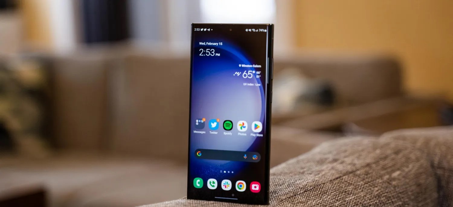
Android 14 itself doesn’t bring a ton in terms of user-facing changes. There’s the arrival of new clock faces on Pixel phones, a bunch of behind-the-scenes changes, and more, but it’s lesser compared to Android 12 and Android 13.
Samsung, though, is bringing more significant changes alongside its Android 14 update.
That does include the new lockscreen changes, with customizable clock faces, but Samsung also lets you move the clock around.
Samsung has also introduced its own take on the Android 14’s media player, as seen above, which has a wavy seek bar.
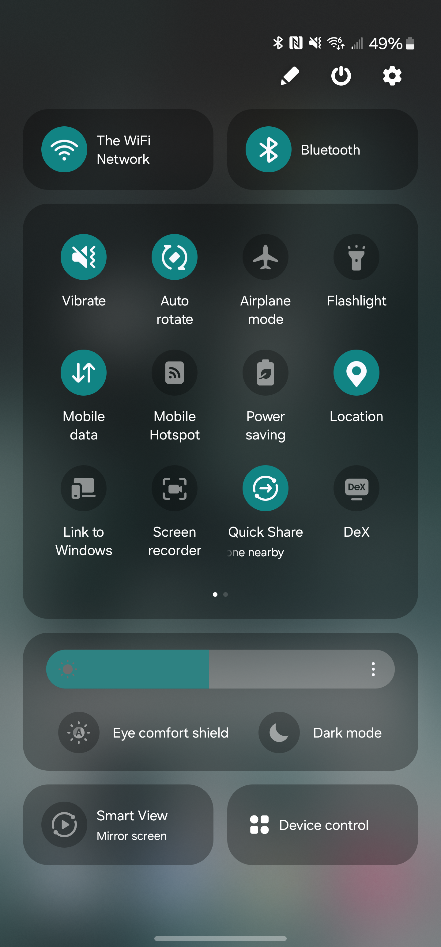
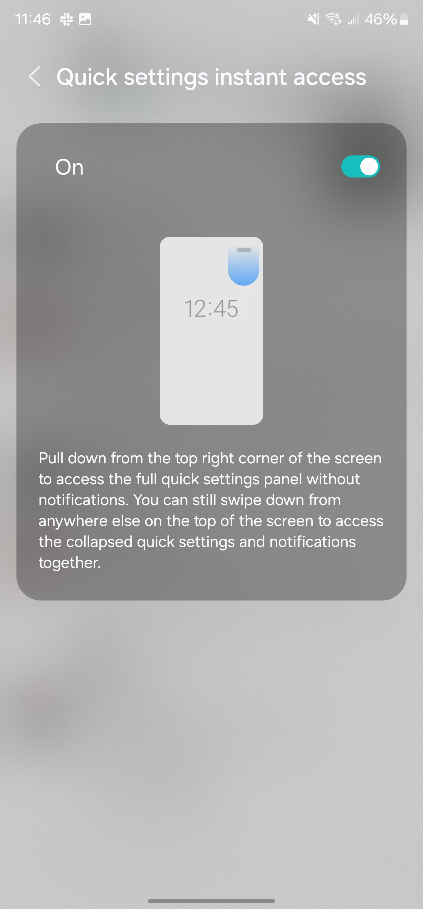
The “Quick Panel” is also significantly updated, with new sections throughout. There are two large cards for Wi-Fi and Bluetooth, a large section for quick settings toggles, and then other sections for brightness, screen mirroring, and device controls. In terms of the look, it’s a pretty shameless copy of iOS’ Control Center, as is the new toggle which lets you swipe from the top left of the display to immediately access the Quick Panel. The notification shade, though, is left unchanged.
Samsung is also further doubling down on widgets. There’s a new camera widget that’s fully customizable. The widget opens up the camera app, but can open it to a specific setting as well as saving the image then taken to a specific album. You can customize the widgets title and background, too.
Another updated widget is for weather, with a new “Weather Insights” widget that can show chance of rain amongst other details.
Perhaps my personal favorite change is that Samsung has updated its default font in Android 14. The new font looks much cleaner and modern as opposed to One UI 5’s font which is a bit too thin. That’s all subjective, though, and Samsung will still let you change your system font.
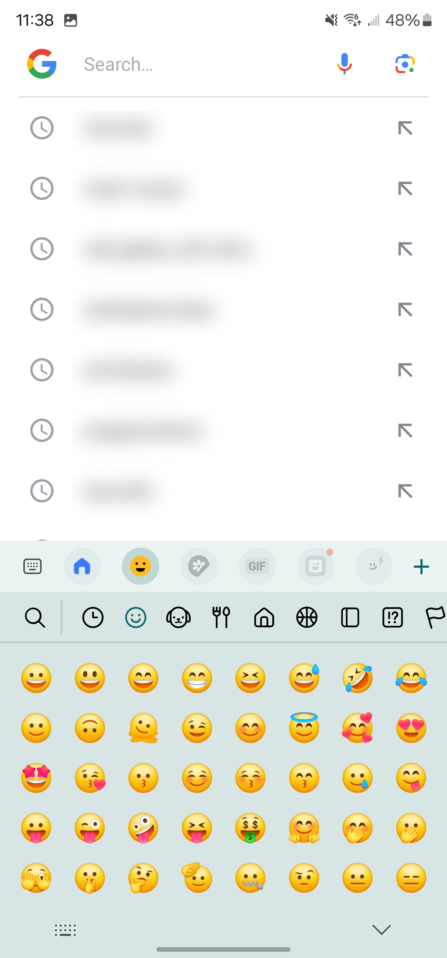
Emojis also get a makeover.
These are some of the most notable changes, but that’s far from everything. Samsung’s full changelog for Android 14 is below with literally dozens of other tweaks and changes that come with One UI 6.0. A few other highlights include:
Level line in camera viewfinder
Resolution settings available in camera viewfinder
“Auto Blocker” security settings
Samsung One UI 6.0/ Android 14 changelog
Quick Panel
New button layout – The quick panel has a new layout that makes it easier to access the features you use most. Wi-Fi and Bluetooth now have their dedicated buttons at the top of the screen, while visual features, like Dark mode and Eye comfort shield, have been moved to the bottom. Other quick settings buttons appear in a customizable area in the middle.
Instantly access the full quick panel – By default, a compact quick panel with notifications appears when you swipe down from the top of the screen. Swiping down again hides notifications and shows the expanded quick panel. If you turn on Quick Settings instant access, you can view the expanded quick panel by swiping just once from the right side of the top of the screen. Swiping down from the left side shows notifications.
Quickly access brightness control – The brightness control bar now appears by default in the compact quick panel when you swipe down once from the top of the screen for quicker and easier brightness adjustments.
Improved album art display – While playing music or videos, album art will cover the entire media controller in the notification panel if the app playing the music or video provides album art.
Enhanced layout for notifications – Each notification now appears as a separate card, making it easier to recognize individual notifications.
Sort notifications by time – While playing music or videos, album art will cover the entire media controller in the notification panel if the app playing the music or video provides album art.
Lock screen
Reposition your clock – You now have more freedom to move your clock to the position of your choice on the Lock screen.
Home screen
Simplified icon labels – App icon labels are now limited to a single line for a cleaner and simpler look. “Galaxy” and “Samsung” have been removed from some app names to make them shorter and easier to scan.
Typeface
New default font – One UI 6 has a new default font with a more stylish and modern feel. You’ll see the new font if the default font is selected in Settings. If you’re using a different font, you’ll still see that font after upgrading to One UI 6.
Multitasking
Keep pop-up windows open – Instead of minimizing pop-up windows when you go to the Recents screen, pop-ups will now remain open after you leave the Recents screen so you can continue what you were working on.
Samsung Keyboard
New emoji design – Emojis that appear in your messages, social media posts, and elsewhere on your phone have been updated with a fresh new design.
Content sharing
Picture and video previews – When you share pictures or videos from any app, preview images will appear at the top of the Share panel to give you one more chance to review the pictures and videos before sharing them.
Extra sharing options – When you share content, additional options may appear on the Share panel depending on the app you share from. For example, when you share a website from the Chrome web browser, you’ll get the option to share a screenshot of the website along with the web address.
Weather
New Weather widget – The Weather Insights widget provides more information about your local weather conditions. You can see when severe thunderstorms, snow, rain, and other events are on the forecast.
More information in the Weather app – Information about snowfall, moon phases and times, atmospheric pressure, visibility distance, dew point, and wind direction is now available in the Weather app.
Interactive map view – Swipe to move around the map and tap a location to view the local weather conditions. The map can help you find weather information even if you don’t know the name of the city.
Enhanced illustrations – Illustrations in the Weather widget and app have been enhanced to provide better information about the current weather conditions. Background colours also change depending on the time of the day.
Camera
Custom camera widgets – You can add custom camera widgets to your Home screen. You can set each widget to start in a specific shooting mode and save pictures in an album of your choice.
More alignment options for watermarks – You can now choose whether your watermark appears at the top or bottom of your photos.
Quick access to resolution settings – A resolution button is now available in the quick settings at the top of the screen in Photo and Pro modes so you can quickly change the resolution of photos you take.
Easier video size options – A pop-up now appears when you tap the video size button, making it easier to see all the options and choose the right ones.
Keep your pictures level – When grid lines are turned on in Camera settings, a level line will now appear in the middle of the screen while using the rear camera in all modes except Panorama. The line will move to show whether your picture is level with the ground.
Apply effects more easily – Filter and face effects now use a dial instead of a slider, making it easier to make precise adjustments with just one hand.
Scan documents easily – The Scan document feature has been separated from Scene Optimizer, so you can scan documents even if Scene Optimizer is turned off. The new Auto Scan lets you scan documents automatically whenever you take a picture of a document. After a document is scanned, you’ll be taken to the edit screen, where you can rotate your document to align it the way you want.
Quality optimization – You can choose between three levels of quality optimization for the pictures you take. Choose Maximum to get the highest quality pictures with the most post-processing. Choose Minimum to reduce the amount of post-processing so you can take pictures as quickly as possible. You can also choose Medium to get the best balance of speed and post-processing.
New Auto FPS settings for videos – Auto FPS can help you record brighter videos in low-light conditions. Auto FPS now has three options. You can turn it off, use it for 30 fps videos only, or use it for both 30 fps and 60 fps videos.
Gallery
Save clipped images as stickers – When you clip something from an image, you can easily save it as a sticker that you can use later when editing pictures or videos.
Enhanced story view – While viewing a story, a thumbnail view appears when you swipe up from the bottom of the screen. In thumbnail view, you can add or remove pictures and videos from your story.
Drag and drop with two hands – Touch and hold pictures and videos with one hand, then use your other hand to navigate to the album where you want to drop them.
Quick edits in detail view – While viewing a picture or video, swipe up from the bottom of the screen to go to detail view. This screen now provides quick access to effects and editing features you can immediately apply.
Photo Editor
Adjust decorations after saving – You can now make changes to drawings, stickers, and text that you’ve added to a photo even after saving.
Undo and redo – Don’t worry about making mistakes. You can now easily undo or redo transformations, filters, and tones.
Enhanced layout – The new Tools menu makes it easier to find the editing features you need. Straighten and Perspective options have been combined in the Transform menu.
Draw on custom stickers – When creating custom stickers, you can now use drawing tools to make your stickers even more personal and unique.
New text backgrounds and styles – When adding text to a photo, you can choose from several new backgrounds and styles to help you get the perfect look.
Calendar
Your schedule at a glance – The new schedule view provides your upcoming events, tasks, and reminders all together in chronological order.
View your reminders in Calendar – You can now view and add reminders in the Calendar app without opening the Reminder app.
Reminder
Refined reminder list view – The main list view has been redesigned. You can manage categories at the top of the screen. Below the categories, your reminders will be shown organized by date. The layout for reminders containing images and web links has also been enhanced.
New reminder categories – The Place category contains reminders that alert you when you’re in a specific place, and the No Alert category contains reminders that don’t provide any alerts. More options for creating reminders: When sharing content to the Reminder app, you’ll get full editing options before your reminder is created. You can also take pictures using the camera when creating a reminder.
Create all-day reminders – You can now create reminders for an entire day and customize the time when you want to be alerted about them.
Samsung Internet
Play videos in the background – Keep playing video sound even if you leave the current tab or leave the Internet app completely.
Enhanced tab list for large screens – When using the Internet on a large screen, such as a tablet in landscape view or Samsung DeX, your tab list will be shown in 2 columns so you can see more tabs on the screen at the same time.
Smart select
Resize and extract text from pinned content – When you pin an image to the screen, you can now resize it or extract text from it.
Magnified view – When selecting an area of the screen, a magnified view will appear so you can start and end your selection at the perfect spot.
Bixby text call
Customize your greeting – You can now edit the greeting that Bixby says when you answer using Bixby text call.
Switch to Bixby during a call – You can switch to a Bixby text call at any time, even if the call is already in progress.
Modes and Routines
Unique Lock screens depending on your mode – Set up different Lock screens with their own wallpaper and clock style for when you’re driving, working, exercising, and more. When you start editing the Lock screen while a mode is on, you’ll edit the Lock screen for that mode.
New conditions – You can now start a routine when an app is playing media.
New actions – Your routines can now do more than ever before. Change your Lock screen, change Samsung Keyboard settings, and more. Smart suggestions
New look and feel – The Smart Suggestions widget has been redesigned with a layout that better aligns with other icons on your Home screen.
More customization – You can now adjust transparency and choose between a white or black background. You can also set apps to exclude from suggestions.
Finder
Quick actions for apps – When an app appears in your search results, you can touch and hold the app to get quick access to actions you can perform using the app. For example, if you search for the Calendar app, buttons for adding an event or searching your calendar will appear. App actions will also appear in search results on their own if you search for the name of the action instead of the app.
My Files
Free up storage space – Recommendation cards will appear to help you free up storage space. My Files will recommend deleting unnecessary files, give you tips for setting up cloud storage, and also let you know which apps on your phone are using the most storage space.
Settings
Smarter Airplane mode – If you turn on Wi-Fi or Bluetooth while Airplane mode is on, your phone will remember. The next time you use Airplane mode, Wi-Fi or Bluetooth will remain on instead of turning off.
Easier access to battery settings – Battery settings now have their own top-level settings menu, so you can easily check your battery usage and manage battery settings.
Block security threats – Get an extra level of protection for your apps and data. Auto Blocker prevents unknown apps from being installed, checks for malware, and blocks malicious commands from being sent to your phone using a USB cable.
Accessibility
New magnification options – Customize how your magnification window appears. You can choose full screen, or partial screen, or allow switching between the two.
Customize cursor thickness – You can now increase the thickness of the cursor that appears while editing text so that it’s easier to see.
Learn more about accessibility – A link to the Samsung Accessibility web page has been added to Accessibility settings so you can learn more about accessibility features and our efforts to make our products accessible to everyone.
One UI 6 will likely be released sometime in November or December, and if last year is any indication, it will probably roll out to many devices very quickly. If you have a Galaxy S23 and want to try it early, though, it’s available now in beta.
One UI 6 is now available to the public in beta form, which means those with certain Samsung Galaxy devices will be able to install the new version of One UI and dive into everything new. Here’s how to install One UI 6 beta on your device.
Samsung’s One UI 6 beta is finally here, open for users to install and take for a spin before the full release a few months from now. Similar to the previous version of One UI, users will be able to sign up for the beta version and receive access to an update that will carry the latest OS to their Galaxy device.
One UI 6 is based on Android 14 and offers some exciting new features. The most forward-facing change is the new adjusted UI, which simplifies the overall look of One UI’s overall design language. The Quick Settings panel is now sectioned off into cards. Individual cards house Wi-Fi, Bluetooth, and Quick Settings controls that feature a 4×3 layout with multiple pages.
The simplified approach is reminiscent of existing Android operating systems like ColorOS from Oppo. It could also be likened to an iOS-type UX with how transparent the cards are to what lays behind the control panel. Either way, it’s a divisive change that will get its fair share of exploration now that a beta version is available.
How to sign up and install the One UI 6 beta
Samsung’s approach to distributing the One UI 6 beta is extremely user-friendly. You simply need to sign up via the Samsung Members app on your Galaxy device and wait for an update to push to your phone. Make sure the Samsung Members app is installed on your device and you have an account set up.
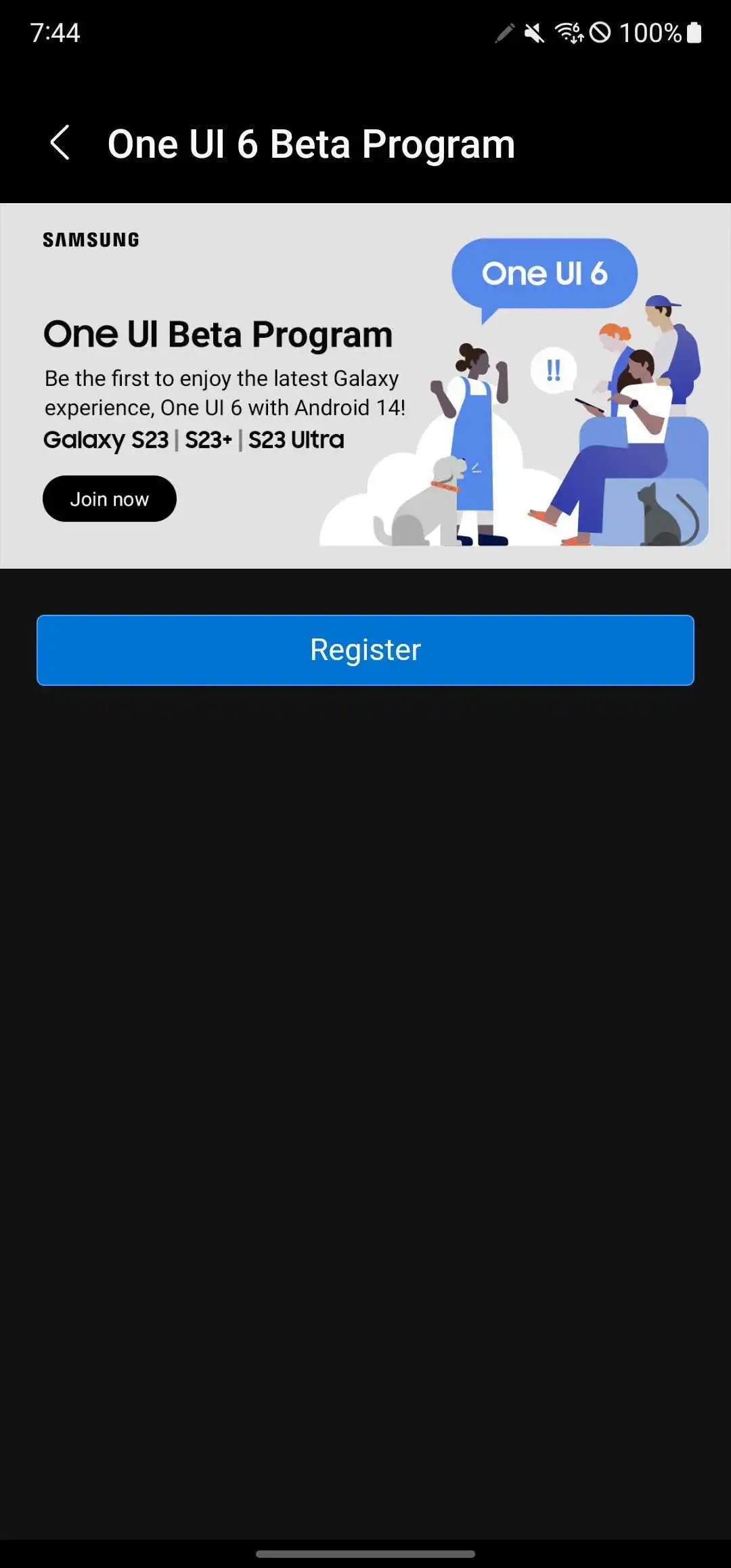
In the Samsung Members app, swipe through the top banner and find the card that reads One UI Beta Program. Tap it.
Tap Register.
Agree to the terms listed by taping Enroll and then Agree.
Note: A pop-up may appear, letting you know you are enrolled.
Head to the settings by swiping down once and tapping the settings cog.
Scroll to the bottom and tap Software update.
Tap Download and install.
Your device will start downloading One UI 6 beta.
Once you finish the above process, you’ll see One UI 6 begin its installation procedure. That generally takes about 10 minutes, with some extra waiting time for the app optimization segment.
Once your Galaxy device is finished, you should be up and running with One UI 6 beta.
What devices are supported?
At this time, there are only a couple of devices supported. Currently, Samsung is limiting the One UI 5 beta to the Galaxy S23 series including:
Galaxy S23
Galaxy S23+
Galaxy S23 Ultra
Samsung may also have plans to bring the beta to more devices down the road, including the Galaxy Z Fold 4, Flip 4, and more.
Where can I use the One UI 6 beta?
Samsung has officially announced that the One UI 6 beta will be available first in just three countries:
United States
Germany
South Korea
This limited list is likely only temporary, though. In years past, Samsung has offered the beta on an almost global scale, and there’s no reason to expect we won’t see it expand in time with this latest iteration.
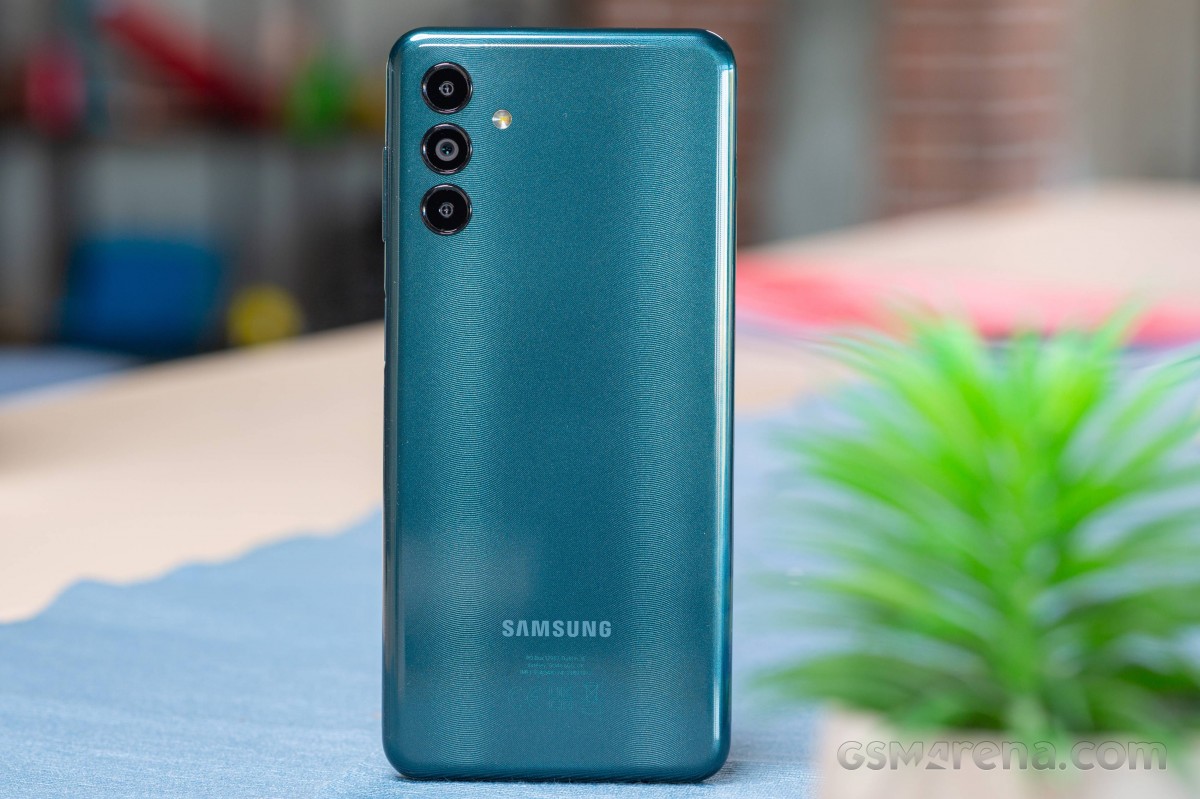
Looking for a Samsung experience on the cheap? The Galaxy A04s is as low as it gets in the Samsung hierarchy. But being inexpensive does not always mean something is good value, so it’s worth having a closer look at this popular entry-level device.
Surprisingly, we also found that Samsung is also offering another model – the Galaxy M13 – which is almost identical with some minor differences in the camera department. The Indian version of the Galaxy M13 is essentially the same phone as the Galaxy A04s but with an even bigger battery. The Galaxy A13 is another phone released earlier this year that almost completely matches the A04s specs.
We won’t blame you if you are confused, but the key takeaway is that the Galaxy A04s probably offers the same user experience as the two M13s. So for all intents and purposes, you can use this review as a reference point for the M13 and M13 (India) as well.
Disclaimer. We can not guarantee that the information on this page is 100% correct.
In any case, the Galaxy A04s runs on a low-end Exynos 850 SoC paired with 3GB of RAM and 32GB of internal storage with a microSD card expansion slot. It’s evident that we are talking about a mid-€100 phone, but we were surprised to see a display with a high refresh rate. The 6.5-inch IPS display is 90Hz, albeit with 720 x 1600px resolution.
Since the Exynos 850 chipset relies on a power-efficient CPU with eight low-power Cortex-A55 cores, we expect great battery endurance in our tests. The 5,000 mAh battery will last you quite a bit, although it will also take more than an hour to fully charge.
Lastly, the device runs on a lightweight version of Samsung’s user interface called One UI Core 4, which in turn is based on Android 12.
Unboxing the Samsung Galaxy A04s
The device ships in a small retail box containing just the user manuals and a pin for the SIM card tray.
Unfortunately, Samsung didn’t include a charger or protective case. But you do get a USB-C to USB-C cable, though.
Competition
An entry-level smartphone, the Samsung Galaxy A04s has simple hardware meant to carry out simple tasks. The phone doesn’t stand out with anything in particular, but you get a decent camera performance in good lighting conditions and dependable battery life. Samsung’s matured, and customizable One UI 4.1 Core is also an advantage, albeit being a toned-down version of the original One UI.
Popular phone manufacturers don’t have that many entry-level models on offer, so in our comparative market research for this review, we found few worthy alternatives. Most competitors in this price bracket, such as the Realme C31, C3 or the C25Y, are hard to recommend due to using inferior Unisoc chipsets.
At the time of reviewing, the Samsung Galaxy A04s has a retail price of around €150 for its 32GB/3GB version. If you are going to use your phone’s camera and messaging features frequently, we’d recommend going for a 64GB model as you would find yourself running out of storage on the 32GB model way before the phone’s warranty has run out.
The Xiaomi Redmi Note 11 falls in the same price category, asking around €160 and running a much more competent Snapdragon 680 chipset along with a standard 4GB/64GB memory configuration. It also impresses with stereo speakers, a 90Hz OLED panel with Gorilla Glass 3 on top, a more versatile camera setup and, of course, faster charging and longer battery life. The Gorilla Glass 3 and IP53 certification against water splash and dust is a nice bonus. It’s hands-down the better smartphone, and the only reason you might want to go for the Galaxy A04s is Samsung’s brand name.
Xiaomi Redmi Note 11 • Realme 9i
If you decide to go up the price ladder by a little, you might want to consider Realme 9i. It asks €170-180, but it’s also running a more capable Snapdragon 680 chip, a better display with higher resolution, faster charging and a nicer selfie camera. Stereo speakers are also on the menu, and Realme’s UI is smoother on the Snapdragon 680 SoC. It may cost a few bucks more, but you are getting a better value for the money.
Now it’s time for some homegrown competition. The Galaxy A04s, Galaxy A13 and Galaxy M13 are priced similarly and have similar hardware and features, with all four having equally sized LCDs and the same Exynos 850 chipset. In fact, the Galaxy A13 is slightly cheaper than the A04s in Europe, while the Indian M13 version is cheaper and at the same time, has a larger 6,000 mAh battery.
There are a few key differences, though, and they do not favor the most recently released Galaxy A04s. The A13 and M13 offer ultrawide cameras, better selfie sensors and higher-resolution displays. Sure, the Galaxy A04s has a 90Hz display, but the frequent lag when navigating the One UI on the underpowered Exynos 850 defeats the purpose of having a smoother display. And in 2022, a 720p resolution screen doesn’t sit well. Additionally, the M13 starts at 4GB/64GB, whereas the A04s settles for a 3GB/32GB standard configuration, which is an inadequate level of storage.
The same goes for the Indian M13 variant – it just makes the A04s obsolete at launch. There’s no reason to go for the A04s when you have an M13 on the shelves.
And then, there’s last year’s Galaxy A13 5G that launched in December 2021. It runs on the twice as powerful MediaTek Dimensity 700 chipset, its base configuration is 64/4GB, and it’s priced at around €170. It’s essentially the same device with more horsepower and support for 5G connectivity, so if you are dead set on getting a Samsung phone, we believe the extra €20 for the Galaxy A13 5G can go a long way towards getting you a better smartphone experience.
Verdict
The Samsung Galaxy A04s is a cheap entry-level device – quite possibly the cheapest Galaxy smartphone you can get. It has a high-refresh-rate screen, an okay primary camera, and very good battery life, so it is a solid upgrade to last year’s Galaxy A03s. Unfortunately, this is hardly enough to tilt the scales in its favor.
The phone’s performance is subpar, and the storage space provided by the base memory configuration is inadequate. It could work for someone who is mainly interested in staying in touch by mostly making calls and the occasional messaging. But for more demanding use cases, we find the A04s hard to recommend. With a low max brightness and low resolution, laggy software experience, and slow charging, there are better options out there – some even coming from Samsung’s own camp.
Pros
Good battery life.
The daylight camera quality is solid, selfies are decent. Video capture is also good, despite the 1080p resolution cap.
One UI 4.1 Core on top of Android 12 is customizable, mature and has plenty of features.
3.5mm jack, microSD, NFC.
Cons
Subpar performance, lag and slowdowns are frequent.
Display is only 720p, while the smooth 90Hz refresh rate is pointless with so much UI lag.
Virtual proximity sensor can be inconsistent, lack of ambient light sensor means brightness adjustment is suboptimal.
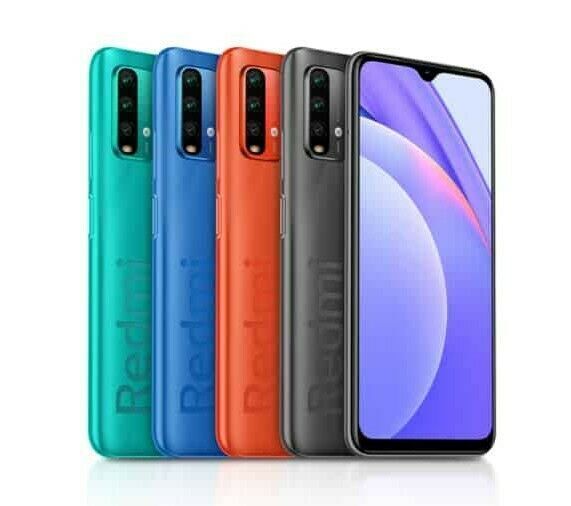
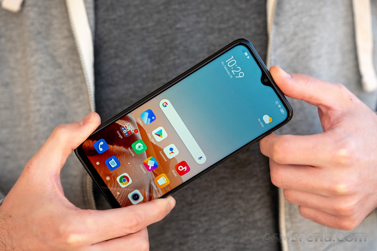
One of the most popular and successful lineups from Xiaomi‘s portfolio is about to make decent sales considering the aggressive price point. This year the Redmi serieswill have unexpected competition from none other than Xiaomi’s own Poco sub-brand. And in the case of the Redmi 9T, we have the Poco M3 in mind.
The two devices are almost identical with just a couple of small differences in the back design and the camera selection. The Redmi 9T adds an ultrawide snapper, an NFC chip (still depending on the region, though) and boasts water-repellent coating. Of course, that means a few extra bucks for the Redmi 9T, which may be worth it if you are looking for those specific features.
Disclaimer. We can not guarantee that the information on this page is 100% correct.
Putting the M3 aside, the Redmi 9T still looks like a solid entry-level solution for just around €150. The phone’s standout features include its stereo loudspeakers, the 48MP main camera, the ultrawide unit, the huge 6,000mAh battery, and the water-repellent coating of the internals. They are definitely hard to come across in this price segment, especially altogether in a single handset.
Memory configurations are also generous as the phone starts at 4GB/64GB, and a dedicated microSD card slot (not shared) can bump up the storage if 64GB isn’t enough for you. The chipset, on the other hand, is pretty much what you’d expect from a device in this price bracket – Snapdragon 662, which was announced a year ago and is built with not performance but power-efficiency in mind.
We already have a good idea of what to expect from the Redmi 9T given that we’ve reviewed the Poco M3, but we will make sure to assess the small upgrades over the M3 and if they make up for the price difference.
Unboxing the Xiaomi Redmi 9T
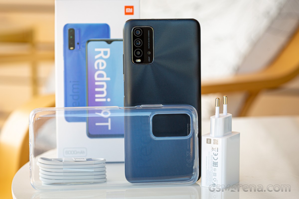
The handset comes in a standard box with the usual user manuals, USB-A to USB-C cable for charging and data transfer and a charging brick rated at 22.5W but the phone caps at 18W. Xiaomi often ships more powerful bricks for its budget phones because it’s cheaper to manufacture one charger that can cover more models.
The box also contains a transparent silicone case for the phone which we found to be quite hard to put on. The phone fits snuggly in it.
Competition
Depending on where you are based, the low-end smartphone market could be full of choices, or it could be quite limited. But there are some mainstream offerings that stand out from the crowd and can challenge the Redmi 9T, which shapes up to be an excellent all-rounder for the asking price. The Poco M3 was a great all-rounder back in December last year, but the smartphone market moves fast, so we have a couple of new competitors to go through.
Obviously, the first alternative to consider is the Redmi 9T’s close sibling – the Poco M3. The latter packs pretty much everything the 9T has but misses on the NFC chip and the ultrawide camera. As we’ve already established in the review, the ultrawide camera might not be worth the extra cash the 9T wants, but if the NFC chip is on top of your priority list for its use for contactless payments, the 9T is the only choice.
Keep in mind that the Redmi 9T sells for around €140 while the Poco M3’s price has gone down quite a bit since December 2020, so it would now set you back just €120.
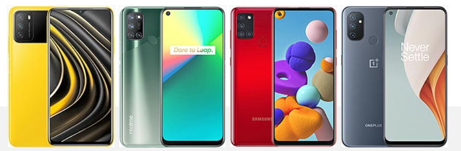
Xiaomi Poco M3 • Realme 7i • Samsung Galaxy A21s • OnePlus Nord N100
A very close competitor from Samsung’s camp would be the Galaxy A21s. It hovers between the €150-160 range and offers comparable hardware. Its main advantage is the overall camera performance and the fact that it runs a more familiar One UI software. Even though battery life is excellent, it falls short compared to the 9T’s huge 6,000 mAh unit. Xiaomi’s contender also has excellent loudspeakers, a higher-res screen, reverse charging, snappier chipset and offers twice the base storage and RAM.
The Realme 7i is a viable option as well, given its aggressive pricing and similar hardware. And despite the Realme 7i being pricier (€160-170), it lacks the 1080p+, 90Hz display, stereo loudspeakers, and has a considerably smaller 5,000 mAh battery. Also, the 7i misses on some nifty goodies like NFC, infrared port and FM radio.
Lastly, the OnePlus Nord N100 may seem a bit pricey for this list with a starting price of €189, but you can find one for way less outside of OnePlus’ official web store. We’ve seen a couple of offers for around €140 brand new. This puts it in a competitive position against the Redmi 9T. Even with an inferior Snapdragon 490, the handset offers an arguably smoother experience with its 90Hz display, which in turn has a lower resolution at 720p.
The clean-ish Android could be a deciding factor for some, while the smaller battery can be a deal-breaker to others. Still, the Nord N100 is the only handset in this price range that also offers dual stereo speakers, NFC and FM radio all at once. The good news is that the NFC chip isn’t market-dependent.
Verdict
Despite the relatively higher price of the Redmi 9T compared to the Poco M3, it still holds well against the competition due to several key features that are hard to come across in a single package. We are talking adequate SoC performance, 4GB/64GB base memory, an excellent set of stereo speakers, a high-resolution display, humongous 6,000 mAh battery, IR port, FM radio and dedicated microSD card slot.
Yes, some of the devices top the Redmi 9T with a better overall camera quality or smoother 90Hz displays, but if you find yourself in this price bracket, you are most likely looking for the most practical features, and the Redmi 9T seems to touch all bases. High refresh rate displays are nice, but they also belong to higher-class devices.
Pros
Large 6.53″ screen with 1080p resolution
Standout design
Record-breaking battery life
Excellent stereo loudspeakers
Generally good main camera performance
Standalone microSD, IR port, FM radio, reverse wired charging and NFC (market-dependant)
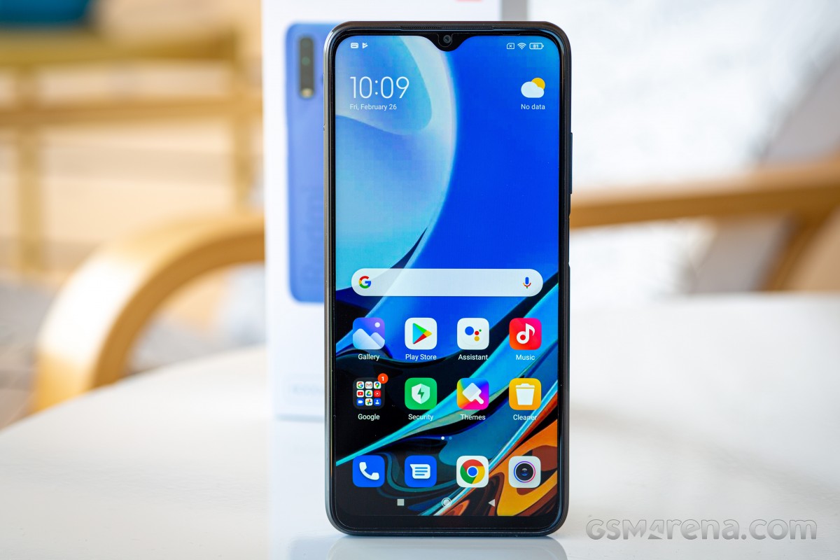
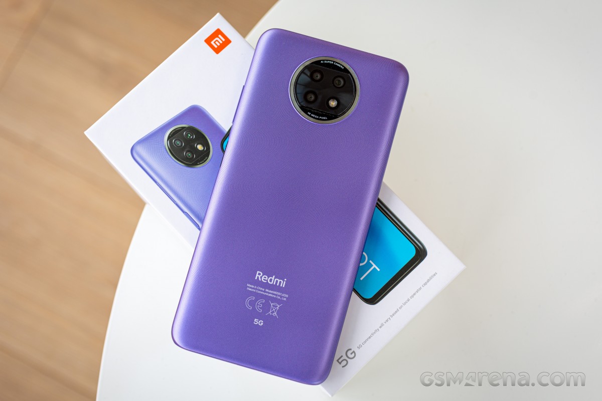
The Redmi Note 9T is a slightly toned-down version of the China-exclusive Redmi Note 9 5G. It is already available in Europe, with an extremely-competitive €199 “early-bird” special price and a regular MSRP promised to start at just (based on 2021 price launch ) €229 for the base 4/64GB version and go up to €269 for the 4/128GB one.
The Redmi Note 9T is clearly crafted to cater to the emerging budget 5G niche on global markets. Its priorities are clear, and they definitely required some other specs and feature sacrifices along the way. And that’s perfectly understandable.
Not every phone needs to be a universally beloved budget offer like Xiaomi‘s Poco line. There is value in catering to specific needs and interests, like the current 5G trend, while still sticking to a strict budget. Plus, specs nitpicking aside, the Redmi Note 9T manages to deliver a well-rounded and competent modern smartphone experience.
Disclaimer. We can not guarantee that the information on this page is 100% correct.
While the Redmi Note 9T price tag falls squarely in the budget territory, it is important to put it into proper context. Some aspects of the Redmi Note 9T’s spec sheet range from merely OK (such as the unassuming 60Hz LCD panel with wide bezels and a sizeable punch-hole selfie cam) all the way to disappointing (like the effectively single usable main camera).
Clearly, the Redmi Note 9T is not the best value proposition around. You can get a better display, better raw performance or a distinctly better camera setup, or even a combination of these, all while still staying within a €250 budget. Getting 5G connectivity for that kind of money outside of China, however, is still tough.
MediaTek has been working overtime to make 5G more affordable, most notably with the introduction of its 5G-equipped Dimensity line of chipsets. The future looks bright in camp Qualcomm as well, with recent announcements, like the Snapdragon 480. For the time being, however, it’s silicon like the Dimensity 800U inside the Xiaomi Redmi 9T that has 5G enthusiasts excited as MediaTek’s affordable 5G hardware is finally trickling out of its domestic market.
Unboxing the Xiaomi Redmi Note 9T
Let’s kick things off by unboxing the phone. After all, in light of recent developments regarding bundled phone chargers and an ever-shrinking accessory kit in general, we are kind of anxious to see the inside of a Redmi box in 2021. Thankfully, the Redmi Note 9T arrives with a few goodies in tow.
You get a wall charger. In fact, one that is rated for 22.5W (5V@3A, 9V@2.23A, 10V@2.25A, 12V@1.67A) of Quick Charge 3+ output – more than the 18W the Redmi Note 9T can charge at. Xiaomi basically decided to standardize its basic chargers at one point, and now, many of its devices get the same wall adapter in the box. Less variation means lower overall production costs.
The bundled USB-A to USB Type-C cable is nothing special, yet still feels sturdy and thick enough to last. The same goes for the included clear TPU case.
It’s great to see that you are basically all set to start using the Redmi Note 9T straight out of the box.
The competition
With a regular MSRP of €229 ( based on the 2021 launch year price ) and n even lower “early-bird” special of €199 for the base 4/64GB version, the Redmi Note 9T falls nicely into the budget smartphone category. However, the key thing to remember is that the main angle Xiaomi seems to have for it is ‘delivering 5G on a budget’. While there is certainly value to that, and we have no doubt affordable 5G is a desirable thing for certain users, the Redmi Note 9T doesn’t necessarily constitute the best universal value offer out there.
Far from it, in fact. Cramming trendy 5G clearly meant sacrificing a few hardware bits here and there. Looking at the Chinese Redmi Note 9 5G as sort of the base from which Xiaomi derived the Redmi Note 9T for international markets on a budget, the lack of an ultrawide camera on the latter instantly sticks out. That and an unfortunate downgrade in charging speed to 18W. Then again, international uses do get NFC and an FM radio as a bonus. But, we digress. The main point we are trying to get across is that unless you really care about procuring 5G on a budget today, there are objectively better ways to spend €250 or less on a phone and get more value.
In fact, we don’t even have to look outside Xiaomi’s own lineup to find some great contenders. The Poco X3 NFC basically beats out the Redmi Note 9T in every aspect, except for 5G. In no particular order, it has an aluminum frame; 120Hz HDR10 display; more-powerful Snapdragon 732G chipset; more RAM at 6GB; a 64MP main camera and a 13MP ultrawide; a 20MP selfie cam; and 33W charging for its slightly-larger battery. We might even be missing a few points in the list, but you get the idea.
Xiaomi Poco X3 NFC • Xiaomi Poco M3 • Xiaomi Mi 10i 5G
And in case you think that some of these specs are a bit superfluous for your needs and you would rather save a few bucks instead (not that many, unfortunately, as per current market pricing), you can always go for the newer Poco M3 instead. From a hardware standpoint, it comes really close to the Redmi Note 9T. One big potential reason to choose it is the extra battery endurance. It scored 154 hours of endurance in our review, thanks to its larger 6,000 mAh battery and despite the less-efficient 11nm Snapdragon 662 chipset.
If you are really after 5G, though, we would be remiss not to mention the Xiaomi Mi 10i 5G. Just like the Poco X3, it has plenty of goodies to outshine the Redmi Note 9T: Gorilla Glass 5 on the front and back; 120Hz, HDR10 display; 6GB of RAM and 128GB of storage in the base model; 108MP, f/1.8 main camera and an 8MP ultrawide; 16MP selfie cam; and 33W charging. It is based on the Snapdragon 750G – one of Qualcomm’s answers to MediaTek’s Dimensity line. All of that with an MSRP below €250.
Unfortunately, there is one major caveat – the Mi 10i 5G was announced as part of the Make in India initiative and is currently only being sold there. Hence our hesitation in bringing it up more often while discussing the Redmi Note 9T as an international market offer. If Mi 10i 5G ever escapes the county’s local shelves, that competitive price likely won’t be joining in on the journey.
Venturing outside Xiaomi’s ranks, there are plenty of solid competitors to fit inside a €250 budget, as well. Samsung has been saturating that same bracket extensively lately. For that kind of money, you can definitely get some quality-of-life goodies like an AMOLED display, with devices like the Galaxy A51 and A31 being quite popular in our database at the moment. Our current pick out of this lot, however, would be the Galaxy M31.
Now that the M31s is out and rocking a higher price tag, the M31 is depreciating nicely and is quite attainable. Some of its highlights, aside from the 6.4″ AMOLED display, include 6GB of RAM in the base tier, a 64MP main and 8MP ultrawide camera, 4K@30fps video capture, 32MP selfie snapper and a huge 6,000 mAh battery.
If you want to keep things even cheaper, though and don’t mind a PLS IPS display, something like the Galaxy A21s currently offers great value. You still get both a 48MP Quad Bayer and an 8MP ultrawide from it, plus a beefy 5,000 mAh battery. All well under the €200 mark.
Since this is far from an exhaustive competitors list and we feel like we have to balance the “heavily-skinned” Android experience crowd in the Xaiomi’s and Samsung’s a bit, why not consider the OnePlus Nord N100. We can’t necessarily say it’s better than the Redmi Note 9T, but it does offer a distinctly different take on the budget formula. One that includes a 90Hz IPS panel, big 5,000 mAh battery and, of course, the much-beloved OxygenOS.
verdict
Xiaomi seemingly had a specific goal in mind with the Redmi Note 9T – modern 5G connectivity on a budget. In fact, that goal is obviously shared by its close Chinese sibling in the Redmi Note 9 5G, as well. With the small caveat that hitting international markets meant making a few compromises on the Redmi Note 9T specs to stay within budget. Namely, dropping the ultrawide camera and reducing the fast charging speed. That’s on top of sacrifices that are inherent to cramming 5G support into a budget phone.
Since an increasing number of big-name players on the mobile scene are doing it and even before that, chipset makers like MediaTek, Qualcomm and Samsung and developing the silicon to allow for precisely such a breed of products, there is clearly a market niche present. If the concept appeals to you, then you can rest assured that Xiaomi managed to build a very competent and dependable budget 5G phone in the Redmi Note 9T.
While not impressive in any way, all the core aspects of the Redmi Note 9T experience, like the display and performance, are solid and perfectly adequate. Xiaomi has even managed to throw in some goodies, like a decent hybrid stereo speaker system, 3.5mm jack, IR blaster, NFC, and an FM radio.
Some compromises were made in the camera department, but even so, the Redmi Note 9T makes great use of the hardware that is present and produces surprisingly good shots.
Battery endurance is solid all-around, proving that the Dimensity 800U can truly deliver next-gen connectivity while going easy on the juice.
And you do get truly versatile connectivity, including dual standby support for two concurrent 5G connections, plus a dedicated microSD slot, as icing on the cake.
If, however, 5G is not high on your priorities list for now, there is undoubtedly better “non-5G” smartphone value, for lack of a better term, to be had by shopping around and the Redmi Note 9T shouldn’t be your first choice.
Pros
Solid build quality with water-repellant coating
Great all-round battery life
Good photo quality, good portraits, great selfies
Decent 4K video capture and great EIS at 1080p
The MediaTek Dimensity 800U offers adequate and consistent performance
IR blaster, NFC, 3.5mm jack, dedicated microSD slot, FM radio
Cons
Thick screen bezels, larger punch hole, slight ghosting – it’s a budget display here
No ultrawide camera
Launches on Android 10 half a year after Android 11 was released