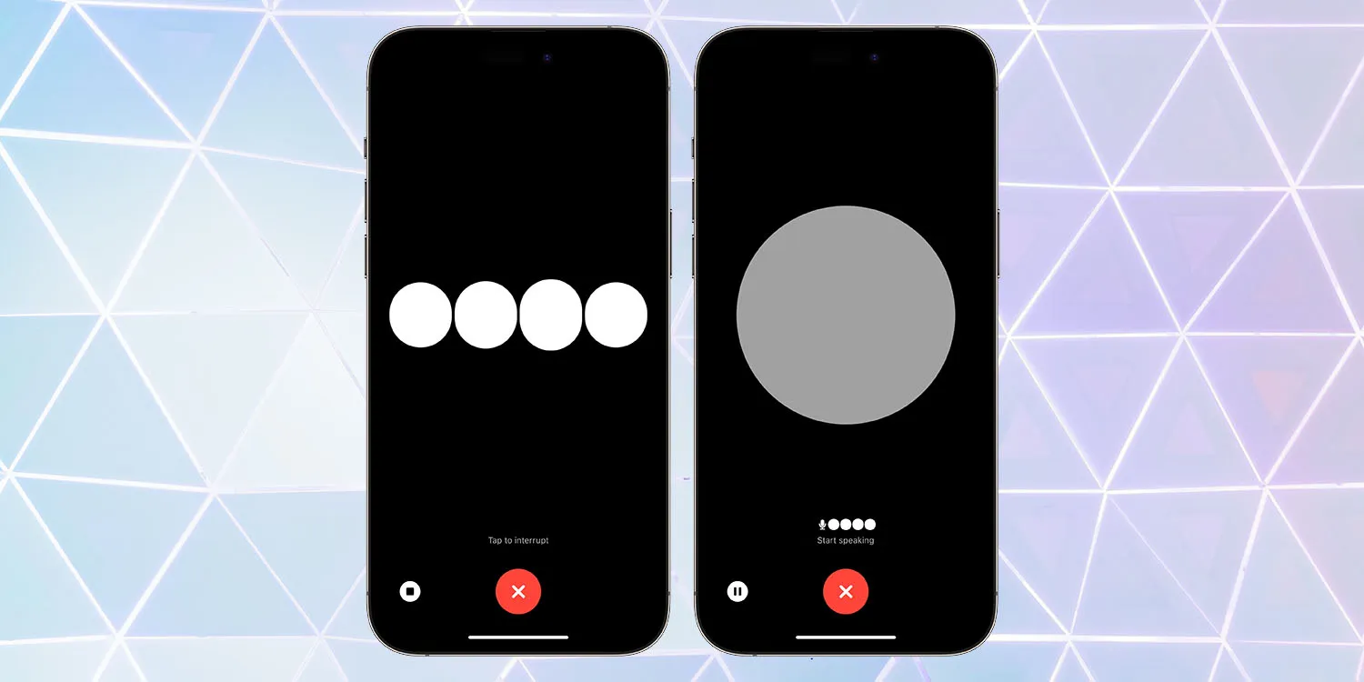
Amid all the OpenAI drama, the team has still been doing some work, it seems! The company’s newly-reinstated co-founder Greg Brockman has just tweeted that ChatGPT Voice is rolling out to everyone, not just paying subscribers …
OpenAI has announced that it is releasing a dedicated iPhone app for its ChatGPT service. The app, which is available via the App Store, gives users the ability to use ChatGPT through a native app on their iPhone. The app is free to download and includes no ads. It’s currently only available in the United States, but OpenAI says availability will expand “in the coming weeks” […]
The app will also sync your ChatGPT history across all your devices, including the web. It also includes support for Whisper, OpenAI’s open-source speech-recognition system. This integration with Whisper enables voice input for the ChatGPT app on iPhone. The ChatGPT app is also completely ad-free.
At that time, you could use voice to ask questions, though there wasn’t any real benefit in doing so over using the iPhone’s built-in keyboard dictation feature, and answers could only be displayed on-screen.
Shortcuts and Siri support was added in July.
ChatGPT Voice
Two-way voice interaction was later launched, but only for paying subscribers. The company now says it is available to all, with Brockman urging people to try it.
ChatGPT Voice rolled out for all free users. Give it a try — totally changes the ChatGPT experience.
You can choose between five different voices.
ChatGPT Voice rolled out for all free users. Give it a try — totally changes the ChatGPT experience: https://t.co/DgzqLlDNYF
I found I had to delete the app and then re-install it from the App Store to get the update. Please be careful if you need to do the same, as there are many scam apps which come up in a search for ChatGPT.
It’s also worth noting that demand for the feature is apparently extremely high, as I’ve experienced long delays at the ‘connecting’ stage, and some failures.
The charging situation for the iPhone 15 and iPhone 15 Pro this year has changed. Apple’s proprietary Lightning port has been replaced with USB-C, so now you can charge your phone with almost any USB-C cable and USB-C power adapter that you can find online. But what exactly do you need to make sure you can charge your iPhone battery as fast as possible?
As USB-C is an open standard, you can use pretty much any USB-C cable you can find. The iPhone 15 comes with a nice woven braided cable in the box, but you can use any USB-C cable you can find — including those marketed as ‘Android’ phone cables. However, if it seems like your iPhone is charging slowly, you probably need to change your charging brick.
Back when Apple included accessories in the box, the iPhone came with small 5-watt power adapters. As they were included with the iPhone for such a long time, there are lot of these still out in the world. If you have one of these, it is perfectly safe to use with iPhone 15; you just need a USB-C to USB-A cable to plug in.
However, it will only charge your phone at 5W speed. This was fine when the battery capacities of smartphones was much smaller five years ago, but the iPhone batteries are much bigger these days. As a result, charging at 5 watts can take four or five hours to go from zero to 100%. It is slow.
Fast charge iPhone 15
To fast charge iPhone 15, you’ll need a higher wattage charging brick. The iPhone USB-C port can technically receive power up to 27 watt speeds, but practically speaking there are diminishing returns on charging speed above ~20-watts. So, with a USB-C cable and an Apple 20 W USB-C power adapter, you can charge the iPhone 15 from zero to 50% in about 30 minutes, and from zero to 100% in under 2 hours.
However, you aren’t limited to using Apple accessories. Plenty of higher-wattage USB-C charging options are on the market that are more convenient than Apple’s adapters, like this dual USB-C compact charger from Anker. It is also perfectly safe to use power adapters that are rated higher than 20 watts; they will automatically charge your iPhone at the maximum speed that it supports.
For example, this means if you have a USB-C MacBook power adapter, you can use that and charge your phone at full speed too. If your MacBook itself is plugged into power and charging, you can even connect your phone into one of the laptop’s USB-C ports and charge at near-full speed.
In fact, USB-C means that you can now fast charge all of your Apple devices with the same cable and 60-watt (or higher) MacBook power adapter.
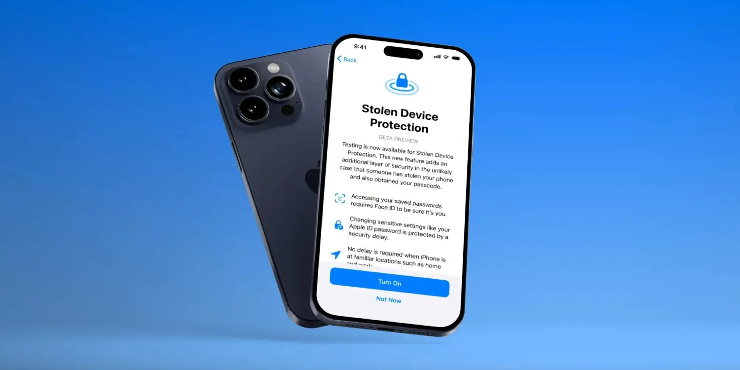
Want to try out the latest iPhone security feature – Stolen Device Protection for iPhone? Read along for how to install iOS 17.3 beta for free, as well as where to turn on the new iPhone protection that requires biometric authentication and more.
Apple has made the first iOS 17.3 beta available for both public and developer testers.
The major new feature to arrive with the test software is Stolen Device Protection for iPhone. It adds a layer of security for your Apple ID and more in the rare event your iPhone is stolen and your device passcode is also compromised.
After you follow the steps below to install the free iOS 17.3 public or dev beta, you’ll be able to:
Open the Settings app.
Swipe down and tap Face ID & Passcode (or Touch ID & Passcode).
Now choose Stolen Device Protection.
How to install iOS 17.3 beta – public
Make a fresh backup of your iPhone or iPad.
You may need to sign in with your Apple ID at beta.apple.com if you haven’t before.
Launch the Settings app on your iPhone or iPad (running at least iOS 16.4).
Tap General > Software Update.
Choose the new Beta Updates button (it may take a moment to appear).
Now, choose iOS 17.3 Public Beta.
If you need to change your Apple ID associated with the beta, you can tap that at the bottom.
Choose Back when done.
Look for iOS 17.3 Public Beta to appear; choose Download and Install.
If you’re not seeing the option to turn on beta updates or iOS 17.3 appear:
Try quitting and relaunching the Settings app.
Double check you’re running iOS 16.4 or later. (If not, you’ll need to update before getting the in-Settings beta option.)
Sign in with your Apple ID at beta.apple.com for free, then try the above steps again.
How to install iOS 17.3 beta – developer
A paid Apple Developer account is no longer needed – but you may need to sign in with your Apple ID at developer.apple.com if you haven’t before.
Make a fresh backup of your iPhone or iPad.
Launch the Settings app on your iPhone or iPad (running at least iOS 16.4).
Tap General > Software Update.
Choose the new Beta Updates button (it may take a moment to appear).
Now, choose iOS 17.3 Developer Beta.
If you need to change your Apple ID associated with the beta, you can tap that at the bottom.
Choose Back when done.
Look for iOS 17.3 Developer Beta to appear, choose Download and Install.
If you’re not seeing the option to turn on beta updates or iOS 17.3 appear:
Try quitting and relaunching the Settings app.
Double check you’re running iOS 16.4 or later. (If not, you’ll need to update before getting the in-Settings beta option.)
Sign in with your Apple ID at developer.apple.com for free, then try the above steps again.
Apple launches Stolen Device Protection for iPhone with iOS 17.3 beta, here’s how it works
On the heels of iOS 17.2 being released to the public yesterday, Apple has seeded developers with the first iOS 17.3 beta. Notably, a brand new security feature is available to test with the update called Stolen Device Protection for iPhone.
Earlier this year, WSJ’s Joanna Stern investigated a rise in iPhone thefts in public places like bars. The tactic usually involved attackers observing victims entering their passcodes before stealing their iPhones and then using that to immediately change their Apple ID password and lock the owners out of their accounts and even iCloud backups.
With iOS 17.3, Apple is debuting a clever solution to this rare but frustrating threat: Stolen Device Protection for iPhone.
How Stolen Device Protection for iPhone works
Here’s how Apple describes the new security feature in iOS 17.3:
Testing is now available for Stolen Device Protection. This new feature adds an additional layer of security in the unlikely case that someone has stolen your phone and also obtained your passcode.
Accessing your saved passwords requires Face ID to be sure it’s you.
Changing sensitive settings like your Apple ID password is protected by a security delay
No delay is required when iPhone is at familiar locations such as home and work
Apple has thoughtfully created a two-tier system of how Stolen Device Protection works that offers a balance of user-friendliness while enhancing security.
For example, with the feature turned on, actions like using passwords or passkeys, applying for an Apple Card, turning off Lost Mode, erasing an iPhone, and using payment methods saved with an iPhone will require biometric authentication – no passcode fallback when away from familiar locations.
But for even more sensitive actions like changing your Apple ID password, updating Apple ID security settings, changing passcode or Touch/Face ID settings, and turning off Find My or Stolen Device protection, the one-hour security delay will come into play away from familiar locations. That means a second biometric authentication will be required after that delay.
How to turn on Stolen Device Protection for iPhone
Make sure you’re running the iOS 17.3 beta on your iPhone.
Open the Settings app.
Swipe down and tap Face ID & Passcode (or Touch ID & Passcode).
As the Digital Markets Act antitrust law passed in the European Union, Apple has until March 2024 to let users in Europe install iOS apps outside the App Store. Although Apple has yet to say a word about how it will do this, regulators around the world have also been considering applying the same demands to the company – and Japan could be the next country to do so.
Japan wants to force Apple to allow sideloading on iOS
According to a report in Nikkei Asia on Tuesday, the Japanese regulator is preparing antitrust legislation that will require big tech companies like Apple and Google to allow third-party app stores, as well as alternative payment methods for any apps. In other words, forcing Apple to allow sideloading in iOS.
The legislation is expected to be sent to parliament next year and focuses on four areas: app stores and payments, search, browsers, and operating systems. If approved, the Japan Fair Trade Commission will be able to impose fines on companies that violate the new legislation. More details are expected to be revealed by spring 2024.
In 2020, the Japanese government began investigating Google, Apple, Amazon, and Facebook over antitrust concerns. In the same year, many Japanese developers expressed dissatisfaction with the App Store’s business model. In 2023, the Japanese regulator completed its study and concluded that the mobile app market is dominated by Apple and Google.
According to the local government, the new legislation would allow Japanese companies to have their own app stores on platforms like iOS and Android. It would also allow developers to opt for payment systems from local fintechs with lower fees.
Apple will soon have to comply with the EU’s DMA
The new Japanese antitrust legislation is very similar to the European Union’s Digital Markets Act in many ways. The DMA requires Apple to allow developers to distribute their iOS apps outside the App Store. Third-party apps will also be allowed to use third-party payment platforms for in-app purchases.
According to many reports, Apple has been working under the hood to enable sideloading in iOS in regions where the company is forced to do so. Unsurprisingly, the company has no plans to make sideloading available to everyone.
A few months ago, Apple vice president of software engineering Craig Federighi acknowledged that Apple will have to comply with European Union legislation. However, on other occasions, Federighi and other Apple executives have taken a stand against sideloading, arguing that distributing apps outside the app store would be dangerous for users.
With Android 14, developers can build share sheets with app-specific actions, and Google Photos is now replacing its custom implementation with a native one.
When sharing an image in Google Photos, a “Sharing image” sheet slides up the screen. “Modify” in the top-right corner lets you select more images to share using a grid.
The first section shows a preview of the selected picture(s) with the pencil icon in the corner launching the Markup tool to quickly crop, add text, draw, and highlight. The carousel below it links to various Google Photos actions, which is what Android 14 makes possible: Create Link, Send in Photos, Add to album, and Create album.
Direct Share targets — which use more signals from apps to improve relevance — appear next, along with frequently used apps. Nearby Share might appear in the first position. Scrolling up takes you to the full grid.
We’re seeing this new share sheet rolled out with version 5.65 of Google Photos today on Android 14 Pixel phones. It’s not yet appearing on large-screen (Pixel Tablet) devices that we checked this afternoon. The share sheet will presumably remain unchanged on Android 13 and earlier.
This follows Chrome, which was a big holdout, also dropping its custom implementation for Android 14 in August.
Google Photos redesign with new Memories feed rolls out
Last August 2023, Google announced a redesign to Photos that revamps the Memories feature, tweaks the bottom bar, and makes other changes. It’s now seeing wider availability in the US.
This redesign starts by moving the “Google Photos” wordmark to the left, while the Print store, Sharing, and your account avatar are at the right.
Sharing in the bottom bar makes way for “Memories,” with Library next and Search being the final tab. (This will certainly disrupt muscle memory.) A similar reorganization is live on tablets, while the “Utilities” tab has been removed from the navigation rail.
The most significant change is the Memories feed with its scrapbook-like timeline — which is not particularly well-optimized for tablets, as padding is just applied to the left and right — that uses AI for automatic curation and organization. Google aims to let you “easily relive, customize and share your most memorable trips, celebrations and daily moments with your loved ones.”
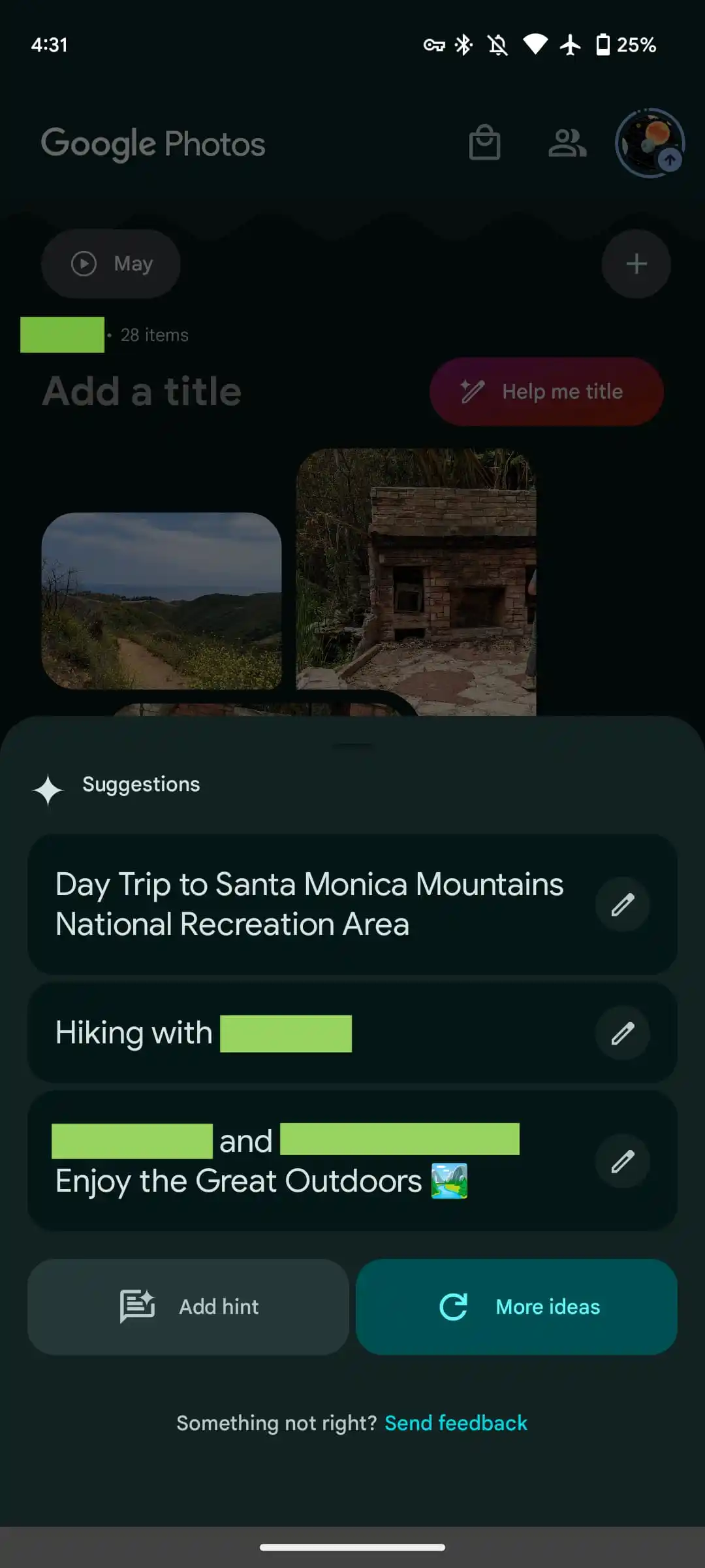
Users can create memories, which are pseudo albums from an editing and sharing perspective, from a rather tiny FAB (floating action button) that only appears when you scroll down. Meanwhile, generative AI is used to offer “customized title suggestions.” “Help me title” slides up a sheet that lets you add a “hint” to guide the generation.
Google started rolling this out in mid-August, but the revamp is only now seeing wide availability with version 6.54. If it’s not yet live on your device, try using the “Force stop” option on Google Photos from App info. It does not appear to be live on iOS yet.
This Google Photos redesign and Memories feed is coming first to the US and is set for global availability in the “coming months.”
Google Photos gets updated upload UI on the web
A small tweak to the Google Photos website in recent days modernizes the interface for uploading images and videos.
Like before, you can start uploading by dragging files into the window, or by tapping “Upload” in the top-right corner and selecting “Computer” to get a system file picker. Google Drive (pre-Workspace logo) is also still listed, but that’s now joined by “Add from other places,” which can also be found in the mobile app:
Transfer from photo collections: Facebook, iCloud
Transfer from photography services: Pixieset, Pic-Time, image.canon
Digitize physical photos: Photomyne, Capture, CVS
Back up from your computer: Google Drive for desktop
Scan photos with your phone: PhotoScan
The more notable change today is to the bottom-left corner progress UI. When uploading, you’ll get an estimate of how much longer it will take with a blue “Stop” button to end the process. “Show more” will expand this UI to provide a list of what’s in the queue.
Once complete, you just get “Add to album” as the available action, with “Saved album” removed. Overall, the UI is smaller than before.
Meanwhile, the redesigned Google Photos app on Android and iOS has yet to widely launch.
Google Photos Locked Folder sync starts rolling out
Announced at the end of August 2023, the ability to sync the Google Photos Locked Folder across devices signed in to your Google Account is rolling out more widely.
As of this morning, we’re seeing a prompt to “Back up Locked Folder” at the top of Google Photos. (Try Force stop from App info if it doesn’t appear, but this is not fully launched yet.) That takes you to a screen that explains how “Backing up Locked Folder keeps your hidden photos & videos safe when you change devices or delete the app.”
You have the option to “Turn on backup” or “Do not back up,” which keeps the feature unchanged from today. The Locked Folder grid will show a cloud icon in the top-right corner. That menu will let you disable sync at any time.
After turning it on, everything will start uploading to the cloud. Locked Folder can be enabled on a per-device basis. In this case, it appears that previously synced photos will appear on a disabled device, but any additions won’t. A cloud icon appears in the bottom-right corner of image previews in those cases.
Meanwhile, “Locked Folder” appears in the photos.google.com sidebar just above “Trash.” To access, you will have to sign in to your account, including 2-Step Verification (2FA).
This is getting a wider rollout today — photos.google.com/lockedfolder — but it’s not yet fully available. We’re also now seeing Locked Folder with sync in Google Photos for iOS today. Meanwhile, the broader bottom bar redesign and AI-powered Memories is not yet seeing broad availability.
One of the more interesting features recently added to iPhone is something called Clean Energy Charging. Apple says that this feature aims to “reduce your carbon footprint” by charging when lower carbon-emission electricity is available. In a support document, Apple has more details on how this feature works.
Apple says:
When Clean Energy Charging is enabled and you connect your iPhone to a charger, your iPhone gets a forecast of the carbon emissions in your local energy grid and uses it to charge your iPhone during times of cleaner energy production.
Clean Energy Charging is available only in the United States and is on by default when you set up your iPhone or after you update to iOS 16.1.
Clean Energy Charging is enabled by default, but you can manage the setting by going into the Settings app, choosing Battery, then Battery Health & Charging. Here, you’ll see a new toggle dedicated to the Clean Energy Charging feature.
Clean Energy Charging works together with Optimized Battery Charging to learn your charging habits. Clean Energy Charging engages only where you spend the most time and regularly charge your iPhone for long periods of time, such as your home and place of work. The feature doesn’t engage if your charging habits are variable or you’re in a new location, such as when you travel.
For Clean Energy Charging to work, Apple says the following settings must be configured:
Go to Settings > Battery > Battery Health & Charging and make sure that Clean Energy Charging is on.
Go to Settings > Privacy & Security > Location Services and make sure that Location Services is on.
Go to Settings > Privacy & Security > Location Services > System Services and make sure that System Customization is on.
Go to Settings > Privacy & Security > Location Services > System Services > Significant Locations and make sure that Significant Locations is on.
Finally, if you enable Clean Energy Charging but want to override it, you can do so directly from your iPhone’s lock screen. When Clean Energy Charging suspends charging, you’ll see a notification on your lock screen. Long press on this notification then choose the “Charge Now” option to override.
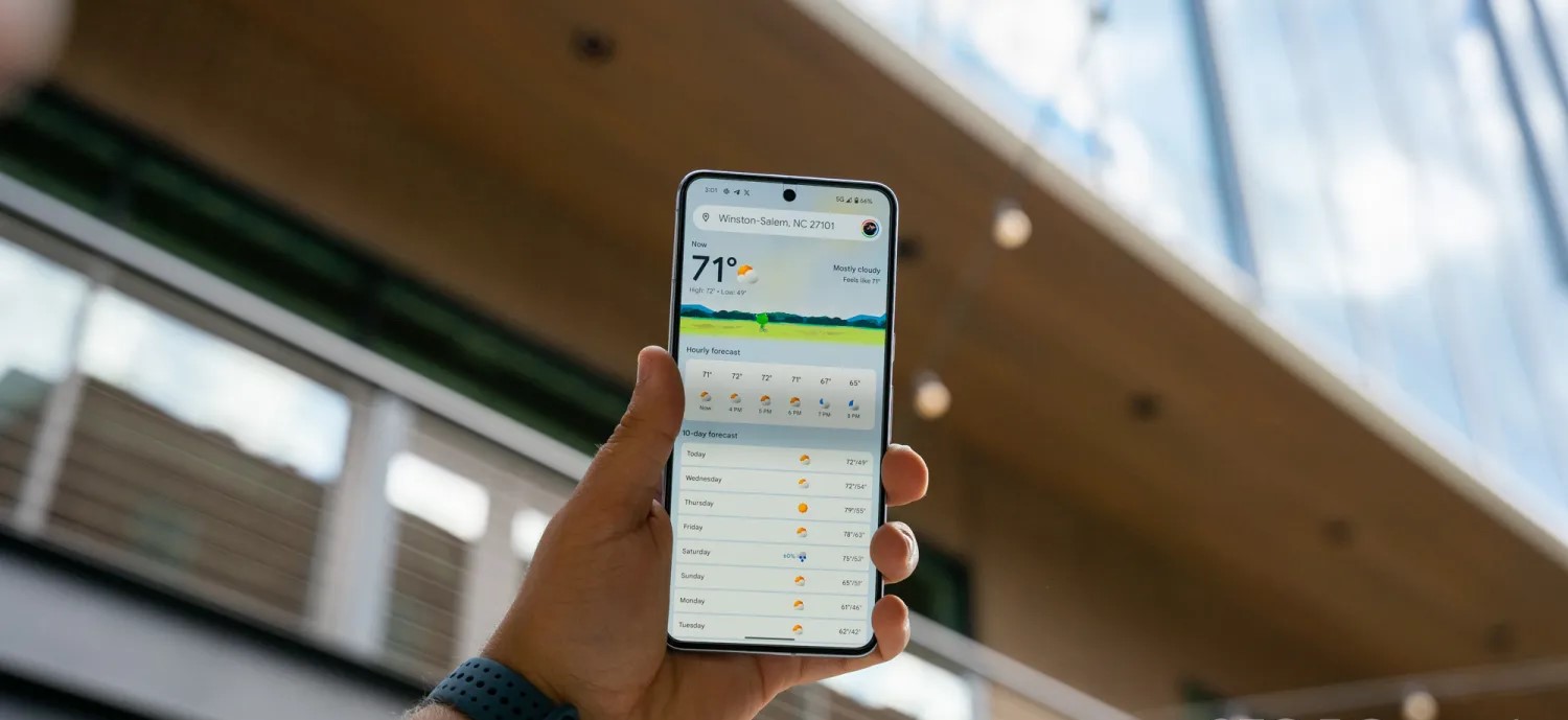
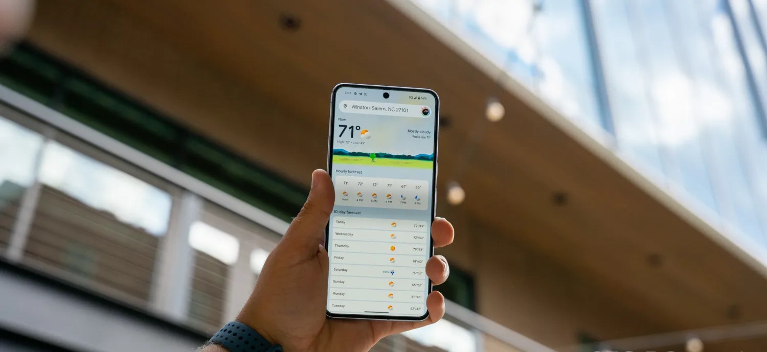
Google did a pretty good job redesigning the Weather experience on Android. It’s modern and has a straightforward layout that shows what’s coming up in the next few hours and days all on one screen.
When you do scroll or select a day, digestible cards note wind, humidity, UV index, precipitation, and more. Meanwhile, Google has kept around the lovable “Froggy” with different backgrounds that reflect the current condition to add a bit of whimsy. It really does keep the app fresh.
Helping power 12-hour precipitation forecasts is a deep learning model called MetNet-3 from Google Research and DeepMind that has so far been on par with Apple Weather/Dark Sky in my testing.
This updated Weather experience is currently available on Pixel, but it will presumably expand to all Android devices going forward.
Before the October rollout to Pixel, the last update to Google Weather came in September of 2021. That redesign used Google’s previous Material Theme design language just as Material You was going live in other apps. It’s embarrassing that it took that long to modernize.
Looking forward, I really hope Google has a feature roadmap in place rather than Weather entering maintenance mode until it’s time for the next refresh. An obvious thing to add next is radar and more widgets to show hourly and multi-day forecasts in a 5×1 size. A broader thing Google could do is bring weather to more first-party apps. It’s already starting to do this with Clocks and Contacts, but I think adding it to Google Calendar with a direct link to the full experience would be very interesting and could help people schedule their days.
One thing that could help with that is separating the fullscreen Weather experience out of Google Search and making it a standalone application. For a long time now, it has been part of the Google app.
The reason behind this is presumably because Google views weather as an extension of Search’s knowledge and information purview. The search engine has a rich experience on the web, as well as the Google app on iOS, which also uses MetNet-3. However, that’s not enough, and I think you need to give people a simple app icon that’s ideally preloaded onto every Android device. Given how good Apple’s Weather app is on iOS, Google really should have a 1:1 competitor.
At the very least, Google needs to drop the Pixel exclusivity for the two widgets available today, as that would make for a much more prominent way to launch weather than the homescreen shortcut that’s badged with the Google icon in the corner.
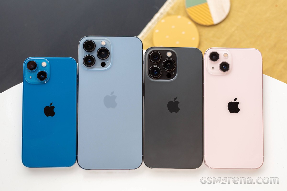
The Apple iPhone 13 mini is the most compact flagship smartphone money can buy. It’s also easy enough to outright recommend to anyone looking for this particular type of device. It is astonishingly rare to find such a pocket-friendly smartphone, let alone one of flagship caliber.
Apple launched the first iPhone mini a year ago, and while it did not turn out to be the massive success some hoped for it to be, it was still a popular purchase among the fans of compact phones, Android and iOS alike. But because of the lackluster sales, the rumor has it the iPhone 13 mini will be the last of its kind before it is merged with the iPhone SE in a year or two.
The iPhone 13 mini brings few updates over the iPhone 12 mini – an improved chipset, a better main camera with new sensor and stabilization, about 10% battery capacity increase, and a couple of software features. And a smaller screen notch, of course! But we imagine few if any iPhone 12 mini users will be upgrading to the iPhone 13 mini.
But as a standalone smartphone, the iPhone 13 mini seems like a great offer for a number of reasons – it is the cheapest current flagship iPhone with unmatched compact and lightweight design. It employs the most durable design on the market so far, runs on the most powerful Apple A15 chip with 5G, has excellent cameras, there are loud stereo speakers and a great 5.4″ OLED screen with Dolby Vision support.
Disclaimer. We can not guarantee that the information on this page is 100% correct.
For a device of this size, the Apple iPhone 13 mini is jam-packed with features. We can’t but appreciate that how Apple made the mini possible without cutting any corners – it is basically a shrunk version of the regular iPhone 13. It even offers Face ID and MagSafe wireless charging. And despite the new improvements, Apple managed to increase the battery capacity, too.
The iPhone 13 mini, just like the iPhone 13, has a regular 60Hz OLED, though that’s hardly surprising. The ProMotion screen is reserved for the iPhone ProModels. And that’s probably the only missing feature worth a mention before we get this review started.
Unboxing the Apple iPhone 13 mini
The iPhone 13 mini may be jam-packed with features, but its retail bundle is the opposite. Inside the thin paper box, you will find the iPhone 13 mini and a USB cable.
If you dig a little deeper, you’ll also discover the SIM ejection pin and one Apple sticker. This year Apple’s removed all plastic wrapping of its boxes and became even greener, so we guess the iconic sticker will be a goner soon enough.
The competition
The Apple iPhone 13 mini is a rare occurrence – it’s not only one of the most compact phones on the market, but it’s also a flagship one. And while people are still hoping for Sony to make a new Xperia mini, Apple is making compact iPhones by the dozen. Not only that, but it also offers budget phones as part of the iPhone SE lineup.
Apple iPhone 13 series
The new iPhone 13 mini is a minor upgrade over the 12 mini model with a smaller screen notch and a brighter panel, a bit faster chipset, doubled base storage, a slightly larger battery, and an improved primary camera. We’d say the battery bump is what got us excited the most about this mini, and it indeed offers improved battery autonomy over the previous model.
The compact class is ruled by Apple, so you can imagine our first alternative recommendations come from Apple’s camp. The iPhone 12 mini is still available, if the new upgrades don’t excite you, you can just as well go for the older model and save yourself €120 and maybe spend them on a pair of AirPods instead.
There is also iPhone SE (2020), which is €320 cheaper than the €799 iPhone 13 mini, but it still offers a great iOS experience, excellent performance, good photo quality, and excellent videos. The bezels and the lack of Night Mode are potential deal-breakers, though.
If the mini is too small for you, then you can consider the iPhone 13 (€100 over the 13 mini) – it’s the same phone but with a larger 6.1″ display. The regular model is still considered compact, and many users may find it striking the best balance between pocketability and multimedia-friendly.
Apple iPhone 12 mini • Apple iPhone SE (2020) • Apple iPhone 13
Outside Apple, we want to mention the Asus Zenfone 8 and the Samsung Galaxy S21 5G for being one of the most compact Android flagships with outstanding screens, performance, hardware, battery life. The Zenfone is a bit cheaper than the mini, while the S21 5G costs about the same.
Asus Zenfone 8 • Samsung Galaxy S21 5G
Verdict
The Apple iPhone 13 mini is the most compact smartphone on the market right now, with a flagship feature set and surprisingly good battery life for its small size. It has a lively Dolby Vision OLED screen, one of the most powerful chipsets to date, superb stereo speakers, and it offers a proficient trio of cameras that delivers great photo and video quality.
The iPhone 13 mini is also one of the most durable phones – it has a scratch-resistant screen and is IP68-rated for dust and water endurance in up to 6m deep water. Oh, and it’s incredibly thin and lightweight.
The iPhone 13 mini is not perfect, of course, but it’s close. It doesn’t offer a 120Hz refresh rate, it ships without a charger, and iOS is not for everyone. Plus, it’s a minor upgrade over the iPhone 12 mini, and the notch reduction is far from what many were hoping for.
We don’t know if the iPhone 13 mini is the last of its kind, for a while at least, but if it goes extinct, we know many people will miss it dearly. Because it is the phone you get if you want a small yet powerful flagship – it’s that simple. Even with its imperfections, it is the perfect smartphone for fans of compact phones.
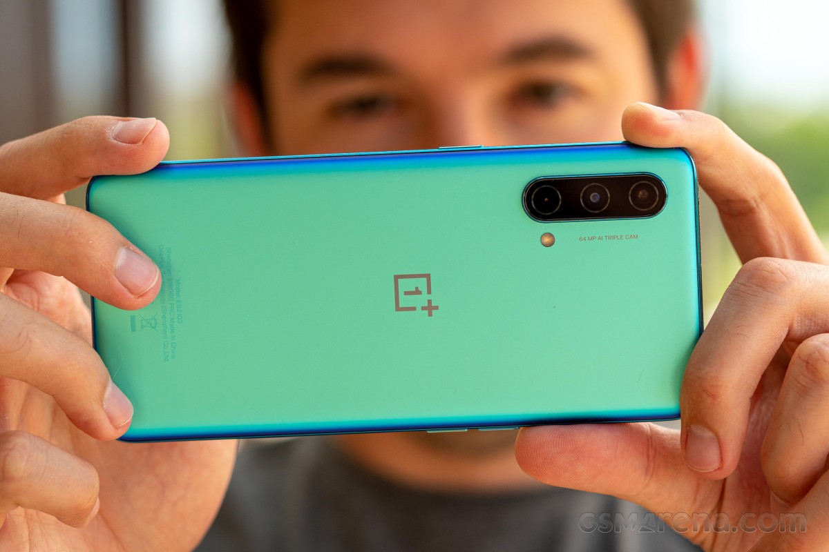
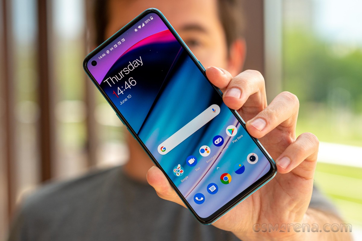
The OnePlus Nord CE 5G is the new mid-range killer or that’s at least how OnePlus markets the handset. And it’s probably not too far off from the truth. The Nord CE isn’t a successor to the original Nord but more of a toned-down version of the latter, hence the name CE, which stands for “Core Edition”. The phone keeps some of the core specs the original Nord brought, including the design, which is almost indistinguishable from the first Nord. So instead of replacing it, it’s meant to co-exist with last year’s Nord.
At around the €300 mark, the phone does face fierce competition from left and right, but it also seems to be well-equipped for the job too. It has a bright, 90Hz OLED display, a competent Snapdragon 750G, which is only a small step down from the Snapdragon 765G-powered vanilla OnePlus Nord. The base version also arrives with 128GB internal storage.
One of the key selling points is probably the portability of the Nord CE. With a 6.43-inch display, the phone is on the compact side, with a profile of less than 8mm and a weight of just 170g.
Disclaimer. We can not guarantee that the information on this page is 100% correct.
OnePlus was able to cram up a respectable 4,500 mAh battery inside the phone, which is even a step up from the first Nord, while retaining the 30W fast charging called Warp Charge 30T Plus.
As far as cameras are concerned, the Nord CE has a 64MP main camera and a secondary 8MP ultrawide. The third camera on the back is used only for depth information – there’s no dedicated macro unit. We can’t really complain, though, as macro cameras don’t bring extra value to the camera setups, especially at this price range.
So is the Nord CE 5G a mid-range killer? We try to find out in the following pages, but one thing is for sure, even by just assessing the specs sheet – the device is a well-rounded product with nothing missing from the list of essentials.
Unboxing the OnePlus Nord CE 5G
The phone comes in a fairly standard retail box containing the usual user manuals, a 30W-rated charger, USB-A to USB-C cable and a transparent case.
Our review unit came with a set of bumper cases from OnePlus itself. They are all made of soft-touch silicone and some small, dust-like golden particles stand out. It’s needless to say that they fit perfectly too.
Competition
The OnePlus Nord CE is touted as a “mid-range killer” but it has to fight off quite a few worthy competitors. This price segment is highly competitive, and since OnePlus wants to position itself as a more premium brand, it’s going to be hard. The good news is that the Nord CE 5G is a capable, well-balanced phone that might be up to the task.
Let’s start with the most obvious competitor – the Xiaomi Redmi Note 10 Pro. This handset starts at €260, which is €40 shy of the Nord CE’s starting price, but if we equate the storages (the Nord CE starts at 128GB), the difference is merely €20. Either way, the Redmi Note 10 Pro has a superior 120Hz OLED display with HDR10 support, a larger battery (although shorter battery life according to our tests), it packs a microSD card slot and offers a sensibly better camera experience all-around. The Nord CE fights back with more compact dimensions, arguably more practical and better-looking build, cleaner and leaner Android experience, longer battery life, faster charging and more importantly – a more recent and powerful SoC. It all boils down to software preference and also if that extra 30Hz on the Redmi Note 10 Pro really matter to you.
Another similarly priced alternative (€300) from the same camp is the Poco F3. This one also employs a superior 120Hz, HDR10+ compliant OLED display and offers 128GB as base storage. The camera department has been overlooked in favor of the considerably more powerful Snapdragon 870 chipset, but the overall camera quality doesn’t fall behind the Nord CE’s. In fact, it may be better in certain situations, mostly due to the better ISP in the Snapdragon 870. Battery life is still on the Nord CE 5G’s side, though. It’s a tough choice, that’s for sure, but if future-proofing and performance per dollar are your main priorities, the Poco F3 is the right way to go.
The recently released Galaxy A52 (about €315) is a hit in the mid-range segment. A well-balanced device with good camera performance across the board and an excellent Super AMOLED display with a 90Hz refresh rate. The microSD card slot is included, and the storage variants start at 128GB too. Nevertheless, as most of the other competitors, the Galaxy A52 (not to be confused with the 5G variant) loses the battery endurance and raw performance (Snapdragon 750G vs. Snapdragon 720G) races against the Nord CE 5G. The polished and more recognizable OneUI running on the Galaxy A52 is a sensible consideration.
Now it’s time for some in-house competition. The Realme 8 Pro is arguably one of the best phones to have around the €300 mark. You can even strike a deal for around €260 if you shop outside Realme’s official web store. And even though the display is just 60Hz, it’s still big, bright and crisp. Definitely not on par with the competition, though. It also settles for a Snapdragon 720G like the Galaxy A52. The camera department is the main reason to consider the handset – with its proficient main sensor and lossless (sort of) 3x zoom. Its 50W fast charging is another aspect worth taking into account, while the microSD card support + 128GB base storage combo is nice to have. And yet, the Nord CE’s more powerful chipset, HRR display, solid software experience and great battery life are really hard to beat.
Verdict
You’ve probably noticed the recurring theme when comparing the Nord CE to its direct rivals – it has better performance than most, and it has a better battery life than most. Even though the camera software needs more work, the Nord CE can stand its ground in the face of competition with a compact size, great OLED display and snappy user experience.
It sure has a few omissions like the microSD card support or the HDR10 video support, but they can be easily forgiven when assessing the Nord CE as a complete package. The Nord CE 5G is a great addition to the OnePlus roster, and it gets an easy recommendation from us.
Pros
Compact and lightweight design.
The plastic doesn’t feel like one and the Void Blue color keeps fingerprints at bay.
Bright OLED 90Hz display with good auto HRR control.
More powerful SoC than the majority of competitors, 128GB base storage.
Excellent battery life and fast charging solution.
OxygenOS feels as snappy as ever, adds a couple of neat features.
3.5mm jack, NFC.
Cons
No ingress protection rating.
Main camera outputs muted photos with a slight magenta tinge and cool white balance.
Ultra-wide camera has oversaturated colors and image quality is underwhelming.
Samsung is pretty widely rolling out its Android 14 update over the past week, but there’s a slight chance you should wait to actually install it, as it seems Samsung has left out a method that prevents burn-in from the status bar.
Burn-in on smartphone displays was once a major problem, with a few years on the same smartphone often resulting in display elements showing up nearly constantly on the screen. A common trick to prevent this is to slightly shift UI elements so they never stay in the same place too long. It’s nearly invisible to the user, but goes a very long way in preventing burn-in.
In One UI 6 (Android 14), though, it seems Samsung might have left this out.
Users on Reddit noticed that the status bar elements (time, battery, etc) no longer seem to shift over time. This was spotted by comparing screenshots over time, with the status bar elements perfectly aligning. Back in One UI 5 (Android 13), comparing screenshots over time showed that the elements would move a fair bit, resulting in an almost blurred effect when stacking screenshots on top of each other as seen below.
Notably, the navigation bar buttons still move, so Samsung doesn’t seem to have given up on this method entirely.
As for what exactly is going on here, it’s really hard to say. It’s entirely possible that Samsung has just adjusted screenshots to where they compensate for status bar elements moving, or that the company is using a new method for preventing burn-in. It’s also noteworthy that the comparison is made on two different devices – a Galaxy S23 Ultra on One UI 6 and a Galaxy Note 20 Ultra on One UI 5.
In any case, it’s at least a little worrying, and we’ll be curious to see if things change with further updates.
One UI 5 (1st photo) vs One UI 6 (2nd photo)
Samsung posts a new Android 14 update schedule for over 50 Galaxy devices
Samsung’s Android 14 rollout is well underway this week, and the company has now posted an updated schedule for the release, which details over 50 devices set to be updated over the next couple of months.
In Germany, Samsung has posted (as spotted by SamMobile) a new schedule via the Samsung Members app that details over 50 different devices set to get Android 14. The updated schedule shows updates going through February 2024, with the bulk of the work being done in November and December of this year.
Of course, we’ve heard this story before. Earlier this month, a roadmap posted by Samsung in another European country also detailed the company’s plans before being scrubbed from the web. But there are a couple of reasons to believe this latest roadmap is much more accurate. For one, it has far more devices, and it also lacks specific dates, which are always tough to hit. Beyond that, it’s being distributed through the Samsung Members app instead of the company’s forums, and the Members app is where we’ve seen this sort of roadmap released in the past.
Presumably, Samsung will add this same list to other countries in the days to come. It’s not live in the US as of now.
That’s not to say this is a concrete, definitive schedule. It’s still lacking plenty of lower-cost models, and things are always subject to change. But, that said, this is the closest we’re likely to get.
Samsung Android 14 update schedule
Smartphones
Galaxy S23 – Completed
Galaxy S23+ – Completed
Galaxy S23 Ultra – Completed
Galaxy Z Fold 5 – November 2023
Galaxy Z Fold 4 – December 2023
Galaxy Z Fold 3 – December 2023
Galaxy Z Flip 5 – November 2023
Galaxy Z Flip 4 – December 2023
Galaxy Z Flip 3 – December 2023
Galaxy S22 – December 2023
Galaxy S22+ – December 2023
Galaxy S22 Ultra – December 2023
Galaxy S21 – December 2023
Galaxy S21+ – December 2023
Galaxy S21 Ultra – December 2023
Galaxy S21 FE – December 2023
Galaxy A72 – December 2023
Galaxy A54 5G – November 2023
Galaxy A53 5G – December 2023
Galaxy A52 – December 2023
Galaxy A52 5G – December 2023
Galaxy A52s 5G – December 2023
Galaxy A34 5G – November 2023
Galaxy A33 5G – December 2023
Galaxy A23 5G – January 2024
Galaxy A14 – December 2023
Galaxy A14 5G – December 2023
Galaxy A13 – February 2024
Galaxy A13 5G – February 2024
Galaxy A04s – February 2024
Galaxy M53 5G – December 2023
Galaxy M33 5G – December 2023
Galaxy M23 5G – February 2024
Galaxy M13 – February 2024
Galaxy XCover 6 Pro – December 2023
Tablets
Galaxy Tab S9 – November 2023
Galaxy Tab S9 5G – November 2023
Galaxy Tab S9+ – November 2023
Galaxy Tab S9+ 5G – November 2023
Galaxy Tab S8 – December 2023
Galaxy Tab S8 5G – December 2023
Galaxy Tab S8+ – December 2023
Galaxy Tab S8+ 5G – December 2023
Galaxy Tab S8 Ultra – December 2023
Galaxy Tab S8 Ultra 5G – December 2023
Galaxy Tab S7 FE – January 2024
Galaxy Tab S7 FE 5G – January 2024
Galaxy Tab S6 Lite – November 2023
Galaxy Tab Active 4 Pro – January 2024
Galaxy Tab Active 4 Pro 5G – January 2024
Galaxy Tab A8 – February 2024
Galaxy Tab A7 Lite – February 2024
Again, the list here certainly isn’t definitive or all-inclusive, but it offers a much clearer picture of Samsung’s Android 14 update schedule compared to what we’ve had thus far.
















 Asus Zenfone 8 • Samsung Galaxy S21 5G