
Take a Look Inside a Foldable Screen Repair: The Ultimate Samsung Galaxy Challenge
![]()
Inside a Foldable Screen Repair: The Ultimate Samsung Galaxy Challenge (Proven 7-Step Breakdown)
Introduction
Foldable smartphones represent one of the biggest leaps in mobile technology, and Samsung Galaxy foldable devices sit right at the forefront of that innovation. They offer a stunning blend of portability and productivity, transforming from a compact phone into a tablet-sized display in seconds. However, behind this impressive design lies a hidden reality that many users only discover when something goes wrong. Inside a foldable screen repair is a level of complexity that far exceeds anything seen in traditional smartphone servicing.
Unlike standard glass screens, foldable displays are built from multiple ultra-thin, flexible layers that must move perfectly in sync with a precision-engineered hinge. Even minor damage can affect not just the screen, but the entire folding mechanism, touch sensitivity, and display performance. A small drop, trapped dust, or everyday wear can quickly turn into a serious and costly problem if not handled correctly.
This article takes you inside a foldable screen repair to uncover why Samsung Galaxy foldable devices present such a unique challenge. From understanding how the technology works to exploring the risks, costs, and professional repair process, you’ll gain clear, practical insights into what it really takes to restore these advanced devices. Whether you’re a foldable phone owner or simply curious about the technology, this guide explains everything in a straightforward, easy-to-understand way—without the guesswork.
Understanding Foldable Screen Technology
Foldable smartphones have changed the mobile industry almost overnight. Samsung Galaxy Fold and Galaxy Z Fold devices represent cutting-edge innovation, blending phone portability with tablet-sized displays. However, inside a foldable screen repair, technicians face one of the most complex challenges in modern electronics.
Unlike traditional glass screens, foldable displays use ultra-thin glass layered with flexible polymers. This design allows the screen to bend thousands of times, but it also introduces vulnerabilities. Even minor pressure or debris can lead to visible creases, dead pixels, or full display failure.
What’s more, Samsung’s foldable devices integrate the screen directly with the hinge system. That means damage rarely affects just one component. Instead, issues often cascade, impacting touch responsiveness, display brightness, and structural alignment. Understanding this technology is crucial before diving deeper into the repair process.
How Samsung Galaxy Foldable Displays Work
Samsung foldable displays rely on a multi-layer structure. At the top sits a protective polymer layer, followed by ultra-thin glass, AMOLED pixels, digitizers, and flexible substrates underneath. Each layer must move in harmony during every open and close motion.
The hinge mechanism synchronizes this movement. It distributes stress evenly across the screen, preventing sharp bends. However, when dust, sand, or micro-particles enter the hinge, friction increases. Over time, this friction can press against the screen from beneath, causing internal cracks that aren’t visible at first glance.
Inside a foldable screen repair, technicians must account for all these layers. Replacing just the outer display isn’t enough. Calibration, pressure testing, and hinge alignment are mandatory steps to restore factory-level performance.
Why Foldable Screens Are More Fragile
Let’s be honest—foldable screens aren’t as forgiving as standard smartphone displays. While Samsung has made massive improvements since the first Galaxy Fold, fragility remains part of the equation.
The flexibility that makes these devices exciting also makes them sensitive. A small drop that wouldn’t faze a slab phone can cause significant damage to a foldable. Even closing the phone with debris inside can lead to permanent marks or dead zones.
That’s why inside a foldable screen repair, technicians often discover hidden damage. What appears to be a simple crack may reveal hinge misalignment or internal pressure points once the device is opened.
Common Causes of Foldable Screen Damage
Foldable screen damage rarely comes from one dramatic incident. Instead, it’s usually the result of accumulated stress over time.
Everyday Wear and Tear
Daily folding and unfolding naturally wears down components. Although Samsung rates its hinges for hundreds of thousands of folds, real-world conditions vary. Humidity, dust, and temperature changes all play a role in screen degradation.
Minor scratches on the protective layer can eventually develop into cracks. Touch sensitivity may decline gradually, making it harder to detect problems early.
Impact, Pressure, and Hinge Stress
Drops remain a leading cause of damage. Even with a case, the hinge can absorb shock unevenly, transferring force directly to the display. Sitting on a folded phone or placing it in a tight pocket also adds pressure where it shouldn’t exist.
Inside a foldable screen repair, hinge stress is one of the first things professionals check. If ignored, replacing the screen alone won’t solve the issue long-term.
Inside a Foldable Screen Repair Process
This is where things get serious. A foldable screen repair isn’t just a remove-and-replace job. It’s a carefully choreographed process that demands precision, patience, and experience.
Initial Diagnostic Inspection
Every repair starts with diagnostics. Technicians test touch responsiveness, display brightness, hinge smoothness, and software calibration. They also inspect for micro-cracks and pressure marks under magnification.
This step determines whether the damage is limited to the screen or extends to the hinge and frame. Skipping diagnostics can lead to incomplete repairs and repeat failures.
Disassembly of a Samsung Foldable Device
Disassembling a foldable phone is significantly more complex than a standard smartphone. Adhesives are stronger, components are densely packed, and cables are fragile.
The back cover, battery, speakers, and hinge covers must be removed in a specific order. Any mistake can damage flex cables or compromise water resistance.
Hinge and Frame Assessment
Once opened, technicians inspect the hinge assembly. Bent rails, worn brushes, or trapped debris are common findings. If the hinge isn’t restored to proper alignment, the new screen will fail prematurely.
Inside a foldable screen repair, this assessment is often the difference between a lasting fix and a costly comeback.
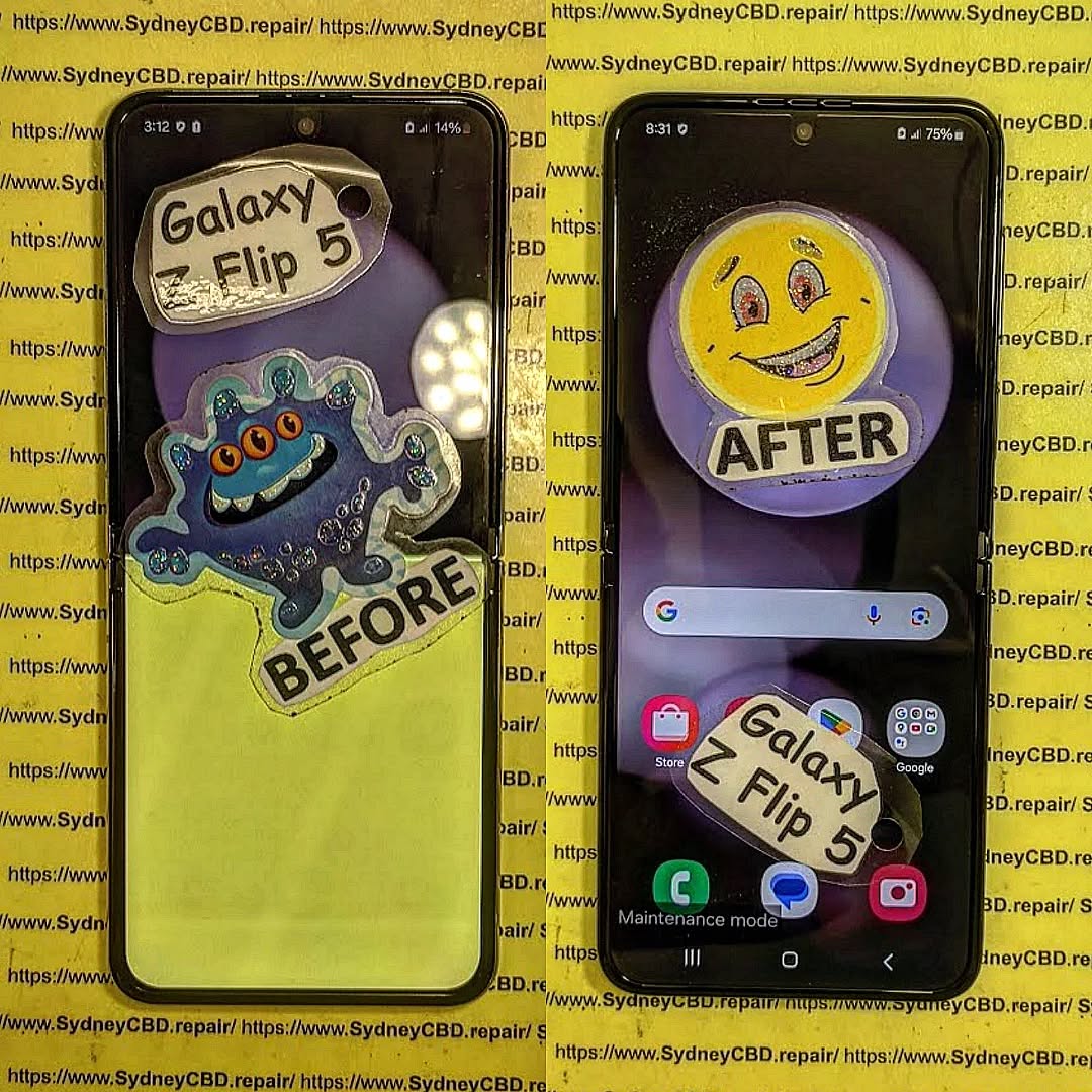
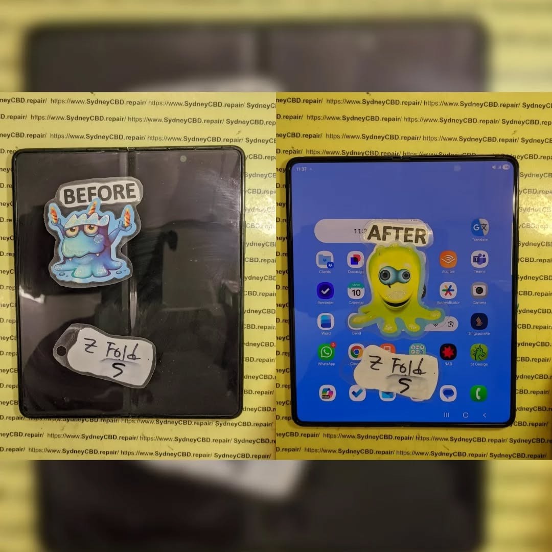
Screen Replacement and Calibration
After removing the damaged display, the replacement screen is installed with extreme care. Alignment is critical. Even a fraction of a millimeter off can cause uneven folding or pressure points.
Calibration follows. Technicians test touch accuracy, color balance, brightness uniformity, and folding smoothness. Only after passing these checks is the device reassembled and sealed.
Tools and Expertise Required for Foldable Repairs
Foldable repairs aren’t for amateurs. They demand tools and training far beyond standard phone repairs.
Specialized Equipment
Professional repair centres use heating plates, precision clamps, hinge alignment tools, and OEM-grade adhesives. Anti-static environments and magnification tools are also essential.
Without these, the risk of damaging internal layers skyrockets.
Technician Skill and Training
Experience matters. Technicians must understand Samsung’s design philosophy and repair protocols. According to Samsung’s official support documentation, improper handling can void warranties and cause irreversible damage. This is why trusted repair centres invest heavily in ongoing training and certification.
Risks of DIY Foldable Screen Repair
It’s tempting to save money by attempting a DIY repair. However, foldable devices raise the stakes considerably.
Common DIY Mistakes
Using incorrect tools, overheating adhesives, or misaligning the hinge are frequent errors. Many DIY attempts result in damaged flex cables or shattered replacement screens.
Long-Term Damage Risks
Even if the phone powers on, improper repairs can shorten the lifespan of the device. Uneven pressure leads to creases, dead pixels, or touch failures within weeks.
Inside a foldable screen repair, professionals often see devices made worse by DIY attempts, increasing overall repair costs.
Cost Breakdown of Samsung Foldable Screen Repairs
Foldable screen repairs aren’t cheap, but understanding the costs helps set realistic expectations.
Parts vs Labor Costs
The display itself is the most expensive component. Genuine Samsung foldable screens cost significantly more than standard AMOLED panels. Labor costs reflect the time, skill, and risk involved.
Warranty and Value Considerations
Using genuine parts and professional service protects your investment. Many reputable centres offer warranties on repairs, providing peace of mind and long-term value.
Professional vs Authorized Repair Centres
Choosing where to repair your foldable device matters.
Why Experience Matters
Authorized and highly experienced independent centres understand the nuances of foldable repairs. They follow strict procedures and use quality parts.
Choosing a Trusted Repair Partner
Look for proven reviews, transparent pricing, and clear warranty terms. A trusted centre won’t cut corners, especially with something as delicate as a foldable screen.
FAQs
- How long does a foldable screen repair take?
Most professional repairs take 2–4 hours, depending on damage severity and parts availability. - Can a foldable screen be repaired, or must it be replaced?
In most cases, the screen must be fully replaced due to its layered structure. - Is foldable screen repair covered under warranty?
Accidental damage usually isn’t covered, but manufacturer defects may be. - Will my phone fold the same after repair?
Yes, if repaired correctly with proper hinge alignment and calibration. - Are third-party repairs safe for Samsung foldables?
They can be, provided the repair centre is experienced and uses genuine parts. - How can I prevent future foldable screen damage?
Avoid debris, use protective cases, and handle the device gently when folding.
Conclusion

Inside a foldable screen repair lies one of the most advanced challenges in modern smartphone servicing. Samsung Galaxy foldables push technological boundaries, but they demand expert care when things go wrong.
From diagnostics to hinge alignment and screen calibration, every step matters. While costs may be higher than traditional repairs, professional service ensures longevity, performance, and peace of mind. In the end, trusting experienced technicians isn’t just smart—it’s essential.
David from Sydney CBD Repair Centre – The Best place to fix mobile phones as 7 Years In A Row! Top Mobile Phone Repair In Sydney. More than 2000 Positive Reviews on Google and Same Day Repairs.
We take pride in delivering exceptional repair services for all major phone brands including Apple, Samsung, Google, and more. Our expert technicians use only genuine parts and offer 90days warranty on repairs. Located in the heart of Sydney CBD, we’re your one-stop solution for all mobile device repairs.
Our commitment to excellence has earned us the trust of thousands of satisfied customers. Whether it’s a cracked screen, battery replacement, or water damage repair, we handle it all with professional care and expertise. Walk in today and experience why we’re Sydney’s #1 choice for mobile phone repairs.
Visit us for:
✓ Same Day Express Repairs
✓ Genuine Parts Guarantee
✓ Professional Technicians
✓ Competitive Pricing
✓ 2000+ 5-Star Google Reviews
✓ 7-Time Award Winner for Best Phone Repairs
Sydney CBD Repair Centre – Where Quality Meets Reliability.
Call : +61280114119
Website: https://SydneyCBD.repair/locate-us